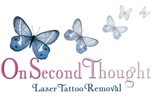
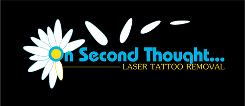
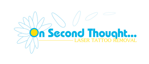
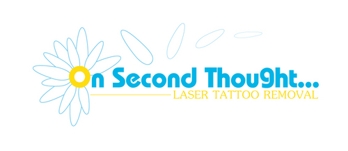
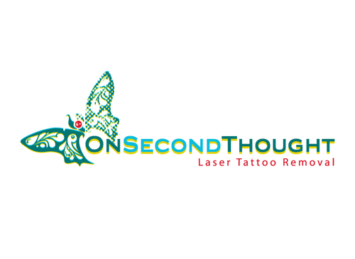
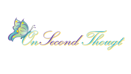
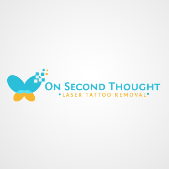
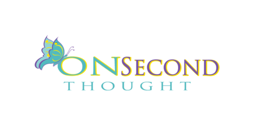
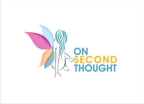
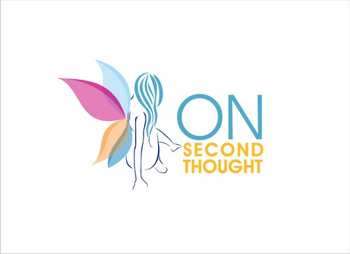
Laser Tattoo Removal Logo
"On Second Thought..."
|
Contest Holder
Dexter
?
Last Logged in : 5192days1hr ago |
Concepts Submitted
233 |
Guaranteed Prize
350 |
Winner(s) | A Logo, Monogram, or Icon |
|
Live Project
Deciding
Project Finalized


Creative Brief
Laser Tattoo Removal Logo
"On Second Thought..."
Yes
Laser Tattoo removal. Eventually will move onward and upward by adding additional lasers and additional services.. such as laser hair removal. Marketed to women because we feel you should market EVERYTHING to women, but obviously men hold a large part of the business (although they are doing it to please the women). I would like to be modern, clean in lines.. with a feminine 'touch' but not overly so.
Health
Symbolic
![]()
Abstract Mark
![]()
Illustrative
![]()
Web 2.0
![]()
Cutting-Edge
Clean/Simple
Sophisticated
Modern
High Tech
Serious
Pantone 631-c is our primary color darker Yellow for highlights Possibly a darker blue thrown in? But would love any thoughts
3
My eye is generally more drawn to 3dimensional ideas, but the logo has to have a good b/w look and feel, as well as the ability to possibly have embroidered shirts, or screen printed t-shirts.
Possibly 'erasing' a logo? Maybe a woman thinking?
Related Contests


