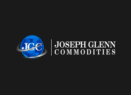
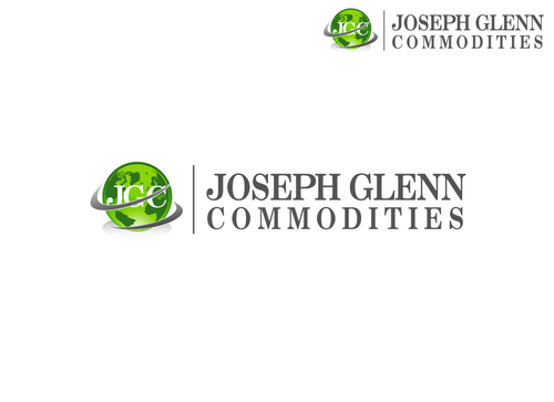
SALES / SUPPORT : +1-877-525-5646   |  


JGC Logo Design

Joseph Glenn Commodities

Contest Holder jgcommodities ?

Last Logged in : 4887days15hrs ago

Concepts Submitted

247

Guaranteed Prize
250
Winner(s)

1

A Logo, Monogram, or Icon veildAll design entries can be viewed by other designers. Featured Featured Contest Expedite Expedite Contest
tick_gray

Live Project

tick_gray

Deciding

tick_blue

Project Finalized


Project: JGC Logo Design
Contest Launched: Dec 07, 2010
Selected: 1 winning design from 247 concepts
Winning Design by: VaastuDesign
Close Date: Dec 18, 2010


JGC Logo Design - Financial Services


Awarded as a winner
Project Report    

Sort by:


Creative Brief


JGC Logo Design

Joseph Glenn Commodities

No

We are a Commodities Investment Firm that focuses on offering precious metals investing. The investment vehicles we offer are; Gold, Silver, Platinum, Palladium, and Copper. Although we do offer to send the physical metal to the customer, this is only 5% of our business (We are NOT a Coin Dealer!). Clients invest with us and we purchase the appropriate metal and store it for them.

Financial Services

Symbolic
Symbolic

Abstract Mark
Abstract Mark

Initials
Initials

Illustrative
Illustrative


Cutting-Edge
Sophisticated
Corporate
Modern
Traditional
Serious

Navy, Beige

not sure

Related Contests


Unsung Heroes
$199
Prize Money
41
Concepts
ATA Financial Services, Inc
$200
Prize Money
77
Concepts
Logo design for a stock investing product called Options Trader Elite
$200
Prize Money
84
Concepts
Logo for Wealth Management Firm
$200
Prize Money
66
Concepts

Discussion


Comments

  • December 20, 2010 12:00 PM
    VaastuDesign VaastuDesign
     
    Thank you, Sir.

    Like Icon 0   DislikeIcon 0
  • December 17, 2010 7:11 PM
    jgcommodities jgcommodities
      Project Holder
    VaastuDesign Please try 205 with other colors - any colors - your choice! and move globe symbol around text.

    Like Icon 0   DislikeIcon 0
  • December 17, 2010 9:11 AM
    jgcommodities jgcommodities
      Project Holder
    #212 213 Please increase size of G to Match J Thanks

    Like Icon 0   DislikeIcon 0
  • December 15, 2010 12:46 PM
    jgcommodities jgcommodities
      Project Holder
    At this point - Feel free to go in any direction you feel would look good. Thanks to all for the hard work. Thank You

    Like Icon 0   DislikeIcon 0
  • December 15, 2010 12:45 PM
    jgcommodities jgcommodities
      Project Holder
    #162 - Too similar to AT&T logo - We are in finance not telecom. Thanks

    Like Icon 0   DislikeIcon 0
  • December 15, 2010 12:44 PM
    jgcommodities jgcommodities
      Project Holder
    Neverland: #163 - Lower Example with Silver lettering is better then colored lettering. Thank You

    Like Icon 0   DislikeIcon 0
  • December 15, 2010 12:43 PM
    jgcommodities jgcommodities
      Project Holder
    More Examples with different Greens Please

    Like Icon 0   DislikeIcon 0
  • December 15, 2010 12:43 PM
    jgcommodities jgcommodities
      Project Holder
    VaastuDesin: #175 is Very good but please try without Blue

    Like Icon 0   DislikeIcon 0
  • December 15, 2010 12:42 PM
    jgcommodities jgcommodities
      Project Holder
    Neverland: #183 is great but too busy with Colored blue/green earth. Thanks

    Like Icon 0   DislikeIcon 0
  • December 15, 2010 12:42 PM
    jgcommodities jgcommodities
      Project Holder
    smayra10: We like #167. Try without linking G and C. Thanks

    Like Icon 0   DislikeIcon 0
  • December 14, 2010 12:40 PM
    Tyba23 Tyba23
     
    #169 , #173

    Like Icon 0   DislikeIcon 0
  • December 14, 2010 9:16 AM
    jgcommodities jgcommodities
      Project Holder
    How about using a real looking Blue/Green Earth?

    Like Icon 0   DislikeIcon 0
  • December 12, 2010 11:07 PM
    jgcommodities jgcommodities
      Project Holder
    VaastuDesign: I feel that Joseph and Glenn should be the same color and Commodities could be the different color. Thanks

    Like Icon 0   DislikeIcon 0
  • December 11, 2010 11:27 PM
    VaastuDesign VaastuDesign
     
    Dear PH, Thank you for the feedback, here's the update. Regards, Vaastu

    Like Icon 0   DislikeIcon 0
  • December 11, 2010 10:10 PM
    jgcommodities jgcommodities
      Project Holder
    x3mart: Of all your designs I believe #48 is my favorite. I would still like to see some other font and color choices. Thank you for all of your hard work. Best of Luck. Thanks

    Like Icon 0   DislikeIcon 0
  • December 11, 2010 10:02 PM
    jgcommodities jgcommodities
      Project Holder
    VaastuDesign: #70 & #71 are great. Please try some other fonts and colors - Deep blue, green, brown/tan. Really like the earth image in #71. Best of Luck. Thanks

    Like Icon 0   DislikeIcon 0
  • December 11, 2010 9:56 PM
    jgcommodities jgcommodities
      Project Holder
    Sergem: I Like #73 but am not a fan of red please try other colors. Thanks

    Like Icon 0   DislikeIcon 0
  • December 11, 2010 9:55 PM
    jgcommodities jgcommodities
      Project Holder
    gunes: #79 & #78 are good. Try with shadow and use some different fonts. Other colors would be nice to see as well. Dark shades of blue, green, brown/tan are my preference. Good work with Globe. Best of Luck Thanks

    Like Icon 0   DislikeIcon 0
  • December 11, 2010 4:25 AM
    SiteAdmin SiteAdmin
     
    Design #72 by hexaner is a derivative of #22 (and corresponding designs) by x3mart, therefore has been taken down.

    Like Icon 0   DislikeIcon 0
  • December 10, 2010 12:11 PM
    VaastuDesign VaastuDesign
     
    Dear PH Need your feedback please, Thank you.

    Like Icon 0   DislikeIcon 0
  • December 09, 2010 10:00 AM
    jgcommodities jgcommodities
      Project Holder
    Simple Images

    Like Icon 0   DislikeIcon 0
  • December 09, 2010 10:00 AM
    jgcommodities jgcommodities
      Project Holder
    Also please try some other colors. I prefer Rich, Deep Colors. Thanks.

    Like Icon 0   DislikeIcon 0
  • December 09, 2010 9:59 AM
    jgcommodities jgcommodities
      Project Holder
    Try using an image of the earth somewhere. We want to come across as GLOBAL Financial Managers. Looks great so far! Thank You!!!

    Like Icon 0   DislikeIcon 0