SALES / SUPPORT : +1-877-525-5646   |   Login


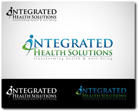
Integrated Health Solutions Logo

Integrated Health Solutions

Contest Holder lwright ?

Last Logged in : 4661days5hrs ago

Concepts Submitted

419

Guaranteed Prize
300
Winner(s)

2

A Logo, Monogram, or Icon veildAll design entries can be viewed by other designers. Featured Featured Contest Expedite Expedite Contest
tick_gray

Live Project

tick_gray

Deciding

tick_blue

Project Finalized


Project: Integrated Health Solutions Logo
Industry: Health Logo
Contest Launched: Mar 10, 2012
Selected: 2 winning design from 419 concepts
Winning Design by: sarkar
Close Date: Mar 20, 2012


Integrated Health Solutions Logo - Health


Awarded as a winner
Project Report    

Sort by:


#419

#418

#395

#360


Creative Brief


Integrated Health Solutions Logo

Integrated Health Solutions

transforming health & well-being

Yes

IHS increases companies health and productivity by serving as their strategic partner in health and well-being. We work with stakeholders to tailor the most effective value added solutions that empower their workforce to take responsibility and participate in their own health and well-being.
We want our design to represent the integration of strategies -a sole solution we offer - health screenings, fitness, nutrition,massage therapy, education, industrial ergonomics that sets us apart from our competitors.
We believe onsite wellness engagements, making it relevant and achievable to the workforce will create a community of wellness thereby changing the workplace culture into a healthy community.
We are in the process of rebranding our messaging, website and logo as we don't feel our strengths of providing strategies that engage the individual in behavior change through tailored results driven initiatives is currently being communicated. Go to www.ihs-wellness.com to see our current logo (don't like our current logo as it leaves the impressions that we are a service driven company and not a comprehensive solution. See our teams bios to get a flavor of our expertise having spent the majority of our careers actually working in the employer side thereby better understand our customer because we have been our customer.


hat empower

Health

Logo Type
Logo Type

Symbolic
Symbolic

Abstract Mark
Abstract Mark


Sophisticated
Corporate
Abstract

teal with grey but open to suggestions

2

no clip art. want a logo that stands out. works well horizontally, incorporates Integrated Health Solutions with a symbol that demonstrated integrated, wellness/well-being

Related Contests


Logo for new Rehab company
$275
Prize Money
223
Concepts
Youth Heart Screening Company
$250
Prize Money
100
Concepts
 logo for re-branding new nursing facility
$400
Prize Money
184
Concepts
Fort Myers Hot Yoga Studio
$199
Prize Money
107
Concepts

Discussion


Comments

  • March 20, 2012 10:47 AM
    sallu sallu
     
    It's a dirty trick to steal someone's design, make a few changes and become a winner. Well done sarkar.

    Like Icon 0   DislikeIcon 0
  • March 20, 2012 10:39 AM
    fawwaz fawwaz
     
    winning design is perfect copy of sallu drafts #344 #342

    Like Icon 0   DislikeIcon 0
  • March 20, 2012 9:52 AM
    max51 max51
     
    GRATE DESIGN sarkar WELL DONE

    Like Icon 0   DislikeIcon 0
  • March 20, 2012 9:12 AM
    lsone lsone
     
    lol stockart and overused designs ...wow

    Like Icon 0   DislikeIcon 0
  • March 16, 2012 8:40 AM
    lwright lwright
      Project Holder
    Designers 125 to 269 who have not been eliminated are our finalists. We need you to make the following changes to your designs. Stacked version and horizontal version. Stacked version: image, IHS, vertical line, Integrated Health Solutions stacked, transforming....underneath Version with image and IHS initials only Version with Integrated HeLth Solutions and tag line separated by horizontal line. Use only teal, black, and grey colors only, mix use of three colors and show me different print options No 3D, flat desgin only. d Image with IHS initials only

    Like Icon 0   DislikeIcon 0
  • March 14, 2012 10:00 AM
    lwright lwright
      Project Holder
    We've extended our project to allow us more time to review your designs, provide specific feedback to our favorites for recommended changes and finally select from our finalists.

    Like Icon 0   DislikeIcon 0
  • March 13, 2012 7:37 AM
    lwright lwright
      Project Holder
    Getting closer to what we are looking for. Please no more leaf designs. Remember it needs to be scalable and easy to reproduce in all sizes.

    Like Icon 0   DislikeIcon 0
  • March 12, 2012 7:48 AM
    lwright lwright
      Project Holder
    Would also like to see some designs incorporated into our name vs outside of our name. Perhaps placing the image around or within one of the words in our name or the entire name. Let your creativity flow.

    Like Icon 0   DislikeIcon 0
  • March 11, 2012 5:09 PM
    lwright lwright
      Project Holder
    All - Quick question - we seem to be receiving many logos with "leaf" style images. Not quite sure of the intent; however, perhaps a geometric design which depicts integration, all inclusive. Remember we are a health and wellness provider to employer groups, physicians, and healthcare brokers. Please check out our current website www.ihs-wellness.com (to be retooled) to learn more about our company, mission and services.

    Like Icon 0   DislikeIcon 0
  • March 11, 2012 9:17 AM
    lwright lwright
      Project Holder
    All - please no medical style symbols and less clip art style symbols - Thanks.

    Like Icon 0   DislikeIcon 0
  • March 11, 2012 8:48 AM
    lwright lwright
      Project Holder
    All - appreciate your submissions and hard work. I'm just not getting the integrated,community inclusive, partner messaging with your logos. In fact, I have seen some of the logos ( #8 and #26) being used in other projects. Although I recognize it is very challenging to encompass all of these components in a logo, we would like something unique that will stand out to create brand recognition. We will also need versions that are vertical as well as horizontal. #22-Integrated is misspelled-please resubmit with correct spelling-thanks.

    Like Icon 0   DislikeIcon 0
  • March 11, 2012 12:25 AM
    lwright lwright
      Project Holder
    Draft 1-4. I like the direction you are going but you need to include our tag line. transforming health & well-being. Also the logo doesn't truly depict the image I was looking for.

    Like Icon 0   DislikeIcon 0