SALES / SUPPORT : +1-877-525-5646   |   Login


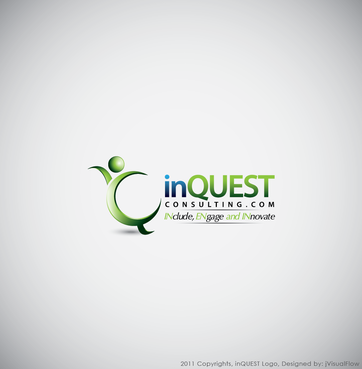
inQUEST Consulting Logo

inQUESTConsulting.com

Contest Holder shoesman ?

Last Logged in : 4709days5hrs ago

Concepts Submitted

78

Guaranteed Prize
300
Winner(s)

1

A Logo, Monogram, or Icon veildAll design entries can be viewed by other designers.
tick_gray

Live Project

tick_gray

Deciding

tick_blue

Project Finalized


Project: inQUEST Consulting Logo
Industry: Consulting Logo
Contest Launched: Nov 30, 2011
Selected: 1 winning design from 78 concepts
Winning Design by: typography
Close Date: Dec 12, 2011


inQUEST Consulting Logo - Consulting


Awarded as a winner
Project Report    

Sort by:


#34

#10

#35

#33

#17

#13

#18

#51

#50


Creative Brief


inQUEST Consulting Logo

inQUESTConsulting.com

For Organizations to INclude, (I)ENgage and INnovate

Yes

This logo is for a next generation diversity & inclusion consulting firm. The primary target audience is Fortune 1000 companies who are looking to a) make sure they are including diverese talent at all levels of their organization b) ensure that they inlcude and reach diverse markets c) that employees and customers are engaged with their business and d) that because of the diverse perspectives - people are able to better innovate. My placeholder webpage is www.inquestconsulting.com; a solid competitor webpage is globalnovations.com. NOTE: I'm not 100% sold on the tagline above...we are a "Diversity & Inclusion" firm, but I'm trying to differientiate ourselves as the NEXT Generation/iteration of those shops...however, I'm concerned that what I have may be too long. That said it is the inspiration for the name - the Journey or Quest to "IN"clude "I/ENgage" and "INnovate" - if used I'd like the E in Engage to resemble an "I" so people just don't think we're spelling it wrong. Also not sure if I need the .com in the logo - feels right to me...but unsure.

Consulting

Logo Type
Logo Type

Abstract Mark
Abstract Mark

Web 2.0
Web 2.0


Cutting-Edge
Unique/Creative
Sophisticated
Corporate

Stay away from "rainbows" or "Mosaics" (overused in the space). Want to avoid reds and purples (other similiar firms use these) ...I'm drawn to greens/yellows which also connote sustainability to me...people sustainability.

not sure

I like the thought of using a globe image somehow in the design...perhaps playing off the Q in quest.


Related Contests


Logo for Payroll Company
$200
Prize Money
248
Concepts
Consulting Firm Logo Design
$250
Prize Money
124
Concepts
Custom Logo for William I. Baker Jr.
$200
Prize Money
68
Concepts
Logo for a management consulting firm.
$200
Prize Money
282
Concepts

Discussion


Comments

  • December 06, 2011 8:29 AM
    shoesman shoesman
      Project Holder
    Wow, really impressed with some of the submissions and the added "people/softer" elements. I think we are getting real close. I've taken some time to eliminate those that are not in consideration and am now focusing my attention on the 4/5 star rated designs. REALLY appreciate the time and thought going into this. THANKS

    Like Icon 0   DislikeIcon 0
  • December 05, 2011 7:40 AM
    shoesman shoesman
      Project Holder
    Thanks Designers! I've re-ranked the current designs as of this morning. #10 captured the "E" in ENgage concept very well - many of the others do not. Are there OTHER options than the globe? I like it, but somehow the important 'people' aspect of my work is missing. I know I also want the ".com" included. I'm liking #5 because it feels different and fresh (although still missing the 'people' aspect)

    Like Icon 0   DislikeIcon 0
  • December 03, 2011 6:43 PM
    finisheddesign finisheddesign
     
    Please see your messages section from right top of the page

    Like Icon 0   DislikeIcon 0
  • December 02, 2011 12:49 PM
    shoesman shoesman
      Project Holder
    #4 just seems like a variation on dermawan's good work...not sure it is bring a new element/concept at play. While I like #2 and #3 I am looking for other creative ideas and approaches too. Thanks

    Like Icon 0   DislikeIcon 0
  • December 01, 2011 6:47 AM
    shoesman shoesman
      Project Holder
    General direction is on target! At this stage two things are striking me - while I like the font for "in" the font selection for "QUEST" is reading too police/security/technical for me. Also the tag line is not connecting with me - not liking repeating "quest" or seperation lines. Also - I'd like for the "E" in engage to put empahsis on the shared line the "E" has with the "I" (the backbone if you will) and downplay the three horizontal marks that make it an actually "E" (hopefully that makes sense).

    Like Icon 0   DislikeIcon 0