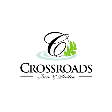
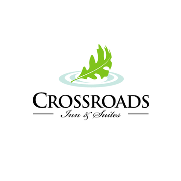
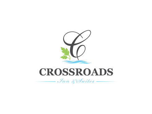
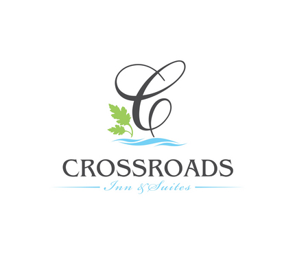
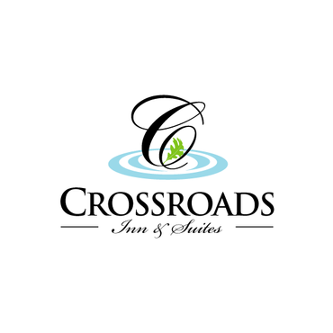
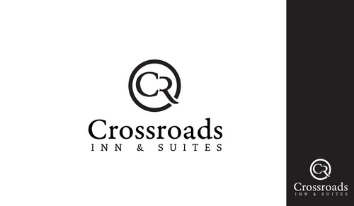
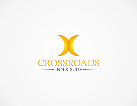
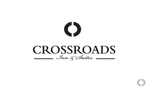
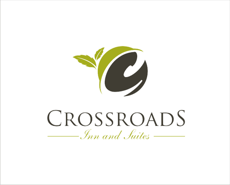
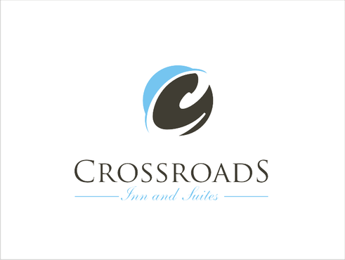
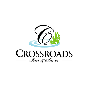
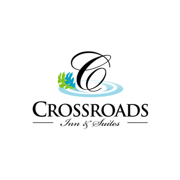
Hotel Business Logo - "Crossroads Inn and Suites"
Crossroads Inn and Suites
|
Contest Holder
jodom1254
?
Last Logged in : 4401days12hrs ago |
Concepts Submitted
51 |
Guaranteed Prize
250 |
Winner(s) | A Logo, Monogram, or Icon |
|
Live Project
Deciding
Project Finalized


Creative Brief
Hotel Business Logo - "Crossroads Inn and Suites"
Crossroads Inn and Suites
No
The logo is for an existing Hotel that is re-branding from a national Hotel chain to a local "one off" Hotel name (basically the hotel is dropping the franchise and going with their own local name). The existing hotel is in a recently renovated shopping complex called "Crossroads Center"
You can see a photo and some more info about the existing hotel here:
http://www.hiexpress.com/hotels/us/en/salem/usalm/hoteldetail
You can see some renderings / photos of the recently renovated adjacent shopping center here:
http://www.johnsodom.com/portfolio/architecture/tower-inn-2
Hospitality Industry
Logo Type
![]()
Symbolic
![]()
Abstract Mark
![]()
Illustrative
![]()
Unique/Creative
Sophisticated
Corporate
Traditional
Colors are open at this point, will have suggestions once the design is put in front of me.
not sure
The client is an out of the box thinker...have fun with it, but don't go too wild!
Related Contests

Comments
Project Holder
Project Holder
Project Holder
Project Holder
Project Holder
Project Holder
Project Holder
Project Holder
Project Holder
Project Holder
Project Holder
Project Holder