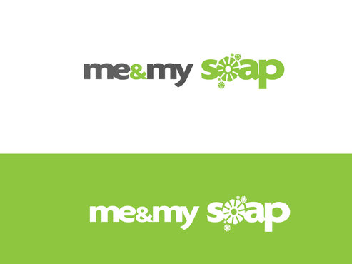
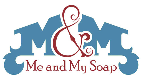
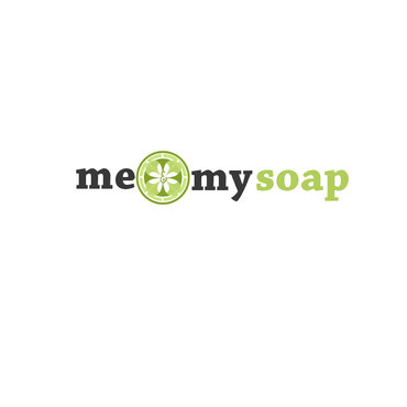
Handmade soap logo
Me & My Soap
|
Contest Holder
Roseann
?
Last Logged in : 4796days1hr ago |
Concepts Submitted
134 |
Guaranteed Prize
299 |
Winner(s) | A Logo, Monogram, or Icon |
|
Live Project
Deciding
Project Finalized


Creative Brief
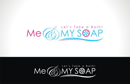
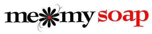
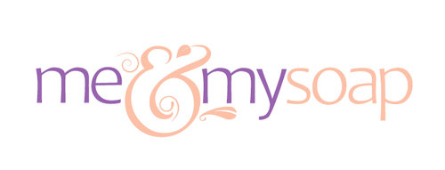
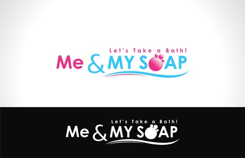
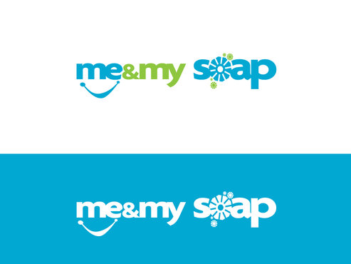
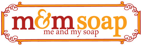
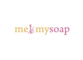
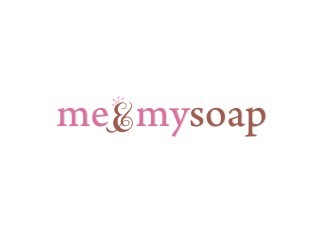
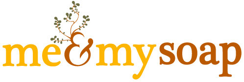
Handmade soap logo
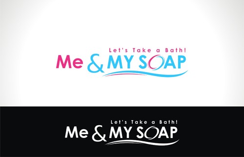
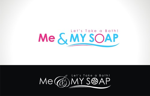
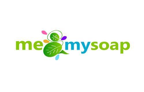
Me & My Soap
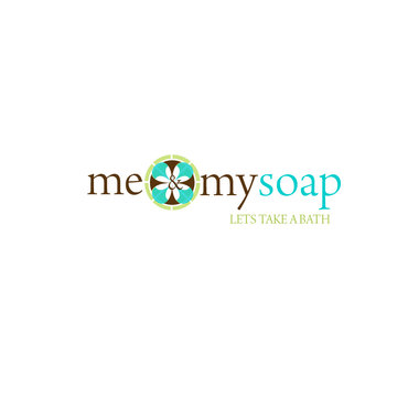
Let's Take a Bath!
Yes
Handmade soap made the old fashioned way. I am a 1 woman business and have been creating handmade soaps for 10 years now. I have a cookie cutter os commerce template for now on my site but am in the works for a full site redesign which this logo will play a huge part of. I have dedicated alot of my time and money into this business and I need a logo that really just says it all for me. the website is www.meandmysoap.com
both
![]()
Unique/Creative
Clean/Simple
Sophisticated
Outdoors/Natural
Serious
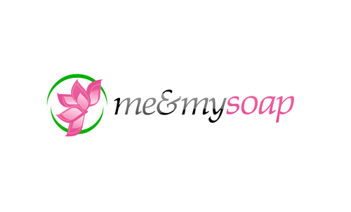
The website when redesigned will have a base background the color of brown kraft paper. I wrap my soaps in white or brown butcher paper at the moment. They look like little parcels when completely dressed. The inside color of the website will most likely end up white so this logo needs to perform well on white....my labels are also white. 2 or 3 colors would be ok...I am not partial to one over the other.
3
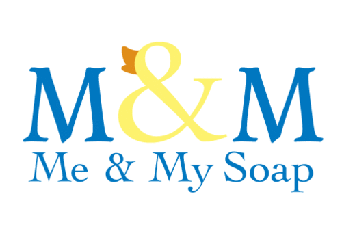
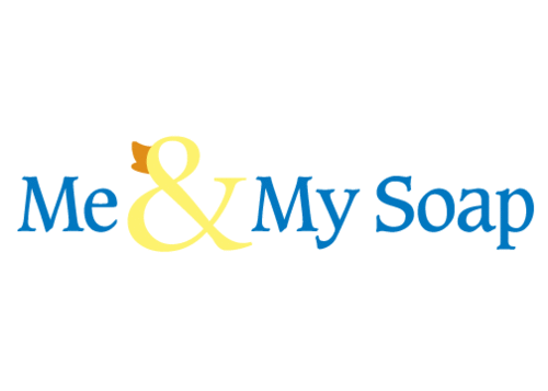
a simple text based logo could perhaps put a play on the ampersand like me&my soap with a fancy ampersand or something. It does not have to read me and my soap it can be me & my soap. Maybe some in caps and some in lowercase. I dunno, I am flexible
Comments
Project Holder
Project Holder
Project Holder
Project Holder
Project Holder
Project Holder
Project Holder
Project Holder
Project Holder
Project Holder
Project Holder
Project Holder
Project Holder