Hair Accessories and Wigs Logo Design
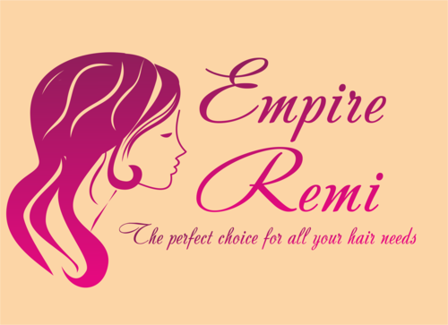
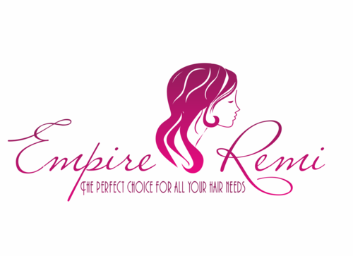
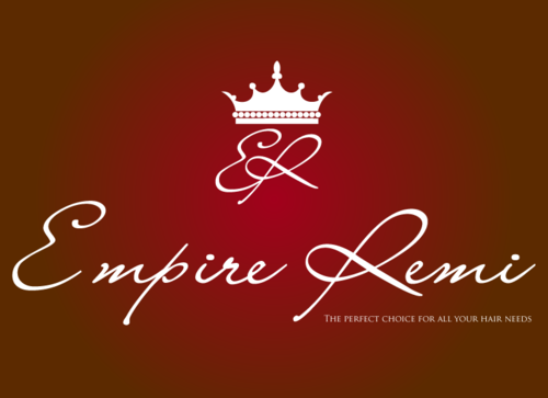
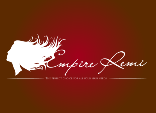
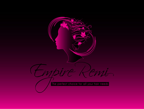
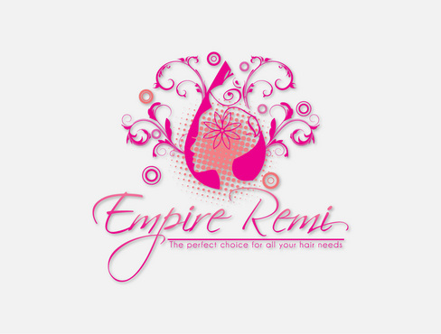
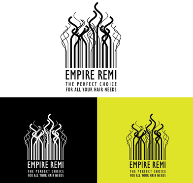
Empire Remi
|
Contest Holder
HairandBeauty
?
Last Logged in : 3808days1hr ago |
Concepts Submitted
45 |
Prize Money
300
|
Winner(s) | A Logo, Monogram, or Icon |
|
Live Project
Deciding
Project Finalized


Creative Brief
Hair Accessories and Wigs Logo Design
Empire Remi
The perfect choice for all your hair needs
No
Product description: Wigs and other hair pieces (extensions and weaves). Human hair wigs, from all over the world. Sold to all types of women, corporate, entertainment industry, fashion, doctors, any woman that accessorizes her hair but wants it to look natural. Company/Brand: Empire Remi - global brand, focuses on all hair types and all ethnicities (mostly african american and caucasion)
Personal Care
Logo Type
![]()
Symbolic
![]()
Abstract Mark
![]()
Sophisticated
Modern
Feminine
Purple, pink, burgandy
not sure
http://www.hairpackaging.com/logo-design-portfolio.html (Estelle or Indira designs)
https://www.indiquehair.com/indique/home.do
http://www.sassytress.com/
http://ep.yimg.com/ca/I/ebonyline51_2130_5624941
Related Contests

Comments
Project Holder
Project Holder
Project Holder