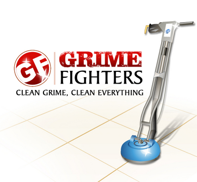
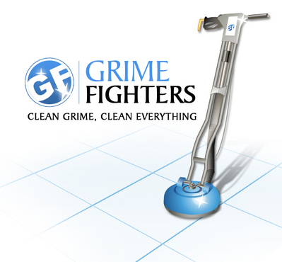
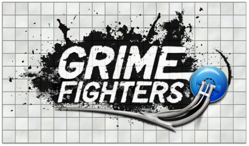
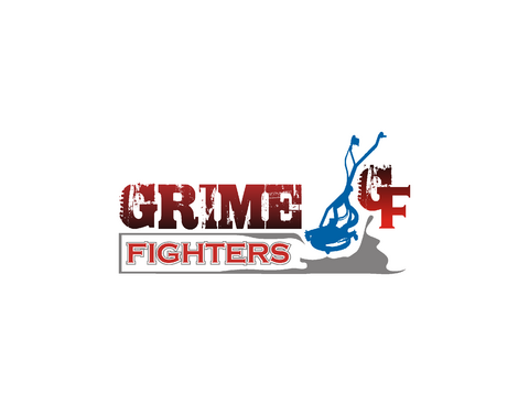
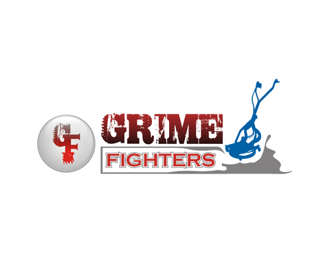
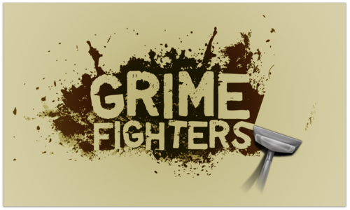
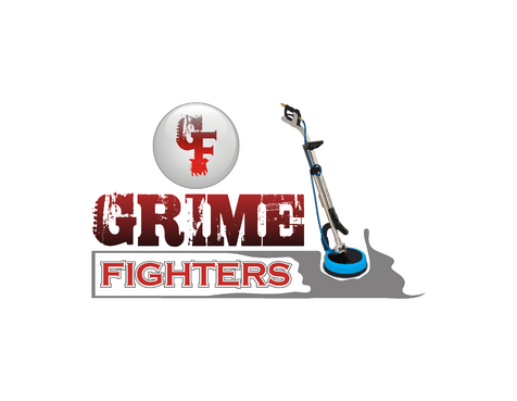
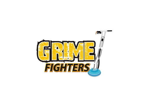
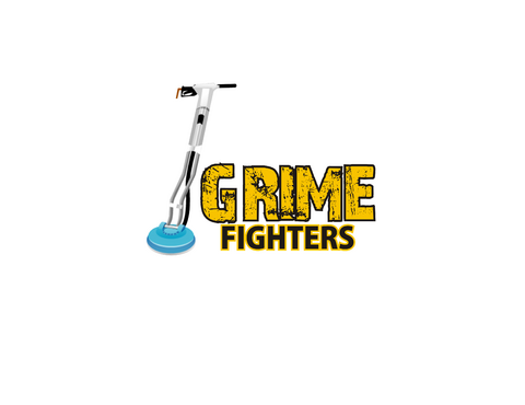
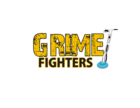
grime fighters logo
GRIME FIGHTERS
|
Contest Holder
leighcrichton
?
Last Logged in : 5094days11hrs ago |
Concepts Submitted
704 |
Guaranteed Prize
1000 |
Winner(s) | A Logo, Monogram, or Icon |
|
Live Project
Deciding
Project Finalized


Creative Brief
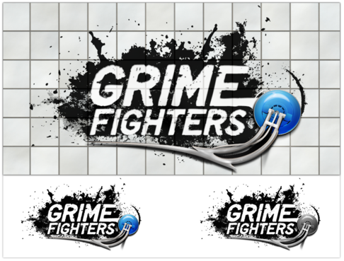
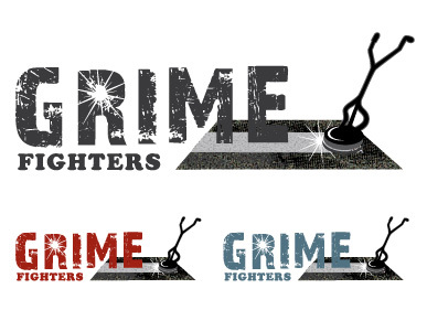
grime fighters logo
GRIME FIGHTERS
No
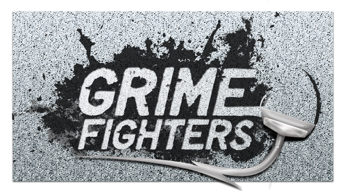
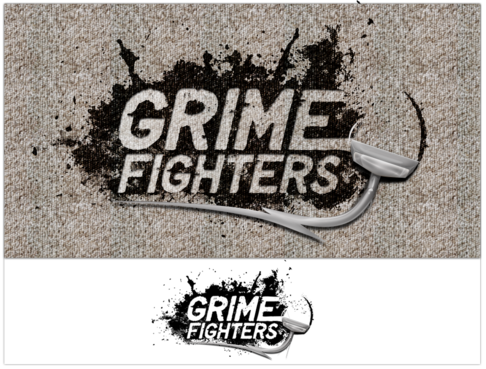
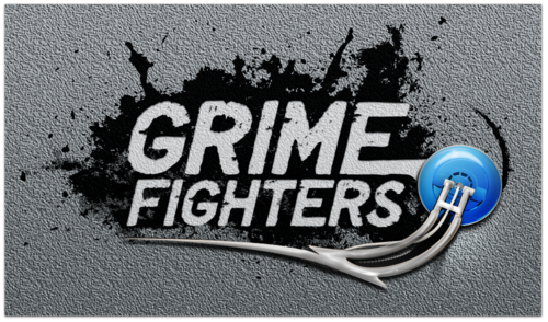
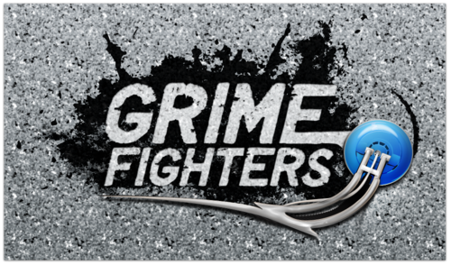
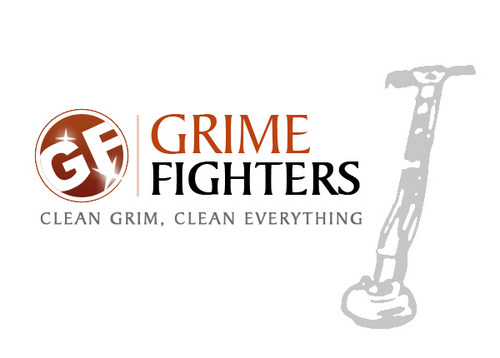
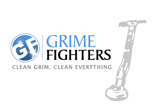
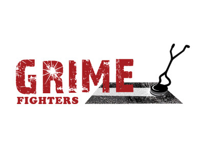
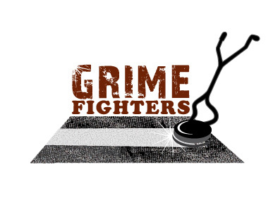
We are a carpet / tile cleaning buisness that doe's steam cleaning, dry cleaning, upholstery and leather cleaning, pressure cleaning, 24 hour flood restoration, duct cleaning, stain and odour removal and general cleaning. Residential, commercial, industrial, medical clinics and nursing homes and insurance work. No job too big or too small.
Cleaning
Industry Oriented
brown, black, white or a creamy or lite tan color. Earthy natural colors.
not sure
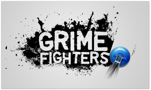
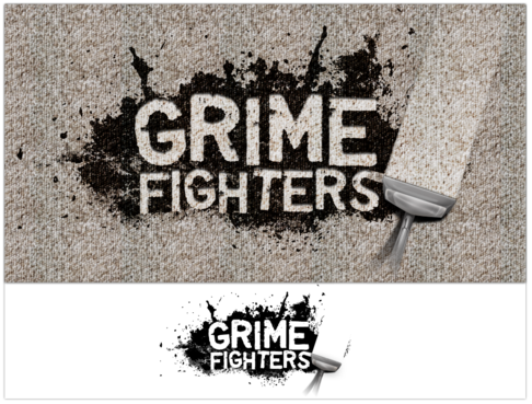
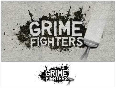
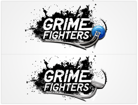
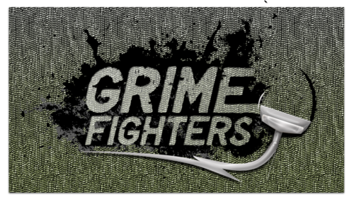
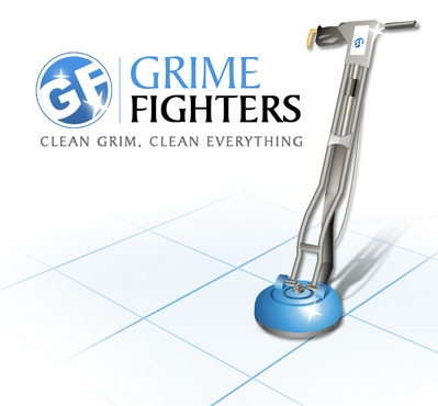
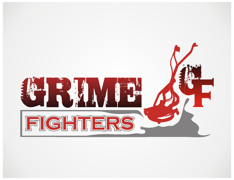
I like how the word CHARGE is written in the charge agency logo in the LogoDesignGuru gallery. I would like to see a design with the name GRIME FIGHTERS written similar to the way the word charge is written or with a simmiler grubby style with maybee a magnifying glass showing some dirty tiles or carpet, or a carpet cleaning wand in the background or comming out from behind the name. Or for the creative designer my first preference would be to see it done as a grubby or disscolored carpet or tile floor with the name written with a cleaning wand and looking as real as possible.
Related Contests


Comments
Project Holder
Project Holder
Project Holder
Project Holder
Project Holder
Project Holder
Project Holder