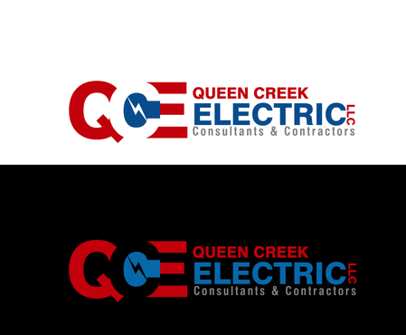
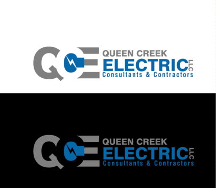
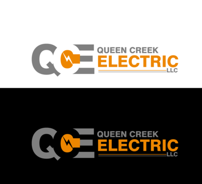
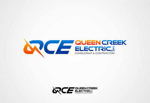
Electrical Contractor Logo
Queen Creek Electric, LLC
|
Contest Holder
wiredwest1963
?
Last Logged in : 5160days23hrs ago |
Concepts Submitted
201 |
Guaranteed Prize
375 |
Winner(s) | A Logo, Monogram, or Icon |
|
Live Project
Deciding
Project Finalized

Creative Brief
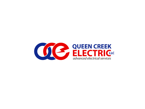
Electrical Contractor Logo
Queen Creek Electric, LLC
Advanced Electrical Services
Yes
Electrical contractor. We install power & communication wiring, lighting, to critical facilities.
Construction
Symbolic
![]()
Initials
![]()
Cutting-Edge
Corporate
Modern
Industry Oriented
High Tech
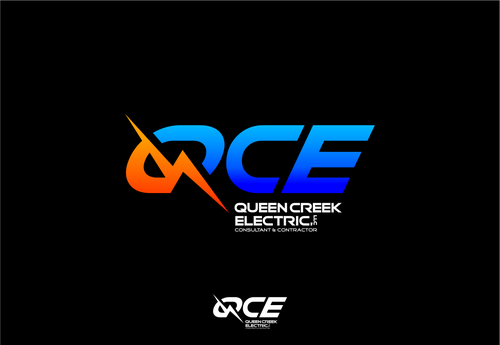
Blue/Green/Orange/ Grey as secondary color is ok This Logo will be placed on trucks and cards with a BLACK background.
2
Related Contests


Comments
Project Holder
Project Holder
Project Holder
Project Holder
Project Holder
Project Holder
Project Holder
Project Holder
Project Holder
Project Holder
Project Holder
Project Holder