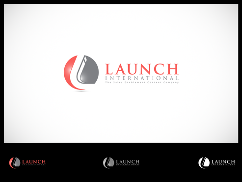
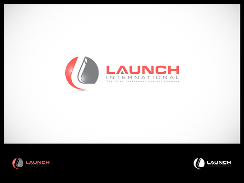
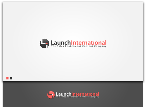
Contemporary logo for strategic marketing services
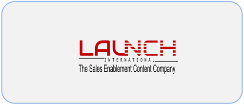
Launch International
|
Contest Holder
JodyCanavan
?
Last Logged in : 4131days10hrs ago |
Concepts Submitted
233 |
Guaranteed Prize
300
|
Winner(s) | A Logo, Monogram, or Icon |
|
Live Project
Deciding
Project Finalized


Creative Brief
Contemporary logo for strategic marketing services
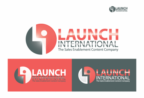
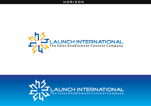
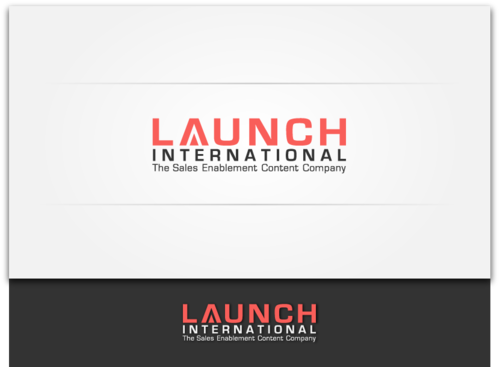
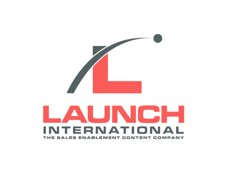
Launch International
The Sales Enablement Content Company
Yes
URL = launchinternational.com, but we are updating the look.
We do strategy, messaging, content and content packaging/design/layout for (primarily) technology companies. The logo needs to be "corporate conservative with an edge" - be contemporary but not crazy contemporary like a real design firm.
Things about us it should convey:
strategy, very smart, very creative-we offer unique solutions and very fresh ideas to shake loose traditional forms of marketing.
We move quickly, are nimble, high energy, fresh. We work at high levels of major corporations. While we are a small boutique, they hire us because we are experts in our niche (sales enablement and thought leadership). We keep pace with the changing industry - always ahead. Leading the way of best practices in our space.
There is a technology spin to our work.
Users of our work interact with it on desktops, on ipads and on iphones.
Needs to show energy.
Needs to use contemporary colors.
We are a 20 year old company - have always used pms178 and cool gray 10.
I'm open to change.
We make content and sales tools. People interact with our deliverables on the fly - sales people are executives
Information Technology
Abstract Mark
![]()
Initials
![]()
Web 2.0
![]()
Modern
Cutting-edge
Sophisticated
Professional
High Tech
WE have always been pms178 and cool gray 10 but i am open to new choices
2
Related Contests


Comments
Project Holder
Project Holder
Project Holder
Project Holder
Project Holder
Project Holder
Project Holder
Project Holder
Project Holder
Project Holder
Project Holder
Project Holder