cargt

cargt

Contest Holder jasoncarman ?

Last Logged in : 4757days23hrs ago

Concepts Submitted

62

Prize Money
300
Winner(s)

1

A Logo, Monogram, or Icon veildAll design entries can be viewed by other designers.
tick_gray

Live Project

tick_gray

Deciding

tick_blue

Project Finalized


Project: cargt
Industry: Electronics Logo
Contest Launched: Mar 21, 2012
Selected: 1 winning design from 62 concepts
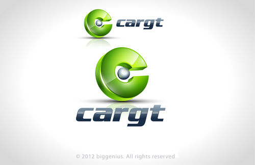
Winning Design by: BigGenius
Close Date: Apr 03, 2012


cargt - Electronics


Awarded as a winner
Project Report    

Sort by:


#42

#25

#31

#62

#61

#59

#57


Creative Brief


cargt

cargt

No

cargt is a high technology electronic design company. We do electrical and software consulting work and we create products in technology, automation, and vision systems.
I want the logo to be elegantly simple - we represent new technology, solutions, and efficiency.
Additional info on company can be found at website: http://www.cargt-llc.com/

Electronics

Logo Type
Logo Type

Symbolic
Symbolic

Abstract Mark
Abstract Mark


Cutting-Edge
Clean/Simple
Sophisticated
Modern
High Tech

Use colors from our website: http://www.cargt-llc.com/

not sure

Open to ideas and excited to see the creativity!

Related Contests


Logo for Wireless Guys - Cell Phone Store
$500
Prize Money
455
Concepts
Modern Logo for **Voltbeat**  -  Electronics Manufacturer
$200
Prize Money
269
Concepts
VIVISHOP.IT Logo for e-commerce store
$350
Prize Money
320
Concepts
Logo for pre-owned electronics
$199
Prize Money
40
Concepts

Discussion


Comments

  • April 03, 2012 4:35 PM
    BigGenius BigGenius
     
    DesignM Don´t copy logos, please delete this or I will report this, http://graphicriver.net/item/communication-logo-2414/762256?WT.ac=item_more_thumb&WT.seg_1=item_more_thumb&WT.z_author=pixellogo http://logos.co/design/royalty-free-3d-vector-logo-of-a-chrome-plated-metal-green-orange-globe-icon-by-beboy-192 http://www.sportslogos.net/logo.php?id=ag07rjqqni4p8b647zl6

    Like Icon 0   DislikeIcon 0
  • March 31, 2012 3:10 AM
    jasoncarman jasoncarman
      Project Holder
    Lovag - can you make an additional # that replaces the pcb trace on the letter 'g' to just an underline or maybe remove it all together? When I mould this text into plastic parts, I worry the detail won't look as nice as you show it in the image.

    Like Icon 0   DislikeIcon 0
  • March 31, 2012 3:05 AM
    jasoncarman jasoncarman
      Project Holder
    Numbers 1, 12, 14 are currently my favorites. 12 and 14 for the logo which would look nice on a website and documentation - although the font on #12 needs to be simplified because I will be moulding this font into plastics (please add another option with simpler, mouldable, font). I do, however, like #1 as well for its simplicity and font. I can mould both the logo and text onto a plastic component without any problems. To all - please make sure colors are coming from the website.

    Like Icon 0   DislikeIcon 0