Campi & Company logo
Campi & Company
|
Contest Holder
ecampi
?
Last Logged in : 3744days13hrs ago |
Concepts Submitted
134 |
Guaranteed Prize
200
|
Winner(s) | A Logo, Monogram, or Icon |
|
Live Project
Deciding
Project Finalized

Creative Brief
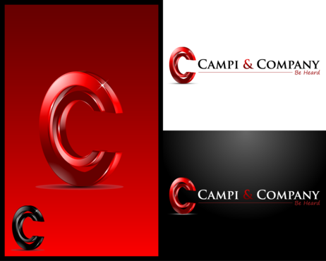
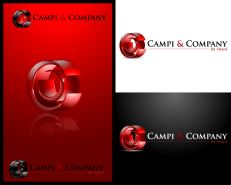
Campi & Company logo
Campi & Company
Be Heard.
Yes
We are a full-service strategic consulting firm that assists Fortune 500 companies with high-stakes communications, public affairs and crisis management.
Campi & Company was founded by Esther Campi, a trusted adviser to America's top leaders -- from CEOs to U.S. senators.
We provide C-suite executives with advice and counsel for any kind of communications where the stakes are high: with regulators, boards of directors, major investors and media; public affairs campaigns such as trying to pass legislation; and crisis management.
Consulting
Logo Type
![]()
Symbolic
![]()
Abstract Mark
![]()
Initials
![]()
Illustrative
![]()
Web 2.0
![]()
Cutting-Edge
Unique/Creative
Clean/Simple
Sophisticated
Corporate
Modern
Industry Oriented
Serious
I'm open, as long as the design is ultra-professional, modern, fresh, crisp and clean.
not sure
We’re open to a design that uses our full name “Campi & Company” – and/or incorporates symbols, abstract elements, illustrations or our company initials. We love the abstract symbols of the Nike "swoosh" and the Yahoo asterisk, and would be open to creative ideas for symbols that represent the communications industry. We are also open to logos that incorporate the "Be Heard" tagline, as well as ones that do not.
Related Contests


Comments
Project Holder
Project Holder
Project Holder
Project Holder
Project Holder
Project Holder
Project Holder
Project Holder
Project Holder
Project Holder
Project Holder
Project Holder
Project Holder
Project Holder
Project Holder
Project Holder
Project Holder
Project Holder
Project Holder
Project Holder
Project Holder
Project Holder
Project Holder