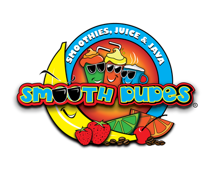
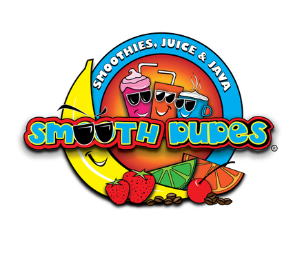
Business logo for smoothie drink shop
Smooth Dude's
|
Contest Holder
supergabe
?
Last Logged in : 5340days15hrs ago |
Concepts Submitted
44 |
Guaranteed Prize
150 |
Winner(s) | A Logo, Monogram, or Icon |
|
Live Project
Deciding
Project Finalized


Creative Brief
Business logo for smoothie drink shop
Smooth Dude's
Smoothies, Juice & Java
Yes
Smooth Dude's is a smoothie shop that sells mostly health oriented smoothies, juices and coffee. "Indulgent" smoothies/milkshakes are also on the menu.
Think of Starbucks meets Smoothie King.
The target audience is fitness oriented people and high school aged teenagers (the shop is very close to a high school).
Smooth Dude's provides a "hangout" atmosphere similar to coffee shops.
Beverages
Logo Type
![]()
Symbolic
![]()
Abstract Mark
![]()
Unique/Creative
Sophisticated
Modern
Fun
Illustrative
Playful/Cartoonish
Youthful
Abstract
Baby blue, bright red...splash of bright yellow Think Houston Oilers + a splash of yellow. It is a smoothie shop, colors need to be bright and they need to "pop-out"
3
Related Contests