SALES / SUPPORT : +1-877-525-5646   |  


Business Logo

Fan Base Solutions

Contest Holder fanbasesolutions ?

Last Logged in : 1918days11hrs ago

Concepts Submitted

79

Guaranteed Prize
200
Winner(s)

1

A Logo, Monogram, or Icon veildAll design entries can be viewed by other designers.
tick_gray

Live Project

tick_gray

Deciding

tick_blue

Project Finalized


Project: Business Logo
Industry: Advertising Logo
Contest Launched: Apr 14, 2011
Selected: 1 winning design from 79 concepts
Winning Design by: alocelja
Close Date: Apr 21, 2011


Business Logo - Advertising


Awarded as a winner
Project Report    

Sort by:


#56

#45

#60

#59

#58

#54

#46

#50

#49

#48

#43

#53

#51

#79

#78


Creative Brief


Business Logo

Fan Base Solutions

No

Fan Base Solutions is an online marketing firm specializing in Facebook/social media advertising geared to small to medium sized companies.

Advertising

Logo Type
Logo Type

Abstract Mark
Abstract Mark

Initials
Initials

Illustrative
Illustrative

Web 2.0
Web 2.0


Cutting-Edge
Unique/Creative
Clean/Simple
Sophisticated
Corporate
Modern
Industry Oriented
High Tech
Fun
Illustrative
Youthful
Abstract
Geometric

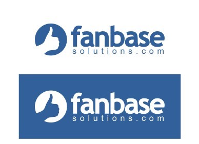
I like the Blue theme because of the correlation with Facebook. But we are open to other creative concepts.

3

Incorporating the "Thumbs Up" that's associated with a "Like" on Facebook may be kinda cool... also, I like a template site from templatemonster.com #32771 that the logo would be integrated into.

Related Contests


Logo design for "Seventh Touch"
$200
Prize Money
78
Concepts
Logo Design for an advertising agency
$350
Prize Money
123
Concepts
A logo redesign for my horse farm
$250
Prize Money
62
Concepts
Strong Coffee Marketing Logo
$300
Prize Money
125
Concepts

Discussion


Comments

  • April 20, 2011 12:17 PM
    fanbasesolutions fanbasesolutions
      Project Holder
    Great work everyone! We originally asked for a 3 color logo... can we some more options with more "graphics" that are multi color... maybe adding confetti popping out of the logo as part of the graphic, a group of fans (some cartoonist use multi colored circles to signify the heads of a crowd) some "swirlies" or flashy sharp additions to some of the work already in place? Thanks! FBSolutions

    Like Icon 0   DislikeIcon 0
  • April 19, 2011 11:41 PM
    fanbasesolutions fanbasesolutions
      Project Holder
    Great work! #50 is in the lead. If we can get the thumb straightened out to look a little more like #46 we may have an early winner! We like the circle around "fan" its unique and facebook has a trademark pending on "fb" inside a square. We LOVE LOVE LOVE the thumb from #46. Lets see some options that have the thumb from #46 matched with the layout of #50! Great work all, thanks again! -FBSolutions

    Like Icon 0   DislikeIcon 0
  • April 19, 2011 9:34 PM
    fanbasesolutions fanbasesolutions
      Project Holder
    Love the new addition. #48 with the B & Hand from #45 would be pretty close to a prize winner.

    Like Icon 0   DislikeIcon 0
  • April 19, 2011 10:49 AM
    fanbasesolutions fanbasesolutions
      Project Holder
    #45 is the type of design that we're looking for but was hard to explain. Its closely related to facebook but uniquely ours. I would like to see something more in that direction. Welcome and Good Job looppee!

    Like Icon 0   DislikeIcon 0
  • April 18, 2011 8:17 PM
    fanbasesolutions fanbasesolutions
      Project Holder
    Hey guys. Truly amazing styles! It would be easy to form a website or any other branding off what we have here. One thing though... I would like to see something with the FB that was a little more propitiatory. We ABSOLUTELY DO NOT want to be misunderstood as Facebook. Can someone turn the "B" from FB into a thumb or something like that to make it unique?? Thanks!!

    Like Icon 0   DislikeIcon 0
  • April 18, 2011 1:03 PM
    fanbasesolutions fanbasesolutions
      Project Holder
    Would like to see revisions of 33, 37, and 30. In number 33 the thumb to the center of the b similar to 37. Take the FB from 30 and match with similar lettering as in 37. In all including 37 try dropping the cuff for a cleaner look. Thanks to all! -FBSolutions

    Like Icon 0   DislikeIcon 0
  • April 18, 2011 2:25 AM
    fanbasesolutions fanbasesolutions
      Project Holder
    Hey Designers!! You’re all doing a great job at showing off your abilities!! Love some of the new ideas!! I’d like to see the graphic from #37 merged with the fanbasesolutions.com lettering from #20. Also, I was hoping to get an idea of a more graphics based logo on the left hand side… like maybe featuring a custom “Thumbs Up” with the text inside?? We absolutely want the correlation to Facebook with a new cutting edge design, but I don’t want that to stifle creativity either. I just want to explore all the creative options. So far they all seem fairly similar. Awesome, but similar:) Thanks Again! -FBSolutions

    Like Icon 0   DislikeIcon 0
  • April 17, 2011 1:51 PM
    fanbasesolutions fanbasesolutions
      Project Holder
    Thanks for the option with "s" As a whole #16 seems to be in the lead. What we like: Familiarity to facebook has been accomplished with the lettering on right hand side of logo. We are happy with the right hand side including the line that separates the lettering from the simple logo - little to no changes should be made here, great job. Next step: Our simple logo ("fb" w thumb, or just "fb") must be a completely unique and custom logo. We liked the fact that the "fb" in drafts 1-4 were completely unique. Suggestions: We would very much like to see more options with a unique and creative simple logo next to with the current right-hand side of #16, #17. We are open to seeing what kinds of creativity and professionalism can be done on this side of the logo. (This could be "fb", "fbs", with thumb, no thumb, creative graphics added to FB, thumb in place of the "b" VERY open to options here) If we can incorporate the thumb in a unique and creative fashion, (without copyright infringement), let's go with it. Maybe try a custom thumb as the "b" in "fb". We are really looking for a wow-factor in this section of the logo... *Creative* and professional. Thanks, -FBSolutions

    Like Icon 0   DislikeIcon 0
  • April 16, 2011 6:07 PM
    fanbasesolutions fanbasesolutions
      Project Holder
    I like #16. I'd like to see the FB symbol with the thumbs up in the center of it from design#2 to the left of the line on design #16. Also, maybe we could set ourselves apart from copyright infringement by using "FBS" instead of just FB. Great job! Thanks! ~FBSolutions

    Like Icon 0   DislikeIcon 0
  • April 16, 2011 4:55 PM
    fanbasesolutions fanbasesolutions
      Project Holder
    we are very much impressed with the direction you are going, creativemind! If we can nail down a unique and individualized custom logo next to the lettering we are in business! -fbs team

    Like Icon 0   DislikeIcon 0
  • April 16, 2011 4:07 PM
    fanbasesolutions fanbasesolutions
      Project Holder
    Possibly take to cuff off the thumbs up

    Like Icon 0   DislikeIcon 0
  • April 16, 2011 3:48 PM
    fanbasesolutions fanbasesolutions
      Project Holder
    Great work so far, we will submit the logo to facebook, if its too much like facebook they will reject it. You are very much on the right track, lets see something a little more unique, maybe the thumb and fb together, try dropping the box surrounding the fb.

    Like Icon 0   DislikeIcon 0
  • April 16, 2011 3:44 PM
    fanbasesolutions fanbasesolutions
      Project Holder
    #7 - looks awesome. This is closer to what we had in mind... As far as the connection between us and Facebook, we like the changes you have made, the resemblance is great... can we take what you have now and customize it a little further to create a logo with a sharp resemblance to facebook, but also unique? Can we put the "fb" and thumb together to create one logo?

    Like Icon 0   DislikeIcon 0
  • April 16, 2011 3:31 PM
    fanbasesolutions fanbasesolutions
      Project Holder
    we like the thumb as a part of the fb instead of separate from it. can you recenter and resize the fb and thumb to form a logo?

    Like Icon 0   DislikeIcon 0
  • April 16, 2011 3:26 PM
    fanbasesolutions fanbasesolutions
      Project Holder
    wow, mind reader great work.. get back to you in a sec

    Like Icon 0   DislikeIcon 0
  • April 16, 2011 3:25 PM
    fanbasesolutions fanbasesolutions
      Project Holder
    Nice! Much closer! Great adjustments creativemind! Some notes: 1. New Font is right on the money 2. New thumb is a PERFECT start 3. We like the thumb next to "fb" as apposed to in front 4. Can you show us other font options for "fb"? 5. Can you show us options with fanbasesolutions.com included 6. Can you show us #5 with "fb" capitalized and lower case? #5 with new font on "fb". Great changes, looking forward to next round! -fbsolutions

    Like Icon 0   DislikeIcon 0
  • April 16, 2011 2:19 PM
    fanbasesolutions fanbasesolutions
      Project Holder
    Conceptually, this is exactly what we asked for. I think the parameters are a great start to build on. We need something a lot more professional looking... I would like to see something that brings a connection between us and facebook, i.e. the font, style, color scheme, and the thumb should be very similar to the "like" on facebook. When clients see our logo, we would like them to recognize a certified facebook ad partner.

    Like Icon 0   DislikeIcon 0
  • April 14, 2011 1:40 AM
    fanbasesolutions fanbasesolutions
      Project Holder
    I would like to see something with a FB w/ a thumbs up image next to it...just a thought.

    Like Icon 0   DislikeIcon 0