SALES / SUPPORT : +1-877-525-5646   |   Login


Business Cards & Letterhead for Sleep Therapist

40 More Winks

Contest Holder rmwright ?

Last Logged in : 3940days23hrs ago

Concepts Submitted

499

Prize Money
99
Winner(s)

1

Business Cards and Stationery veildAll design entries are veiled from other designers till the end of the contest.
tick_gray

Live Project

tick_gray

Deciding

tick_blue

Project Finalized


Project: Business Cards & Letterhead for S ...
Industry: Health Logo
Contest Launched: Dec 29, 2013
Selected: 1 winning design from 499 concepts
Winning Design by: Xpert
Close Date: Jan 07, 2014


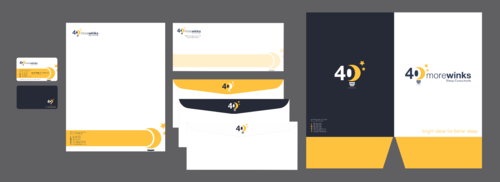
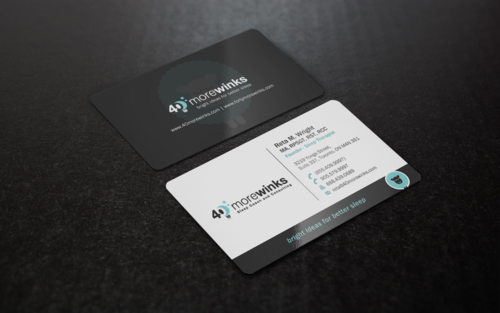
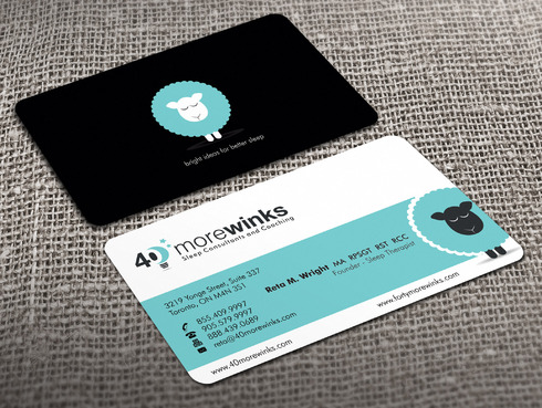
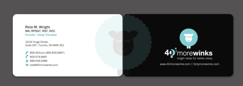
Business Cards & Letterhead for Sleep Therapist - Health


Awarded as a winner
Project Report    

Sort by:


#470

#469

#421

#448


Creative Brief


Business Cards & Letterhead for Sleep Therapist

40 More Winks

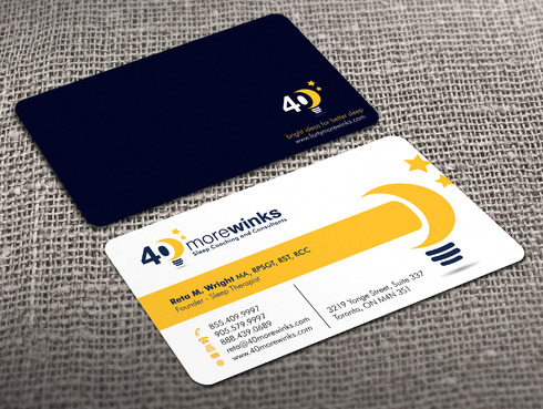
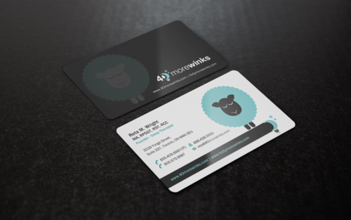
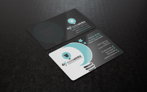
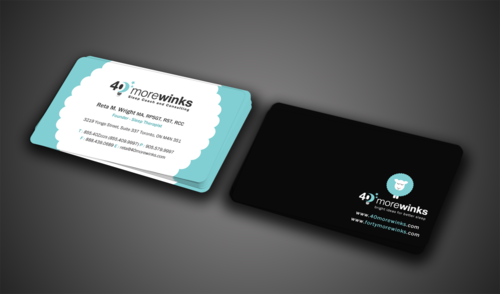
I need double sided standard sized Business Card [3.5" x 2"]

Use same font as used in my logo

Modern

Professional

Reta M. Wright, MA, RPSGT, RST, RCC

Founder - Sleep Therapist

3219 Yonge Street, Suite 337 Toronto, ON M4N 3S1

855.40Zzzzs (855.409.9997)

905.579.9997

888.439.0689

reta@40morewinks.com

www.40morewinks.com www.fortymorewinks.com

Front of card should be logo with the tagline "Sleep Consultants and Coaching" on mainly white background, and contact information as provided. I have a few versions of my logo -- I'd like to see both mocked up.

Dark background (black, navy or midnight blue) logo with the tagline "bright ideas for better sleep" & web addresses

Health

Related Contests


Discussion


Comments

  • January 07, 2014 8:36 PM
    rmwright rmwright
      Project Holder
    Sincerely, thank you to all the designers who submitted to my project ... I am so pleased with the quality of work.

    Like Icon 0   DislikeIcon 0
  • January 01, 2014 2:48 PM
    rmwright rmwright
      Project Holder
    Hello Designers, I'd appreciate not seeing full stationary design submissions until a business card layout you have submitted has been narrowed to a finalist. There are so many great and unique designs to review ... your time and mine is valuable. So, I will request to see the stationary package options from you when I have selected a business card design of yours that is remaining as one of my finalists. thank you!

    Like Icon 0   DislikeIcon 0
  • December 30, 2013 11:38 PM
    rmwright rmwright
      Project Holder
    Great start! Wow. Thank you for the submissions so far ... general feedback for now, with private feedback to follow soon: 1) please don't merge the two logo concepts (with rare exception - if you have stars on a design now that did this, you've done a unique job that somehow is working for me) The light blue sheep with white and black is one complete look. The yellow moon-bulb with white and midnight blue/navy or black is another complete look. I hope to see/have these two versions of the winning design layout. 2) the light blue as a full colour background for the back of the card doesn't work. I prefer black background with the sheep design on the back of the card. 3) do not use the Zzzzs for the toll free phone number just the numbers 855.409.9997 and please be sure to denote this as 'toll free' or TF. 4) please make sure both web addresses appear on the card ... if one is used on the front, the other must appear on the back. Or both can appear on the back only ... but both must appear. 5) both logo designs need the tagline "Sleep Coach and Consulting" (no quotation marks though) on the front of the card ... and "bright ideas for better sleep" (all lower case, no quotation marks) on the back of the card. Cheers! I'll do a fresh round of star ratings shortly

    Like Icon 0   DislikeIcon 0
  • December 29, 2013 2:53 PM
    rmwright rmwright
      Project Holder
    I'm open to creative interpretation of my directions ... ie. Logo on the back can be just an element of same (moon-bulb, sheep), larger watermark, etc.? The tagline does not have to reside just under the logo ... Although the front of the cards should be light background & back dark background I don't mind some of the creative touches that tie the sides together more artistically. You're the pros, so I look forward to seeing what is submitted!

    Like Icon 0   DislikeIcon 0