Creative Brief
[Restricted Project] For MAYAS only
Lowry’s Scorch Preventer now SCORCH SHIELD
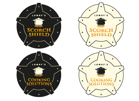
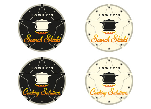
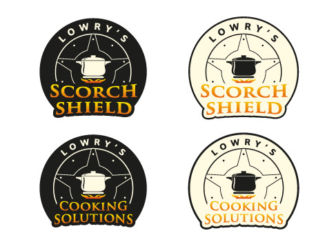
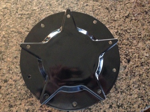
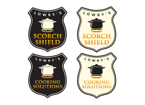
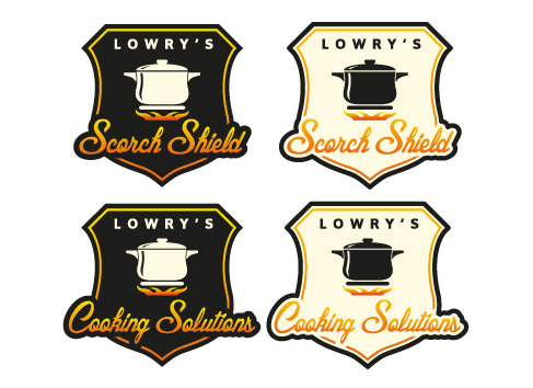
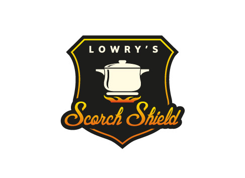
we are looking to redesign the Lowry’s Scorch Preventer now SCORCH SHIELD. I am attaching an image of an idea that depicts a SHIELD or background. We are attempting to convey a sense of quality, taste and richness. Use of the same Pot, flat shield under the pot with the flame, however now encompassed with in a background Color scheme is black, burnt orange, yellow , gold. There will be TWO (2) logos. One is the master. Lowry’s Cooking Solutions. The other is a sub logo, Lowry’s Scorch Shield. Lowry’s should be smaller with the Scorch Shield as the standout name. Scorch Shield in perhaps a script type font, in burnt orange or the like.
Food

![[Restricted Project] For MAYAS only - Food](http://dypdvfcjkqkg2.cloudfront.net/large/4605885-973.jpg)
