SALES / SUPPORT : +1-877-525-5646   |   Login


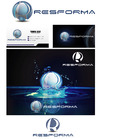
Logo for IT consulting Group

Copperband Technologies

Contest Holder bpetersen ?

Last Logged in : 416days23hrs ago

Concepts Submitted

134

Guaranteed Prize
250
Winner(s)

2

A Logo, Monogram, or Icon veildAll design entries are veiled from other designers till the end of the contest.
tick_gray

Live Project

tick_gray

Deciding

tick_blue

Project Finalized


Project: Logo for IT consulting Group
Contest Launched: Mar 09, 2016
Selected: 2 winning design from 134 concepts
Winning Design by: doraemon
Close Date: Mar 11, 2016


Logo for IT consulting Group  - Information Technology


Awarded as a winner
Project Report    

Sort by:


#118

#117

#116

#113

#83

#82

#132

#131

#130

#129

#125

#123

#122

#112

#111

#110

#109


Creative Brief


Logo for IT consulting Group

Copperband Technologies

"You need technology and options"

No

Established Technology Consultation and support. We target our services at the Small and Medium business crowd.

80% of our business comes from word of mouth and generally is verbalized without the word "technologies". The logo however needs to included the word technologies but emphasis on the name.

We have discussed a design where the color copper and representation of a band could meshed with something technical however we don't want it to look dated or western in its design. Those were just ideas we had ,and we are certainly not bond to those ideas by any means.

Information Technology

Logo Type
Logo Type

Symbolic
Symbolic


Modern
Cutting-edge
Professional
High Tech

Possibly a Copper color but by no means necessary

not sure

Check out the description:

No Rustic. It needs to be new and modern feeling.

Related Contests


small business logo/monogram
$501
Prize Money
1393
Concepts
SteadyStart
$210
Prize Money
67
Concepts
Modern Logo for an IT Consultancy Company
$250
Prize Money
226
Concepts
IT Company Logo
$200
Prize Money
173
Concepts

Discussion


Comments

  • March 11, 2016 11:12 AM
    SiteAdmin SiteAdmin
     
    Project Holder has added additional winner(s).

    Like Icon 0   DislikeIcon 0
  • March 10, 2016 10:20 PM
    bpetersen bpetersen
      Project Holder
    A design that I somewhat liked and was going to suggest changes to has been withdrawn. Designers please do not think that I am being critical to the point of disliking. I'm just trying to find one that I really like that does what I need it to. I'm certainly looking at all of these designs, and there are a bunch of great designs. All of you are doing fantastic work. While I want the design to be able to be made into a 1-3 color flat design I am tending to lean towards designs that show depth and color through 3D and Shading. Please disregard my previous comment about no gradient just keep in mind that the design will need to be embroidered at some point in time.

    Like Icon 1   DislikeIcon 0
  • March 09, 2016 11:55 PM
    bpetersen bpetersen
      Project Holder
    Try these colors for the designs with simple colors and no gradients #CC5500 #D2691E I lthink the copper color looks better more on the orange\red side of the color scale. I'm still not 100% using the copper color but if you use in your design keep it more orange reddish. Keep up the fantastic work.

    Like Icon 0   DislikeIcon 0