SALES / SUPPORT : +1-877-525-5646   |   Login


Logo Design for Slushy Frozen Beverage

Glacier Blast

Contest Holder klemanski ?

Last Logged in : 2638days10hrs ago

Concepts Submitted

39

Guaranteed Prize
199
Winner(s)

1

A Logo, Monogram, or Icon veildAll design entries can be viewed by other designers.
tick_gray

Live Project

tick_gray

Deciding

tick_blue

Project Finalized


Project: Logo Design for Slushy Frozen Bev ...
Industry: Logo
Contest Launched: Mar 05, 2010
Selected: 1 winning design from 39 concepts
Winning Design by: Scatterbrained
Close Date: Mar 12, 2010


Logo Design for Slushy Frozen Beverage -


Awarded as a winner
Project Report    

Sort by:


#35

#34

#32


Creative Brief


Logo Design for Slushy Frozen Beverage

Glacier Blast

Yes

The logo is for a line of slushy non alcholic frozen beverages targeted at youth and young adults in the c store channel. Lineup consists mainly of tutty fruity flavors like blue raspberry and cherry. However there will be a lineup of iced cappuccino flavors.

symbol
symbol


Cutting-Edge
Unique/Creative
Clean/Simple
Modern
Fun
Youthful

It is important to note that the logo will be going on black equipment so colors need to work with that. Prefer cool colors to coordinate with the product elements of cold frozen beverages.

2

Discussion


Comments

  • March 26, 2010 5:49 AM
    SiteAdmin SiteAdmin
     
    Congratulations! Scatterbrained, Contest Holder has selected your design #39 as Winner. Thanks to all the designers for their creativity and hard work. Thanks

    Like Icon 0   DislikeIcon 0
  • March 18, 2010 11:40 AM
    Scatterbrained Scatterbrained
     
    srry about that, i must have accidentally added the .jpg to the file name. if you rename the file to .psd you will be able to open it up in the same program you use for the master file. cheers :)

    Like Icon 0   DislikeIcon 0
  • March 18, 2010 9:11 AM
    klemanski klemanski
      Project Holder
    Scatterbrained: I received your files for download. They are great! I can see all the work you put into draft #39 when I start to pull apart all the layers. It’s amazing! There is one file I cannot open which is odd because it is a simple JPEG. When I try to open the “Penguin Master” file I get a message stating “could not complete your request because an unknown or invalid JPEG marker type is found.” When I attempt to do a preview of the item, it says no preview available. Would you be able to send me the file in a different format?

    Like Icon 0   DislikeIcon 0
  • March 11, 2010 9:17 PM
    Scatterbrained Scatterbrained
     
    Great! Been great working with you, really glad you like the final design and love the suggestions you made, I could use your eye on my other projects! ;)

    Like Icon 0   DislikeIcon 0
  • March 11, 2010 9:10 PM
    klemanski klemanski
      Project Holder
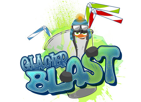
    Draft #39 This is perfect. Thank you very much for all your efforts in developing the image for our brand. It is super!!!

    Like Icon 0   DislikeIcon 0
  • March 11, 2010 7:55 PM
    klemanski klemanski
      Project Holder
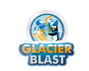
    Draft #38 This is fantastic. Three last things we would like to see if possible: 1. The slushy disappeared from the side of his mouth - can that come back? 2. Can we see #38 without the aqua backdrop you just added. We like it but just not sure. 3. The blue used in Glacier now seems a little off since Blast went to aqua (which we love) Any thoughts on this? We like that it is different and two toned but maybe the top blue of the tone in Glacier needs to be aqua? Thank you for your creativity, time dealing with us and your awesome design!

    Like Icon 0   DislikeIcon 0
  • March 11, 2010 6:25 PM
    klemanski klemanski
      Project Holder
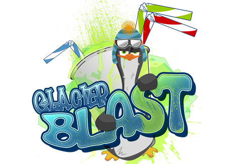
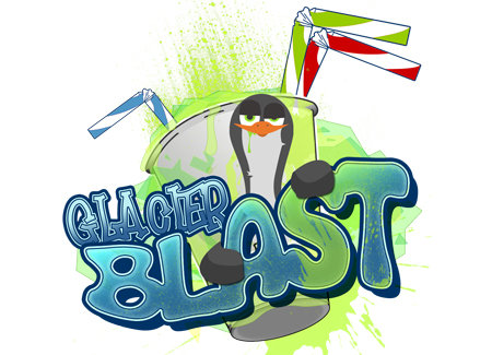
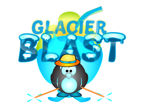
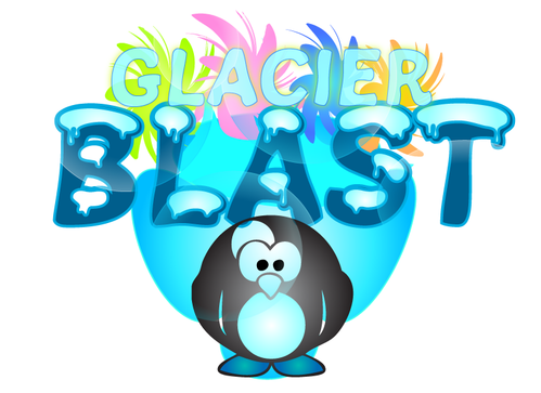
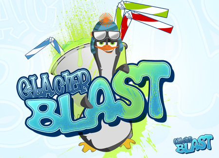
    I just saw these and consulted with my business partner and here is what we think we want. BTW - Awesome job! The penguin is the bomb! You did an outstanding job on this project. Here's the combo we are looking for. Draft #37 with penguin smiling. Include the penguin body as in Draft #36 and use the cup from Draft #13 (sorry remove the ice. We think it takes away from the super cute penguin.). Can you also minimize the hands so less black is showing? Right now they look a little like black rocks/chunks if you look quickly at it. Maybe more pointed, refined hands would take the chunk look away? Lastly, can you brighten the blue color in the letters to be more bright aqua like the cup contents in Draft #14. That's it. Whew! Awesome job. Thank you so much for sticking with us on this and all the hard work you have put into it.

    Like Icon 0   DislikeIcon 0
  • March 11, 2010 4:44 PM
    Scatterbrained Scatterbrained
     
    yeah i can make him happier, i think the eyes are an important part of his look tho, the goggles over them would break up the image. will get back to you shortly.

    Like Icon 0   DislikeIcon 0
  • March 11, 2010 4:26 PM
    klemanski klemanski
      Project Holder
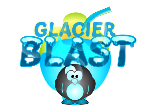
    Draft #36 You are incredible. Love him. Only feedback from our team is that he needs to be a little happier. Is that possible without too much work? Maybe he has his glasses on (we don't think so but would like to know what you think) Also can we see the same version in the half body. I think he is very cool. Thank you so much for getting us to this point!

    Like Icon 0   DislikeIcon 0
  • March 11, 2010 3:08 PM
    klemanski klemanski
      Project Holder
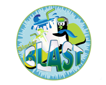
    Draft # 29. Love the penguin! We laughed hard as he is adorable and funny. We wanted to see if you could make him edgier. Possibly cool hat, googles,snowboarder type. You do awesome work. Thank you very much for your creativity.

    Like Icon 0   DislikeIcon 0
  • March 11, 2010 1:07 PM
    klemanski klemanski
      Project Holder
    Draft #28 Changes look great! One other thing that we would like to work on is the glass and the product. We were wondering if the glass could look more like a slushy cup v. a pint beer glass and the product having more depth (look frozen) v. liquid. It is really looking good. You have done a great job of making the penguin edgier. Thank you again for working on this!

    Like Icon 0   DislikeIcon 0
  • March 11, 2010 11:24 AM
    klemanski klemanski
      Project Holder
    The changes are super! Is there a way to make the penguin seem more like a teenage snowboarder? Possibly different hat, snowboard somewhere by him, etc. You are the expert so I am just throwing things out. Also, possibly making the straws a little more fun (over emphasized?) Thanks you for all your hard work!

    Like Icon 0   DislikeIcon 0
  • March 11, 2010 11:05 AM
    LotusDesigns LotusDesigns
     
    Thanks...CH...for the feedback and good to know you like my work...I have submitted one more design with some changes...Looking forward for your feedback.

    Like Icon 0   DislikeIcon 0
  • March 11, 2010 8:00 AM
    klemanski klemanski
      Project Holder
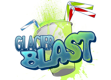
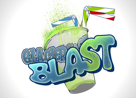
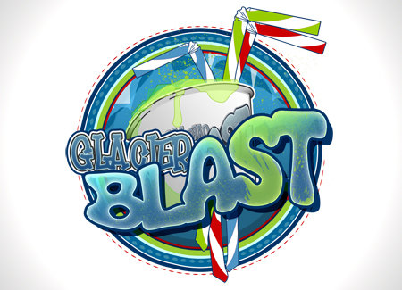
    Draft #13 & #14 by Scatterbrained We continue to love these designs. One comment we continue to get is that thet appear to liquid v. frozen. We love the graffiti aspect of it so we don't want to lose that but wondering if we could make some of the liquid on the sides of the cup with depth like the top so it appears frozen? Not all of it but a combo of what you have and some with depth. Thank you very much for all your work. These are super!!

    Like Icon 0   DislikeIcon 0
  • March 11, 2010 7:56 AM
    klemanski klemanski
      Project Holder
    Draft # 26 Thank you very much for submitting your design. You do awesome work. We are wondering if you could utilize cooler colors like lime green the Glacier part of the logo and smaller glass to give more of a frozen feel. Also possibly make the liquid in parts have depth so it gives the feel of a frozen beverage v. just liquid. Another possibility would be to make Glacier smaller and overempasize the Blast. Thanks again for all your hard work!

    Like Icon 0   DislikeIcon 0
  • March 09, 2010 7:03 PM
    klemanski klemanski
      Project Holder
    scatterbrained: Any chance you could incorporate a penguin on a snowboard coming around the glass and kicking up some of the slushy into the name or some other creative idea. Not sure it would look good but many on our sales team would like to see a mascot of some sort. As I have said many times these logos look awesome just want to try a few more tweaks.

    Like Icon 0   DislikeIcon 0
  • March 09, 2010 10:18 AM
    klemanski klemanski
      Project Holder
    We love all the designs so far and appreciate everyones efforts. Tha cups are extremly fun and project the image of bursting with flavor. One thing that is missing is the opportunity to have some sort of cool mascot like a Penguin to utilize on wearables etc. I was wondering if anyone would take a stab at a cool penguin (or other animal) on a snowboard or with headphones etc. Not set on anything as far as animal or design but thought a Penguin on a snowboard and the snow creating the name or something creative like that. I am thinking something a little less kiddish than the current penguin. Again we love the cups as well but just need a mascot to represent the brand in some way. Any ideas is appreciated. We are extremly pleased with where we are at with this project!

    Like Icon 0   DislikeIcon 0
  • March 08, 2010 5:59 PM
    Scatterbrained Scatterbrained
     
    thanks guys. the 'glacier' text in Draft: #14 is actually the same as that in Draft: #13, unfortunately the restrictions in sizes we are allowed to post don't let you see the detail in the words. A solid variation would look more like that of Draft: #1. Ill put up some examples of this and maybe try and show you a full sized version of an area of text. The problem may well lie in the font itself as you said, i really like the curves in it but definitely harder to read at a distance. ill see what else i can find here too.

    Like Icon 0   DislikeIcon 0
  • March 08, 2010 5:48 PM
    klemanski klemanski
      Project Holder
    Draft #14 - One additional comment- I see my partner has commented on this already, too. "Glacier" is harder to read. I think because the letters touch together and becuase they have a lot of "layered" lines around them, they begin to meld together with our eyes. Any way to separate them a bit? We would be open to a different font if that would help. Please keep "Blast" as is. We do like the letter style used for that.

    Like Icon 0   DislikeIcon 0
  • March 08, 2010 5:45 PM
    klemanski klemanski
      Project Holder
    Draft #14 is awesome. I just saw it. I see my business partner has already responded. Love the new fun colors and also like that you were able to get the red color slush in there without looking scary. That is one of the colors of product that we will have as well as the blue which you've incorporated, too. Nice job. We will discuss further.

    Like Icon 0   DislikeIcon 0
  • March 08, 2010 5:07 PM
    klemanski klemanski
      Project Holder
    Thanks for the additional option. I was wondering if we could see draft #13 with the word Glacier in a solid blue. It still seems hard to read. Thanks again d=for all your work on this project.

    Like Icon 0   DislikeIcon 0
  • March 08, 2010 11:45 AM
    Scatterbrained Scatterbrained
     
    ah i see. you mean just a single stroke of solid dark blue outlining the text, opposed to 3/4 different shades expanding outward?

    Like Icon 0   DislikeIcon 0
  • March 08, 2010 11:31 AM
    klemanski klemanski
      Project Holder
    I like the changes but wondering if it could just be the solid deeper blue in the outline. We don't want it to pop of the logo as I said before but wondering what that would look like. Thanks again for all your great work.

    Like Icon 0   DislikeIcon 0
  • March 08, 2010 8:17 AM
    klemanski klemanski
      Project Holder
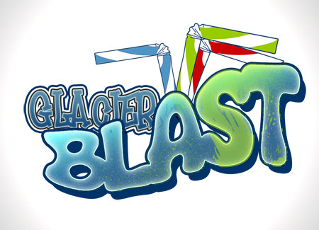
    Draft # 9 is awesome. We were wondering if you could somehow make Glacier more clear. It definetly gets lost. Not that we want to emphasis it as we love how you made Blast the main focus Possibly put Glacier in the deeper blue that is outlining Blast or some other idea you may have. We appreciate all the effort you have put into this!!!!

    Like Icon 0   DislikeIcon 0
  • March 07, 2010 9:42 PM
    klemanski klemanski
      Project Holder
    Draft #9 looks just a little more splashy than #8. I think I actually like the lesser in 8 (see the difference right behind the "s" in blast).

    Like Icon 0   DislikeIcon 0