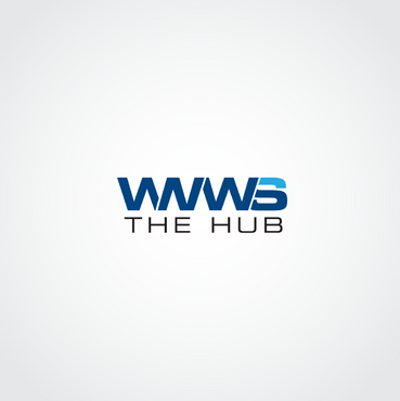
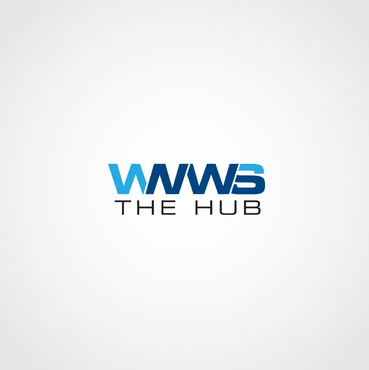
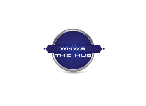
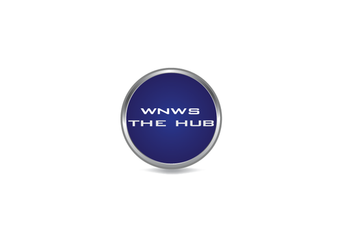
WNWS the hub
WNWS the hub
|
Contest Holder
wnwsnewstalk
?
Last Logged in : 5111days7hrs ago |
Concepts Submitted
28 |
Guaranteed Prize
250 |
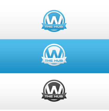
Winner(s) | A Logo, Monogram, or Icon |
|
Live Project
Deciding
Project Finalized

Creative Brief
WNWS the hub
WNWS the hub
No
This logo is for a community, news and classifieds company.
News and Media
Symbolic
![]()
Abstract Mark
![]()
Initials
![]()
Cutting-Edge
Clean/Simple
Corporate
Modern
Blue, dark blue, white, black
not sure
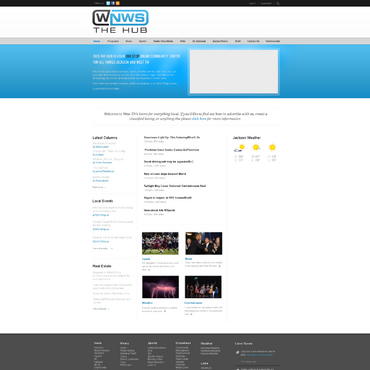
We have a website we have created. We've attached the design so you can try and create a logo that matches the site itself.
Related Contests