SALES / SUPPORT : +1-877-525-5646   |   Login


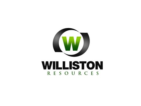
Williston Resources

Williston Resources

Contest Holder joshuawert ?

Last Logged in : 4767days4hrs ago

Concepts Submitted

242

Guaranteed Prize
401
Winner(s)

1

A Logo, Monogram, or Icon veildAll design entries can be viewed by other designers. Featured Featured Contest
tick_gray

Live Project

tick_gray

Deciding

tick_blue

Project Finalized


Project: Williston Resources
Industry: Energy Logo
Contest Launched: Oct 17, 2011
Selected: 1 winning design from 242 concepts
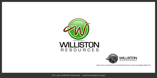
Winning Design by: dermawan
Close Date: Oct 27, 2011


Williston Resources - Energy


Awarded as a winner
Project Report    

Sort by:


#170

#168

#167

#166

#165

#164

#163

#160

#159

#158

#157

#156

#155

#154

#153

#152

#151

#149

#148

#147

#146

#145

#144

#143

#142

#141

#140


Creative Brief


Williston Resources

Williston Resources

ND & MT Mineral Leasing

Yes

This is a business. Our strategy is to drive traffic to a website (the only place this logo will be utilized). The target audience are owners of North Dakota and Montana mineral rights, specifically those located in what is referred to as the Williston Basin. The target audience could be land-owners (farmers) living in North Dakota, or descendants of people who used to own land / mineral rights in North Dakota - this later group usually own their mineral rights by way of a will (i.e., their father / mother / grandparent left them the mineral rights that they owned.

Energy

Illustrative
Illustrative


Clean/Simple
Corporate
Industry Oriented
Outdoors/Natural
Traditional
Local/Neighborhood
Retro
Serious
Masculine

Colors could be natural and organic: dirt brown, green like leaves on a tree, yellow like wheat, corn, the sun... Although

3
Related Contests


Logo for a company selling parts for HVAC and gas
$200
Prize Money
59
Concepts
Modern logo Export/Import company
$200
Prize Money
45
Concepts
CSP-F solar collectors
$450
Prize Money
189
Concepts
Logo for a solar electric contractor that installs solar panels on homes and businesses
$300
Prize Money
476
Concepts

Discussion


Comments

  • October 24, 2011 1:25 PM
    joshuawert joshuawert
      Project Holder
    #16. Dude. Are you serious? When I suggested you look at the COPYCATS logo for a reference point regarding my taste in aesthetics, I wasn't meant to be interpreted as instruction to abandon all creativity. I'm being a little harsh on you but... c'mon.

    Like Icon 0   DislikeIcon 0
  • October 24, 2011 1:09 PM
    joshuawert joshuawert
      Project Holder
    I'm just going to say to everyone... WOW! The submissions have been amazing and exceeded my expectations. As long as the winning designer works with me on some tweaks to make it perfect in my eyes... this will be money very well spent. While I had narrowed it down to about five last week, the list of finalists are growing based on the last batch of submissions. Keep up the great work. And thank you again for your participation.

    Like Icon 0   DislikeIcon 0
  • October 18, 2011 4:39 PM
    joshuawert joshuawert
      Project Holder
    I was involved in the design of our my last company's logo. Check it out. I am still in love with that logo and it's vibe. wink-mpls.com/archives/portfolio/copycats

    Like Icon 0   DislikeIcon 0
  • October 18, 2011 4:37 PM
    joshuawert joshuawert
      Project Holder
    our website, corporeate website for investors, is www.ante5oil.com. it's way too corporate and too slick for Williston Resources. But i just thought i would mention it. I did approve the designs and iconography on it.

    Like Icon 0   DislikeIcon 0
  • October 18, 2011 4:36 PM
    joshuawert joshuawert
      Project Holder
    Interesting that no one (well, almost no one) has submitted imagery related to the oil business. Like an oil well or a pump-jack. Honestly, i don't think i want something so obvious. I just found it surprising that nobody has yet gone that direction.

    Like Icon 0   DislikeIcon 0
  • October 18, 2011 4:34 PM
    joshuawert joshuawert
      Project Holder
    #1 i love this logo. in fact lot of people do. it speaks to the modernist in me. it's clean and cool. unfortunately, i'm not in the wall business. and so it's a little bit random. it would be nice if there was something that connected the overall design to the business i am in.

    Like Icon 0   DislikeIcon 0
  • October 18, 2011 4:33 PM
    joshuawert joshuawert
      Project Holder
    #7 and #8 are nice. But a bit too corporate for my taste.

    Like Icon 0   DislikeIcon 0
  • October 18, 2011 4:29 PM
    joshuawert joshuawert
      Project Holder
    #5 Loving the plow fields. Speaks to the farmers, as does the color pallet. But I don't love the asymmetric shape it is in. Looks too much like a guitar pick.

    Like Icon 0   DislikeIcon 0
  • October 18, 2011 4:28 PM
    joshuawert joshuawert
      Project Holder
    Note. my first comment, for design #8... was meant for design #9. I would delete my first comment if only i knew how.

    Like Icon 0   DislikeIcon 0
  • October 18, 2011 4:23 PM
    joshuawert joshuawert
      Project Holder
    #8 I like this. Seems to speak to the ranching history of the North Dakota. That is an angle i had not thought of before.

    Like Icon 0   DislikeIcon 0
  • October 18, 2011 4:23 PM
    joshuawert joshuawert
      Project Holder
    #9 I like this. Seems to speak to the ranching history of the North Dakota. That is an angle i had not thought of before.

    Like Icon 0   DislikeIcon 0