SALES / SUPPORT : +1-877-525-5646   |   Login


Thirty

30 30 30

Contest Holder Bowsy ?

Last Logged in : 2399days6hrs ago

Concepts Submitted

215

Guaranteed Prize
350
Winner(s)

1

A Logo, Monogram, or Icon veildAll design entries can be viewed by other designers. Expedite Expedite Contest
tick_gray

Live Project

tick_gray

Deciding

tick_blue

Project Finalized


Project: Thirty
Industry: Marketing Logo
Contest Launched: Feb 04, 2015
Selected: 1 winning design from 215 concepts
Winning Design by: nelly83
Close Date: Feb 15, 2015


Thirty - Marketing


Awarded as a winner
Project Report    

Sort by:


#198

#192

#191

#161

#160

#158

#131

#106

#82

#199

#180

#175

#174


Creative Brief


Thirty

30 30 30

No

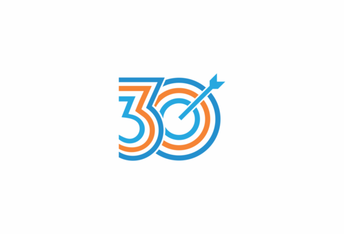
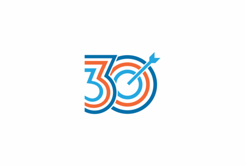
This is for an internal company motivation campaign. We have three targets to achieve. Each of the targets is 30 e.g. 30% increase in sales, 30 more customers etc..

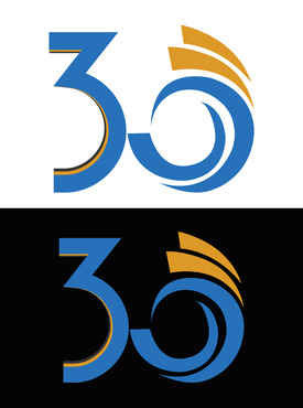
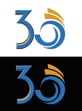
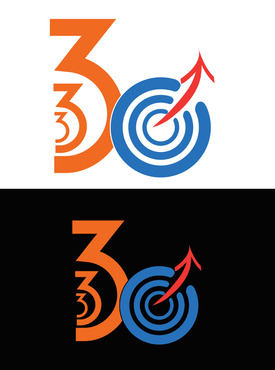
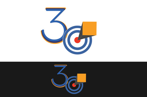
I am looking for a simple logo that uses three '30s' that we can use on posters and internal communications.

It would be nice if the design could turn the three 30s into a single symbol.

Marketing

Symbolic
Symbolic


Modern
Youthful
Simple

Orange, Blue and White but open to other colors.

not sure

It would be nice if the design could turn the three 30s into a single symbol.
Related Contests


Logo for a legal services support company
$250
Prize Money
170
Concepts
Logo Redesign for ELXR Marketing
$199
Prize Money
40
Concepts
Logo for Marketing Consultant
$199
Prize Money
87
Concepts
Logo for a marketing consulting company
$200
Prize Money
121
Concepts

Discussion


Comments

  • February 04, 2015 5:39 PM
    Bowsy Bowsy
      Project Holder
    #79 also would be good to see the top blue orange design repeated like '3d' eg large background 30 with medium sized 30 on top with small sized 30 on front like 3 layers.

    Like Icon 0   DislikeIcon 0
  • February 04, 2015 5:31 PM
    Bowsy Bowsy
      Project Holder
    #79 like the simple design and arrow treatment. Would be interesting to see the same design repeated 3 times vertically or stacked using different shades of the orange blue colour palette with white. Thanks.

    Like Icon 0   DislikeIcon 0
  • February 04, 2015 4:16 PM
    Bowsy Bowsy
      Project Holder
    Like #63 but would avoid use of red. Maybe a combination of different shades of orange and blue lighter shades. Thanks.

    Like Icon 0   DislikeIcon 0
  • February 04, 2015 11:33 AM
    Bowsy Bowsy
      Project Holder
    #28 Maybe try the growing in size from left to right so it looks like an upwards curve/line

    Like Icon 0   DislikeIcon 0
  • February 04, 2015 8:58 AM
    Bowsy Bowsy
      Project Holder
    #11. Good combination. Maybe need a more unifying element or other graphic element.

    Like Icon 0   DislikeIcon 0
  • February 04, 2015 8:56 AM
    Bowsy Bowsy
      Project Holder
    Hi Designers. Thanks for the input so far. I am in the process of 'unveiling' the project so everyone can see the other submissions and comments. #10 and #7, I like the way you have tried to incorporate the three '30s' into a single design. #8 and #9 - like the simplicity and colors of the design - looks dynamic. Just missing the connection with the three '30s'. Thanks

    Like Icon 0   DislikeIcon 0