SALES / SUPPORT : +1-877-525-5646 |
Login
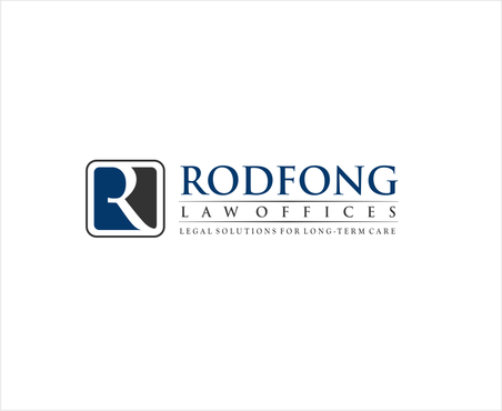
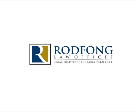
Small Law Office Logo and Stationary Design
Rodfong Law Offices
|
Contest Holder
rodfonglaw
?
Last Logged in : 4647days6hrs ago |
Concepts Submitted
57 |
Prize Money
199
|
Winner(s) | A Logo, Monogram, or Icon |
|
Live Project
Deciding
Project Finalized
Project: Small Law Office Logo and Station ...
Industry:
Law Logo
Contest Launched:
Dec 21, 2011
Selected:
1
winning design from 57 concepts
Winning Design by:
lovatodesign
Close Date:
Dec 31, 2011
Creative Brief
Small Law Office Logo and Stationary Design
Rodfong Law Offices
Legal Solutions for Long-Term Care
Yes
This is a small law office which focuses solely on practicing asset protection for the elderly who require long-term care.
Law
Symbolic
![]()
Initials
![]()
Sophisticated
Traditional
Serious
Masculine
Blue, Black, Grey
2
Do not want any scales, or lady justice. Interested in emphasizing the initial "R"...Not "RLO" though. We are not opposed to including an architectural column.
Related Contests
Comments
Project Holder
Project Holder