SALES / SUPPORT : +1-877-525-5646   |   Login


Reverb Networks logo design

'reverb' or 'Reverb'

Contest Holder reverb2012 ?

Last Logged in : 4594days25mins ago

Concepts Submitted

46

Guaranteed Prize
200
Winner(s)

1

A Logo, Monogram, or Icon veildAll design entries are veiled from other designers till the end of the contest.
tick_gray

Live Project

tick_gray

Deciding

tick_blue

Project Finalized


Project: Reverb Networks logo design
Contest Launched: Jun 01, 2012
Selected: 1 winning design from 46 concepts
Winning Design by: zaqsyak2
Close Date: Jun 15, 2012


Reverb Networks logo design - Telecommunications


Awarded as a winner
Project Report    

Sort by:


#14


Creative Brief


Reverb Networks logo design

'reverb' or 'Reverb'

Intelligent SON solutions

No

Reverb Networks is a software company that provides systems to improve the operating efficiency of wireless networks. Our target audience are mobile network operators: AT&T, Verizon Wireless, Rogers, Telstra, Telefonica, Orange, and others around the globe. Our existing website and logo can be found at www.reverbnetworks.com. We wish to refresh our corporate branding starting with our logo.

Telecommunications

Logo Type
Logo Type

Abstract Mark
Abstract Mark


Cutting-Edge
Clean/Simple
Corporate
Modern
Industry Oriented
High Tech

prefer blue, orange (different than the orange currently used, yellow), black/grey

not sure

Reference other firms in the telecommunications industry:

www.aircominternational.com
www.infovista.com
www.actix.com
www.celcite.com
www.huawei.com
www.ericsson.com
www.nokiasiemensnetworks.com
www.edenrockcomm.com
www.newfieldwireless.com
www.mentum.com
www.celplan.com
www.ascom.com
Related Contests


 RePhoned
$300
Prize Money
77
Concepts
(expedite) Logo For Radio Staton
$250
Prize Money
109
Concepts
modern logo for a telecommunications company
$250
Prize Money
72
Concepts
wiretap telecom version 2
$200
Prize Money
112
Concepts

Discussion


Comments

  • June 06, 2012 2:11 PM
    reverb2012 reverb2012
      Project Holder
    #13 is a very good design! Well received here...

    Like Icon 0   DislikeIcon 0
  • June 05, 2012 1:39 PM
    reverb2012 reverb2012
      Project Holder
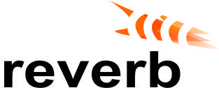
    We created an internal design concept using the 2 "beams" as shown in the logo on our corporate website, but elongated and turned horizontally behind the reverb name. Variations on this concept would be likely winner.

    Like Icon 0   DislikeIcon 0
  • June 04, 2012 1:35 PM
    reverb2012 reverb2012
      Project Holder
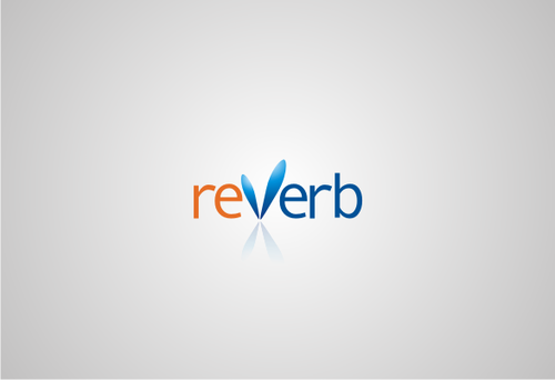
    Thank you all for your submissions! 2 comment: - preference will be given to logos that work well on white background - use of colors in #2 appealing

    Like Icon 0   DislikeIcon 0
  • June 02, 2012 11:13 AM
    SiteAdmin SiteAdmin
     
    Attention Designers!! MycroBurst permits you to submit unlimited designs with unlimited variations. However, if you are providing 2 or 3 different color versions of the same logo in one draft, please make sure that if the particular draft gets finalized, each color version should be separated before you will send the final files. Thanks, MB/LDG Team

    Like Icon 0   DislikeIcon 0