SALES / SUPPORT : +1-877-525-5646 |
Login
Revamp Form 10 Group Logo
Form 10 Group
|
Contest Holder
form10
?
Last Logged in : 479days24mins ago |
Concepts Submitted
144 |
Guaranteed Prize
149
|
Winner(s) | A Logo, Monogram, or Icon |
|
Live Project
Deciding
Project Finalized
Project: Revamp Form 10 Group Logo
Industry:
Logo
Contest Launched:
Jun 05, 2010
Selected:
1
winning design from 144 concepts
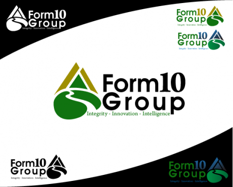
Winning Design by:
raindesign
Close Date:
Jun 12, 2010


Creative Brief
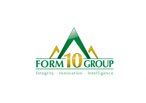
Revamp Form 10 Group Logo
Form 10 Group
Integrity - Innovation - Intelligence
No
We are technology implimenter for companies. We take our customer's products and get them to work in field. Most of projects involve hightech (i.e. computers or electronics). The end customers are usually state and federal governments or large corporations.
symbol
![]()
Cutting-Edge
Sophisticated
Corporate
High Tech
Serious
Forest Green - we like our current color and would be interested in adding a second color.
2
We want to modernize our current logo. It can be seen at www.form10.com. We want to keep the triangle shape. The original concept was a mountain, but it got dumb down to a triangle. A mountian theme could work. We also want to keep forest green as the predominant color. It would be nice to keep the "10" as part of the symbol, but not critical.
Comments
Project Holder
Project Holder
Project Holder