SALES / SUPPORT : +1-877-525-5646 |
Login
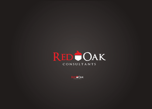
Red Oak Logo
Red Oak Consultants
|
Contest Holder
howbouthere
?
Last Logged in : 5048days15hrs ago |
Concepts Submitted
38 |
Prize Money
200
|
Winner(s) | A Logo, Monogram, or Icon |
|
Live Project
Deciding
Project Finalized
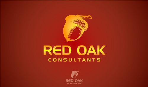
Project: Red Oak Logo
Industry:
Consulting Logo
Contest Launched:
Nov 04, 2010
Selected:
1
winning design from 38 concepts
Winning Design by:
AbsolutMudd
Close Date:
Nov 11, 2010


Creative Brief
Red Oak Logo
Red Oak Consultants
No
Consulting/training for retail, restaurant, hospitality chains. Franchised and non-franchised.
Specific focus in Market Planning, Trade Area Analysis, and Site Selection.
Typical assignment would be to provide real estate training for franchise operators, within a large franchise system. Sometimes client is the franchisee; sometimes it is the franchisor.
Founder/principal has headed the real estate and construction departments of several nat'l and internat'l chains over the past 25 years. Segments have included: retail, lodging, restaurants, financial services, telecom.
Consulting
Symbolic
![]()
Unique/Creative
Clean/Simple
Sophisticated
Corporate
Serious
dark red/maroon brown/black
2
Since my business is about teaching franchise companies to grow a business by replicating a proven retail concept again and again--one successful store begets many identical franchise stores--I like the image of a tiny acorn becoming a mighty oak. the mighty oak produces thousands of acorns which produce more mighty oaks. And so on...
Related Contests


Comments
Project Holder
Project Holder
Project Holder