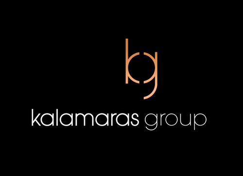
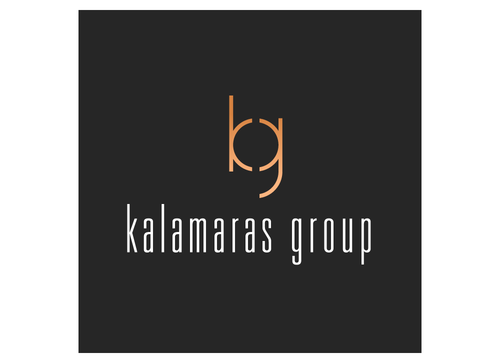
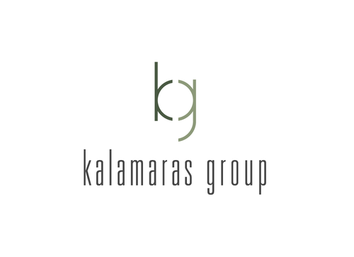
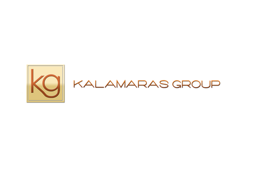
Real Estate Team Business logo
Kalamaras Group
|
Contest Holder
vincek
?
Last Logged in : 2153days7hrs ago |
Concepts Submitted
201 |
Guaranteed Prize
250 |
Winner(s) | A Logo, Monogram, or Icon |
|
Live Project
Deciding
Project Finalized

Creative Brief
Real Estate Team Business logo
Kalamaras Group
Real Estate
Yes
We would like a VERY clean professional design that encompasses a logo. We are Realtors who handle residential property transactions. Real Estate can appear within the design or not. We are looking for suggestions and variations. Real Estate, Real Estate Solutions, etc...
We will use this design in print promotions, web site, internet, business cards.
Real Estate
Initials
![]()
Clean/Simple
Sophisticated
Traditional
Serious
green, blue, black, gold (More bronze than gold)
not sure
We really want something that is timeless and can be used in all applications of our advertising. We do not neccesarily need the word/s Realty or Real Estate, but we are not oppossed to it either. Nothing cute please, like a house or building in the design.
Related Contests


