Outdoorsy Logo for Northern Roots Start-up
Northern Roots Healing
|
Contest Holder
NorthernRootsLLC
?
Last Logged in : 2107days7hrs ago |
Concepts Submitted
183 |
Guaranteed Prize
300
|
Winner(s) | A Logo, Monogram, or Icon |
|
Live Project
Deciding
Project Finalized

Creative Brief
Outdoorsy Logo for Northern Roots Start-up
Northern Roots Healing
No
New start up! We had been working with an individual who began our logo design, but wasn't working out, so we have some ideas that need to be tweaked/re-imagined. We are a new CBD topical company called "Northern Roots Healing".
We make organic salves and other organic cosmetic products that contain CBD oil for reduction of inflammation and increased healing rates in joints, muscles, etc. We plan to also carry products like tinctures, bath bombs, etc.
Our client demographics: Rock Climbers, Outdoor Enthusiasts, Hikers, Mountain Bikers Etc.
About us: Jake and I have been avid adventurers our entire lives, and would like to create our imaging to match this. We like bold, simple concepts and would like a symbol/logo that looks great stand-alone, and also looks good tied into the current circular-packaging concept that we're working with (I will find a way to attach this). We like mountains (especially Mount Baker in Washington), suns, trees, roots, topographic lines, and other outdoor-concepts. We really like black/white. Not opposed to color, so if that's your specialty, we'd love to see the ideas.
What's Important to Us: We are organic. We will offer to ship empty containers back to us to help reduce packaging waste going into landfills. Our products are a healthy alternative to current synthetic chemical - based inflammation- reducing products on the market. Our products are made by hand.
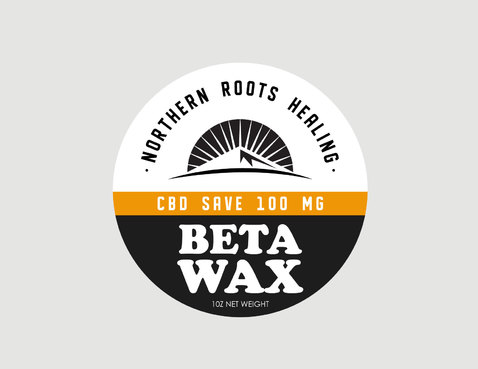
In the attachment, you'll see what we've currently been working with. The circular "Beta Wax" label is something we like and want to run with, but we require a "Northern Roots Healing" logo to go in the top half of the label (and be able to stand alone for stickers, letterheads etc).
In the attachment: "current Northern Roots logos"
LOGO #1 (two circles) - we hate it. Too simple, means nothing to us.
LOGO #2 (mountain and sun) - we've been working with this idea for a bit, we like the simplicity, and the hexagon is OK, but when you put the hexagon in the top half of our label, it doesn't look right. It leaves too much space on the outsides and doesn't jive. An adaptation to this concept would be great.
LOGO#3 (block-style tree) - we like the simplicity of this idea, and how it works well with the vertical name next to it, but aren't crazy about the tree itself. It kind of looks like a raining tree...sort of.
Attached you will also find a hand-sketched idea using Mt Baker, the sun, and "northern roots healing" in a circular fashion over the art (we love the circular "northern roots healing"). We like how something like this would fit very well with our circular "Beta Wax" label, but would need to find a way to also make it work as a nice stand-alone logo, which hasn't been done yet. This isn't a MUST, but we do like how it fills the space above Beta Wax. Something similar could be magic.
I have also attached a few snapshots of pinterest boards that contain symbols/logos that use design themes that appeal to us. Concepts that will appeal to folks in the outdoor world, but can also be later used in non-outdoor related product lines (for example, we wouldn't want to use images of climbers in our logo, because if we later expanded into a different demographic, that wouldn't make sense to them).
I'm not sure if the above is too specific or too vague, first time using Guru, and we've heard nothing but amazing stories from folks who had their art done via Guru. Please reach out for any specification needs or more inquiries. Thank you!!!
Outdoors
Simple
We like black/white the most, but if colorwork is your specialty, let's see it!
2
See lengthy above description to get an idea of what we're looking for!


Comments