SALES / SUPPORT : +1-877-525-5646 |
Login
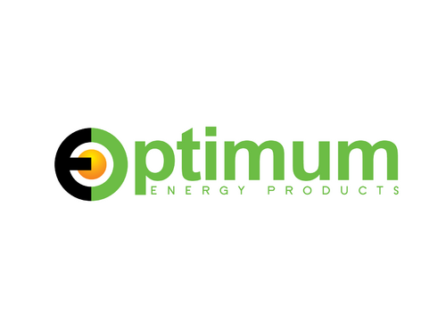
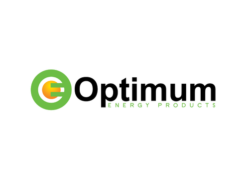
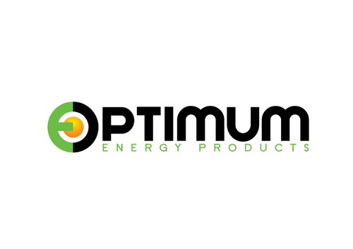
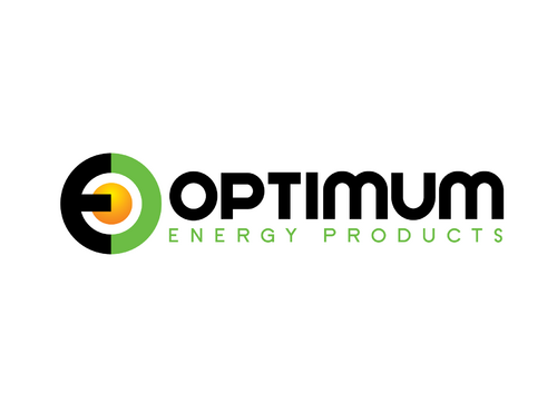
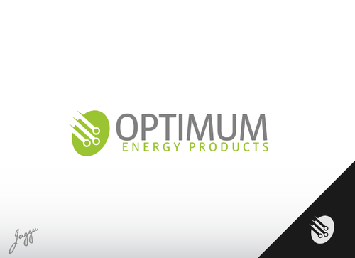
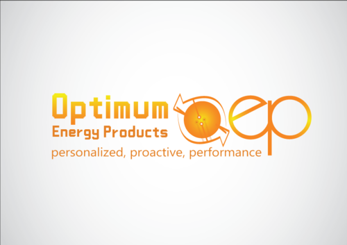
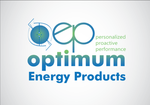
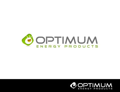
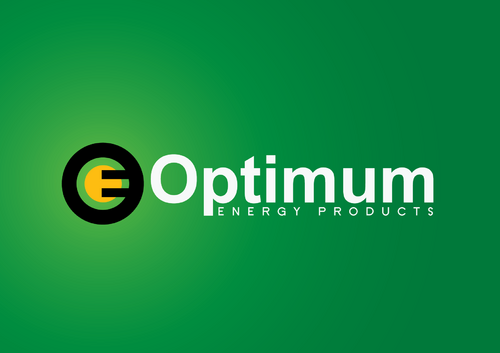
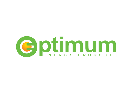
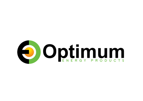
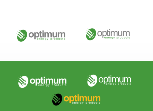
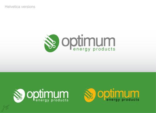
Optimum Logo Design
Optimum Energy Products / OptimumStores.com
|
Contest Holder
optimumenergy
?
Last Logged in : 5200days18hrs ago |
Concepts Submitted
57 |
Guaranteed Prize
279
|
Winner(s) | A Logo, Monogram, or Icon |
|
Live Project
Deciding
Project Finalized
Project: Optimum Logo Design
Industry:
Energy Logo
Contest Launched:
Sep 14, 2010
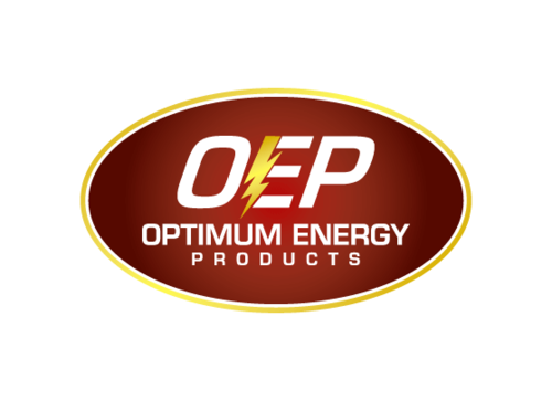
Selected:
1
winning design from 57 concepts
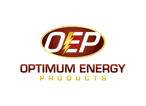
Winning Design by:
Sergem
Close Date:
Sep 22, 2010

Creative Brief
Optimum Logo Design
Optimum Energy Products / OptimumStores.com
Personalized. Proactive. Performance.
Yes
Distributor of professional electrical test tools and energy metering products, mostly through the Internet. We focus on having the right products available and fast reliable personalized service.
Energy
Initials
![]()
Illustrative
![]()
Clean/Simple
Corporate
Modern
Industry Oriented
High Tech
Masculine
For subtle design, consider using shades of green and white as used in the website design or for a more striking design, consider using the ‘gold/orange’ of the legacy ‘electric e’, all of which can be seen on http://www.powermeterstore.com/
not sure
This logo should be either a circle or square (or slightly rectangular, but it should not be too tall or too long).
Our products fit into three categories:
Electrical test equipment
Gas detectors for worker personal safety
Energy measurement - both in an industrial context for cost savings and also some products that come from a ‘green’ angle.
Our customers are predominately male although we don’t wish to the logo to be TOO masculine.
The logo you design will be used both for the optimumstores.com website (which will have the same design as the powermeterstore.com design previously given) AND it will be used for our company, Optimum Energy Products. So the logo should not incorporate the company name or website name because it needs to work for both.
Lastly, regarding the use of the slogan in the logo - we aren't sure if we want to see the slogan in the "illustrative" or "initial" style that we are asking you to create, or whether it should appear alongside either the company name or website, which will appear next to your logo.
We are open to ideas and look forward to seeing what you have! Go get 'er!
Related Contests


Comments
Project Holder
Project Holder
Project Holder
Project Holder
Project Holder
Project Holder
Project Holder
Project Holder
Project Holder
Project Holder
Project Holder
Project Holder
Project Holder