SALES / SUPPORT : +1-877-525-5646 |
Login
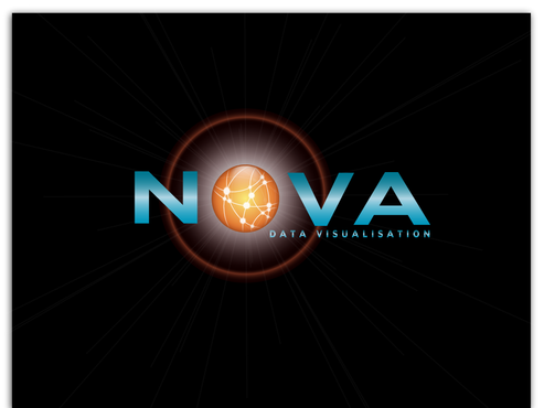
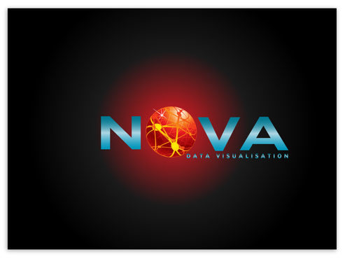
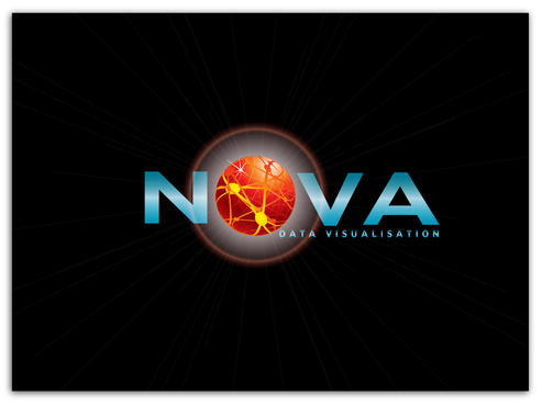
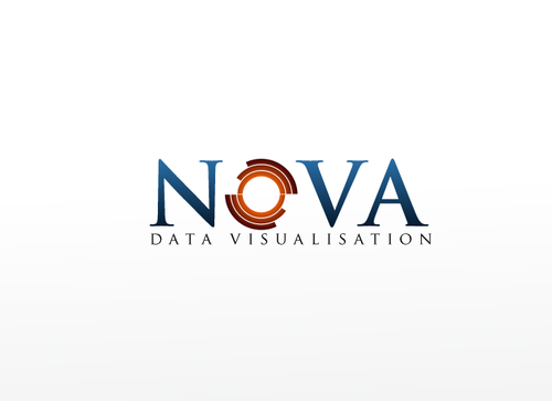
Nova logo
NOVA
|
Contest Holder
tchexxum
?
Last Logged in : 4796days4hrs ago |
Concepts Submitted
47 |
Prize Money
200
|
Winner(s) | A Logo, Monogram, or Icon |
|
Live Project
Deciding
Project Finalized
Project: Nova logo
Industry:
Information Technology Logo
Contest Launched:
Jun 16, 2011
Selected:
1
winning design from 47 concepts
Winning Design by:
monart
Close Date:
Jun 25, 2011

Creative Brief
Nova logo
NOVA
Data Visualisation
Yes
Nova is a data visualisation platform - providing reporting dashboards and real-time analytics. The themes are: speed, light, precision, power, insight, vision etc.
Use the visuals from Synovate.com for some guidance, but this does not have to be closely tied to what you see there. Note that NOVA is the middle set of letters in Synovate.
Information Technology
Abstract Mark
![]()
Web 2.0
![]()
Cutting-Edge
Sophisticated
Corporate
High Tech
reference the red and yellow in the synovate rings on the website synovate.com. I would like one strong colour to go with the synovate colours - to indicate the product is on brand but with strength and independence. This could be a dark grey, blue or black.
not sure
There is an astronomical theme in the brand name, and the rings of the synovate logo work well with the idea of a Nova. I want to merge the concepts of high-tech, sharp, precise, powerful information system with the burst of energy that you get in a (super)nova - a kind of explosion of information, happening around the brand name.
The "Data Visualisation" tagline is optional - I would like to see how this looks.
Note that the upper-case/lower-case option is fine either way. I would like to see how a large upper case N and small upper case OVA might look, but I am open to suggestions.
Related Contests


Comments
Project Holder
Project Holder
Project Holder
Project Holder
Project Holder