SALES / SUPPORT : +1-877-525-5646   |   Login


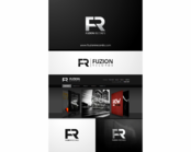
Music Artist Services Company logo

Spin Digital

Contest Holder cameo21 ?

Last Logged in : 3662days14hrs ago

Concepts Submitted

126

Guaranteed Prize
350
Winner(s)

1

A Logo, Monogram, or Icon veildAll design entries are veiled from other designers till the end of the contest.
tick_gray

Live Project

tick_gray

Deciding

tick_blue

Project Finalized


Project: Music Artist Services Company log ...
Industry: Music Logo
Contest Launched: Oct 22, 2014
Selected: 1 winning design from 126 concepts
Winning Design by: ARdes
Close Date: Nov 10, 2014


Music Artist Services Company logo - Music


Awarded as a winner
Project Report    

Sort by:


#43

#42

#124

#111

#69


Creative Brief


Music Artist Services Company logo

Spin Digital

Artist, Management & Tech Concierge Services

No

Spin Digital is about serving music artists and fans. It bridges the music & entertainment industries and technology. The company name was borne of the owners experience in a hurricane and is a good representation of doing things differently in an exciting but staid industry.

Music

Logo Type
Logo Type

Abstract Mark
Abstract Mark

Initials
Initials

Web 2.0
Web 2.0


Modern
Cutting-edge
Simple
High Tech

I lean towards strong color combinations (red/black, blue/black/white) but open to anything

not sure

Want to see some motion to it, representative of a hurricane but not literal.

Related Contests


Mindbreak Dj logo
$400
Prize Money
22
Concepts
Record Label Logo
$200
Prize Money
77
Concepts
Logo for a Music Festival
$250
Prize Money
57
Concepts
Logo for an Audio Production Agency
$200
Prize Money
28
Concepts

Discussion


Comments

  • October 31, 2014 11:36 AM
    cameo21 cameo21
      Project Holder
    I am eliminating multiples and designs in varying colors so I can narrow the choices.

    Like Icon 0   DislikeIcon 0
  • October 31, 2014 11:13 AM
    cameo21 cameo21
      Project Holder
    Heena, I like the inclusion of the treble clef but wondering if we can make it sleeker and less curley-que so it looks more modern.

    Like Icon 0   DislikeIcon 0
  • October 31, 2014 11:12 AM
    cameo21 cameo21
      Project Holder
    PLease do not upload multiple versions of your design on merchandise photos. It clogs up the process and this is not a design for merch. Thank you.

    Like Icon 0   DislikeIcon 0
  • October 23, 2014 5:51 PM
    cameo21 cameo21
      Project Holder
    I love the bold & clean/modern looks (#17, 9, 4 are great starts). Strong and not too literal. Prefer a bit of motion but not too literal.

    Like Icon 0   DislikeIcon 0