SALES / SUPPORT : +1-877-525-5646 |
Login
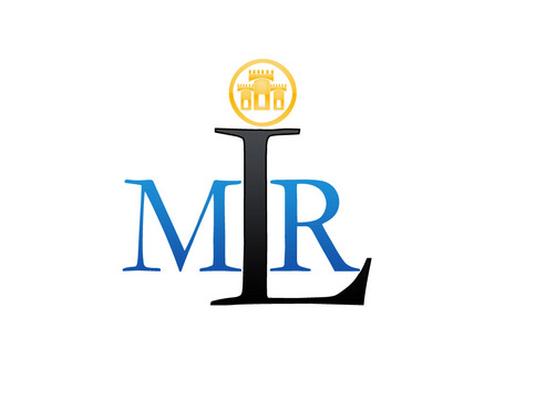
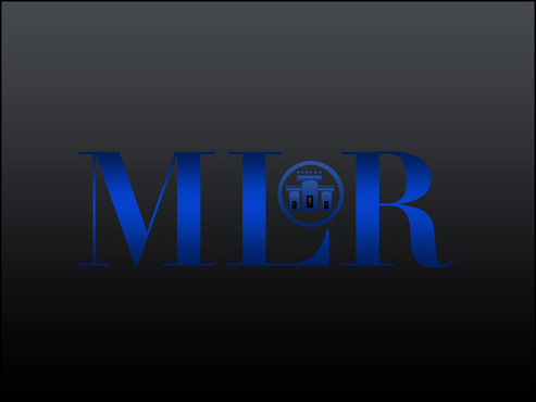
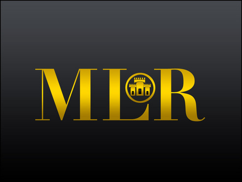
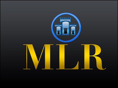
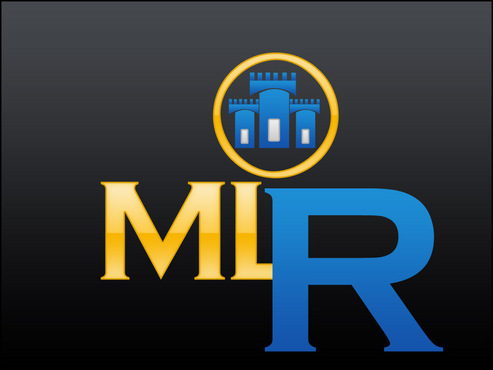
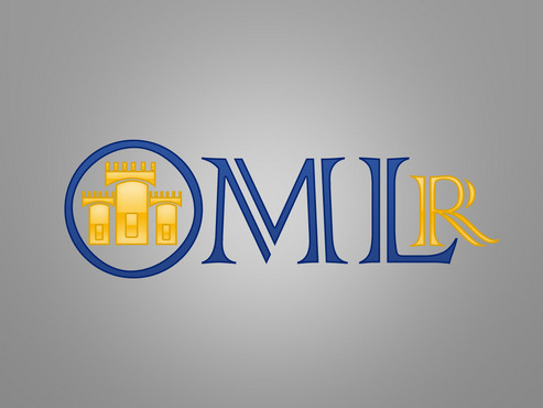
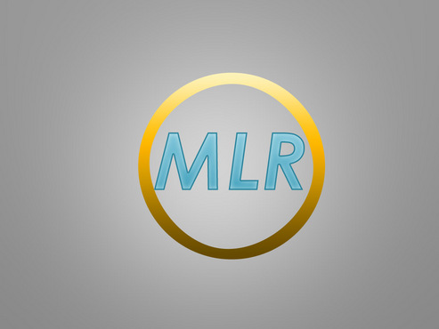
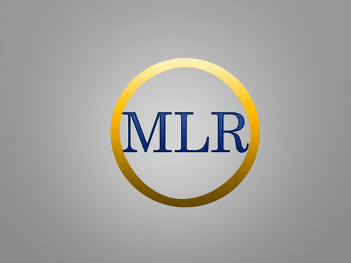
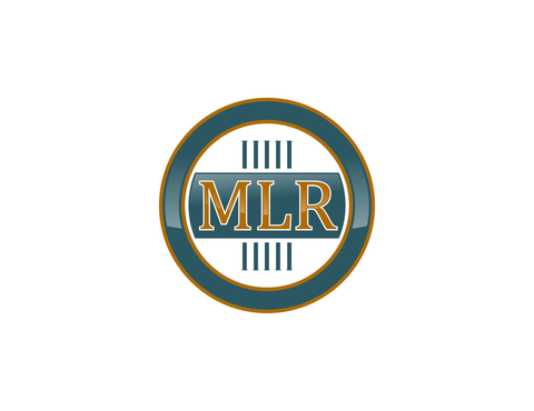
Michigan Law Review Logo
MLR
|
Contest Holder
Emgoebel10
?
Last Logged in : 4258days4hrs ago |
Concepts Submitted
170 |
Prize Money
300
|
Winner(s) | A Logo, Monogram, or Icon |
|


Creative Brief
Michigan Law Review Logo
MLR
No
The Michigan Law Review is the 5th leading law journal in the country, looked to by the academic community, the legal field, even the Supreme Court. We publish 8 issues a year and have a strong online presence (Website, Twitter, LinkedIn, Facebook, etc.). We are looking to create a new logo that reflects the long tradition of the Law Review and that would be used across all media and easily recognizable. Please submit your best design of the below description in both full color and black and white.
Law
Initials
![]()
Illustrative
![]()
Traditional
Sophisticated
Elaborate
Rustic
Dark Blue and Gold
2
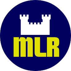
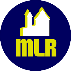
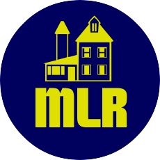
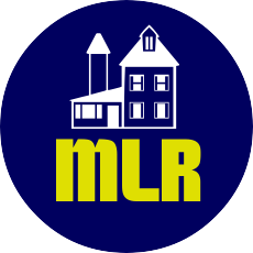
We are imagining a circular seal, inspired by the Michigan Law Quad (We've uploaded a photo of it - think stone and ivy. If you're having trouble viewing the photo, just Google "Michigan Law Quad"). We would like "MLR" to be spelled out in an elegant, yet readable, way within the circle. When not in black and white, the colors for the logo should incorporate dark blue and gold.
Related Contests


Comments
Project Holder
Project Holder