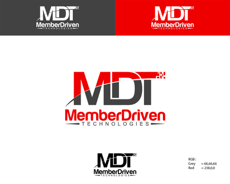
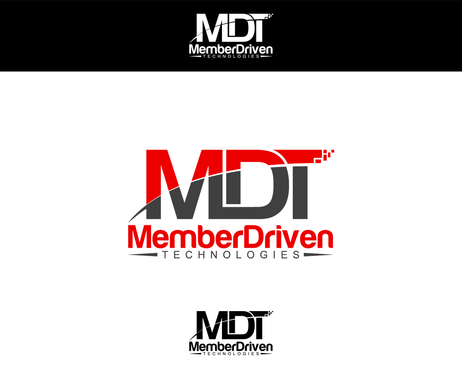
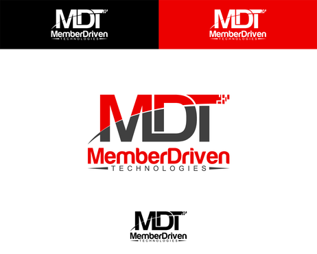
MDT Logo Refinement (RESTRICTED PROJECT)
MDT (Member Driven Technologies)
|
Contest Holder
MemberDriven
?
Last Logged in : 4891days16hrs ago |
Concepts Submitted
13 |
Guaranteed Prize
200 |
Winner(s) | A Logo, Monogram, or Icon |
|
Live Project
Deciding
Project Finalized


Creative Brief
MDT Logo Refinement (RESTRICTED PROJECT)
MDT (Member Driven Technologies)
Yes
This is a private project for designer Alzam only. We have some tweaks to his winning design that are attached in a rough format. Would like the attached logo cleaned up as well as some slight creative alterations at the designers discretion. We look forward to an open discussion on this design concept.
Information Technology
Related Contests