SALES / SUPPORT : +1-877-525-5646   |   Login


Logo needed specialty food distributor

OpenCupboard.com

Contest Holder chuckedog ?

Last Logged in : 3474days7hrs ago

Concepts Submitted

77

Prize Money
525
Winner(s)

1

A Logo, Monogram, or Icon veildAll design entries are veiled from other designers till the end of the contest.
tick_gray

Live Project

tick_gray

Deciding

tick_blue

Project Finalized


Project: Logo needed specialty food distri ...
Industry: Food Logo
Contest Launched: Mar 29, 2014
Selected: 1 winning design from 77 concepts
Winning Design by: veedesign
Close Date: Apr 14, 2014


Logo needed specialty food distributor - Food


Awarded as a winner
Project Report    

Sort by:


#66

#46

#45

#41

#27

#23

#21

#10

#13

#12

#68

#67

#65

#59

#54

#52

#48

#47

#44

#43

#42

#40

#39


Creative Brief


Logo needed specialty food distributor

OpenCupboard.com

No

The logo should represent healthy eating choices in gourmet and specialty foods. OpenCupboard.com's cupboard is always open for shopping and selecting healthy foods.

Food

Logo Type
Logo Type

Symbolic
Symbolic

Abstract Mark
Abstract Mark

Web 2.0
Web 2.0


probably nature colors like green, orange, yellow, brown

not sure

please no fancy script and cursive writing, want more of a bold look. I think something creative could be done with an opening door concept, or something like the door icon for seller stores on ebay. this is my seventh project offering on this site, and in all of them we've always selected a winner and we communicate a lot with feedback and suggestions

Related Contests


Logo for Restaurant
$250
Prize Money
188
Concepts
Unique logo design for a bakery and patisserie business that also offers top end coffees
$200
Prize Money
130
Concepts
Master Chefs
$390
Prize Money
222
Concepts
Logo for innovative cookie made of only two ingredients
$300
Prize Money
77
Concepts

Discussion


Comments

  • April 07, 2014 2:34 AM
    chuckedog chuckedog
      Project Holder
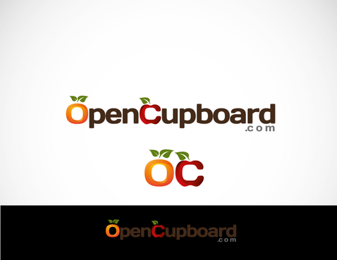
    #27- this is a cool idea. i like how the icon looks like an apple (or other fruit) made from the letter "O" and "C". Would like to see this with a few tweaks to the "fruit" as this idea and concept is very good. thanks

    Like Icon 0   DislikeIcon 0
  • April 01, 2014 3:46 PM
    chuckedog chuckedog
      Project Holder
    #9 and #10: very good logo in design and concept. only thing may be some minor color tweaks down the road, and my favorite thus far. thanks! #19 good concept, but design and color choices needs some work. thanks

    Like Icon 0   DislikeIcon 0
  • March 31, 2014 10:13 PM
    chuckedog chuckedog
      Project Holder
    #2 and #3- this sparked an idea in that it might be cool to somehow work the letters "b" and "p" make a smile face where the knob on the door could portray an eye? #4: this sparked an idea in that it might be cool if the logo is coming out the door. Almost like a shopping cart going in and out of a grocery store. #7 and #8: A very cool idea. Love how the design makes a door in the middle. Could you please try making the design look more like a leaf with a door in the middle maybe?

    Like Icon 0   DislikeIcon 0