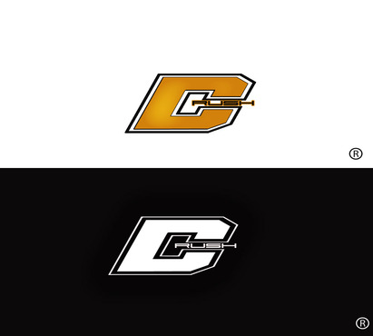
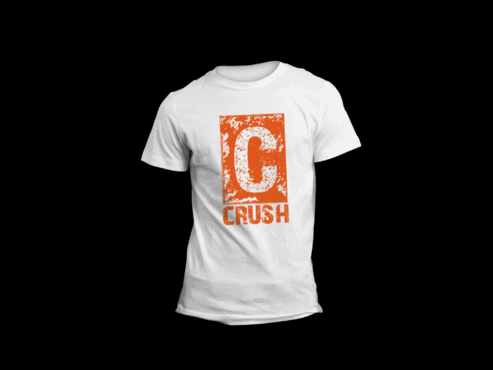
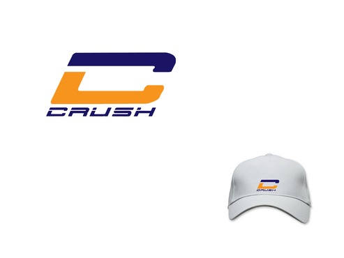
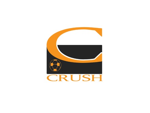
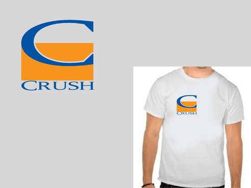
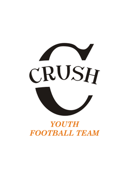
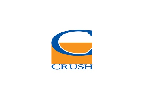
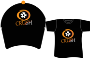
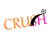
Logo for youth football team- Hats and shirts
C
|
Contest Holder
travisM
?
Last Logged in : 4111days19hrs ago |
Concepts Submitted
82 |
Guaranteed Prize
200 |
Winner(s) | A Logo, Monogram, or Icon |
|
Live Project
Deciding
Project Finalized


Creative Brief
Logo for youth football team- Hats and shirts
C
No
Logo for youth football team- Hats and shirts
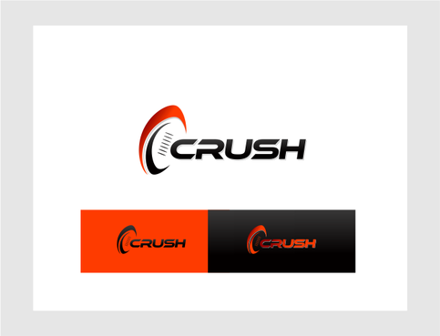
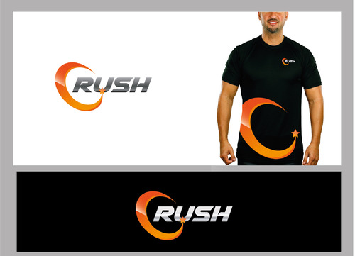
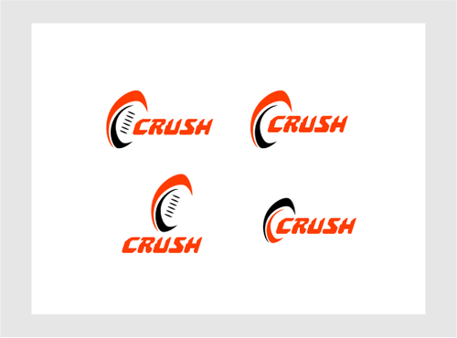
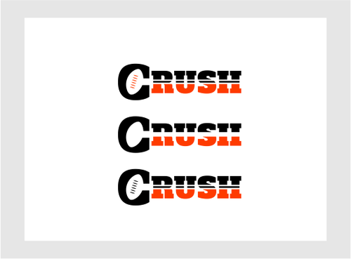
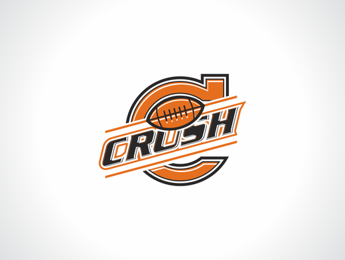
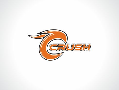
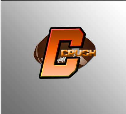
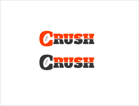
thinking using something Like big C and maybe use the team name "Crush"
Sports
Abstract Mark
![]()
Character
![]()
Masculine
Youthful
Orange for sure , black maybe
2
its a logo for front of a hat so using mainly the C unless you find a way incorporate the whole team name CRUSH
Related Contests