SALES / SUPPORT : +1-877-525-5646   |  


Logo for Tango Studio

Tango Social Club

Contest Holder kristintania ?

Last Logged in : 4917days6hrs ago

Concepts Submitted

137

Prize Money
200
Winner(s)

1

A Logo, Monogram, or Icon veildAll design entries can be viewed by other designers. Expedite Expedite Contest
tick_gray

Live Project

tick_gray

Deciding

tick_blue

Project Finalized


Project: Logo for Tango Studio
Industry: Art Logo
Contest Launched: May 04, 2011
Selected: 1 winning design from 137 concepts
Winning Design by: KiwiDesign
Close Date: May 11, 2011


Logo for Tango Studio - Art


Awarded as a winner
Project Report    

Sort by:


#127

#105

#92

#104

#137

#136

#135

#129


Creative Brief


Logo for Tango Studio

Tango Social Club

Montréal

Yes

Tango Social Club is a friendly, innovate dance studio that facilitates the learning, dancing, sharing and living of argentine tango through workshops, courses, performances, and social events. Here is our current facebook page where you can see photos and get a feel for how much fun we have. http://www.facebook.com/tangomileend

What we don't want in our logo:
red,
silhouettes of tango dancers,
cartoon tango dancers,
fishnets,
fedora hats,
roses,
...anything you’d traditionally associate with argentine tango!

What would be okay in our logo design;
the tango embrace (abrazo in spanish),
hands,
abstract dancers,
abstract people,
footsteps or tango shoes (but we want to avoid looking like arthur murray!),
stick figure tango dancers (if abstract).

Art

Logo Type
Logo Type

Symbolic
Symbolic

Abstract Mark
Abstract Mark

Character
Character


Cutting-Edge
Unique/Creative
Illustrative
Abstract

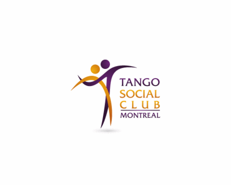
Purple is one color we would like to keep, but we're open to ideas. We also like orange, gold, and lime (but of course, not all together at once, haha). No red please!! (but a super dark, super saturated pink would be a decent substitute)

not sure

We want to be able to use this logo on either black or white backgrounds. We will use this logo on everything from notebooks, to t-shirts to business cards... etc. Less complexity is better so we can make the logo quite small if necessary.

Here are some examples of logos we kinda like in terms of concept:

http://logopond.com/logos/ca775cdc76002d7d48b169594e66c63c.png

http://studiodedanseflamenco.com/images/logo-intro-over.png

http://logooftheday.com/wp-content/uploads/2009/06/chernikoff.gif

http://imgcssjs.logomoose.netdna-cdn.com/wp-content/uploads/2010/05/coffee-club.jpg

http://logopond.com/logos/4898757e9aab71b31551b522008fa89b.png


And finally, to get a sense of our broader tango world, here is a link to our friend Alejandro's tango pictures (most taken at social tango events across North America). This will provide you with some context:

http://www.flickr.com/photos/donocelotl/collections/72157606478235560
Related Contests


Logo for Artisans Shop - Consignment Shop for local artists
$200
Prize Money
60
Concepts
aka FORM logo
$209
Prize Money
52
Concepts
Paint and sip logo
$200
Prize Money
50
Concepts
Arabic Calligraphy Logo
$300
Prize Money
137
Concepts

Discussion


Comments

  • May 12, 2011 1:35 PM
    kristintania kristintania
      Project Holder
    Thank you to everyone who entered designs for this project. It was a difficult decision and unfortunately we could only choose one winner. You all really impressed us!! We appreciate that you were willing to approach a tango-themed logo without relying on traditional definitions and images of tango. Thank you!! Good luck in the future to all of you!!!

    Like Icon 0   DislikeIcon 0
  • May 10, 2011 9:05 PM
    kristintania kristintania
      Project Holder
    Kiwidesign, we really like draft #105 and are wondering if we could see the dancing couple even larger in relation to the words in the logo? Thank you very much!!!

    Like Icon 0   DislikeIcon 0
  • May 10, 2011 11:52 AM
    nealbuto nealbuto
     
    Whoops, just saw that. Changes made :) Cheers.

    Like Icon 0   DislikeIcon 0
  • May 10, 2011 11:06 AM
    kristintania kristintania
      Project Holder
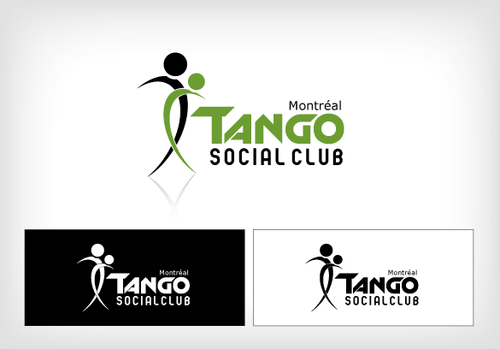
    konstanc - we like draft #78 and especially how the three words tango social club are stacked vertically. Please see my feedback for kotakdesign below. The tango embrace should be evident which means that on one side of their bodies, their arms are wrapped around each other. On the other side, they are holding hands. To have both sets of arms and legs open is too athletic. This may seem like a subtle difference, but it is important. :) Thanks very much for all your efforts!! :)

    Like Icon 0   DislikeIcon 0
  • May 10, 2011 10:59 AM
    kristintania kristintania
      Project Holder
    kotakdesign - we like drafts #63 and #64, and are curious to know if we could please see the top green leg closer to their bodies somehow? Or in a wrap? It may be better for the dancers to appear to be in the tango embrace (bodies and legs are closer together). If the legs, arms, or hands are away from each other then it seems more athletic than tango. ;) Please let me know if you have any questions!

    Like Icon 0   DislikeIcon 0
  • May 10, 2011 10:41 AM
    kristintania kristintania
      Project Holder
    This is feedback for prakashpawar and everyone, all three words, Tango Social Club, need to be legible when the entire logo is made small. For drafts #81, #83, #84, #85, we would love to see a version with the words Social Club larger and not in handwriting font. And please place an accent on the e in Montréal. Thank you very much!

    Like Icon 0   DislikeIcon 0
  • May 10, 2011 10:38 AM
    kristintania kristintania
      Project Holder
    nealbuto - thanks for these new versions! Could you please change the word Club? We need the fonts to be quite clean and it appears that Club is superimposed on itself. :)

    Like Icon 0   DislikeIcon 0
  • May 10, 2011 10:33 AM
    kristintania kristintania
      Project Holder
    In general, we are looking for a logo that conveys dance, socializing, and connection between people. This is fundamentally different from the concept of romance and we want to avoid romance in our logo. We really love the direction many of you have taken with the abstract dancers, so thanks! Thank you!!

    Like Icon 0   DislikeIcon 0
  • May 10, 2011 10:31 AM
    kristintania kristintania
      Project Holder
    parusheva - we are looking for very clean fonts (no script font) and also do not want any hearts in the logo.

    Like Icon 0   DislikeIcon 0
  • May 10, 2011 9:50 AM
    kristintania kristintania
      Project Holder
    Feedback coming right away! Thanks for your patience. We are very impressed with the designs and want to thank you all for your talents and creativity!

    Like Icon 0   DislikeIcon 0
  • May 10, 2011 7:17 AM
    prakashpawar prakashpawar
     
    Feedback please Thank you!!!

    Like Icon 0   DislikeIcon 0
  • May 09, 2011 12:37 AM
    prakashpawar prakashpawar
     
    Thank you....PH

    Like Icon 0   DislikeIcon 0
  • May 07, 2011 6:30 PM
    kristintania kristintania
      Project Holder
    OOPS! My last comment should say #41 for nealbuto. Sorry about that!

    Like Icon 0   DislikeIcon 0
  • May 07, 2011 6:27 PM
    kristintania kristintania
      Project Holder
    nealbuto, we like #31, thank you!! About the lovely "heart" illustration, could we see two heads? And could you adjust or play with the lines so that it's less curvy? As is the dancers make me thing of (cute) sea creatures, like shrimp or octopi or jellyfish. :) We'd love to see another version of this heart, thanks!

    Like Icon 0   DislikeIcon 0
  • May 07, 2011 6:21 PM
    kristintania kristintania
      Project Holder
    Prakashpawar, we like #31 (very nice!!) and would like to see that same illustration beside some different fonts. Thank you so very much!

    Like Icon 0   DislikeIcon 0
  • May 07, 2011 6:19 PM
    kristintania kristintania
      Project Holder
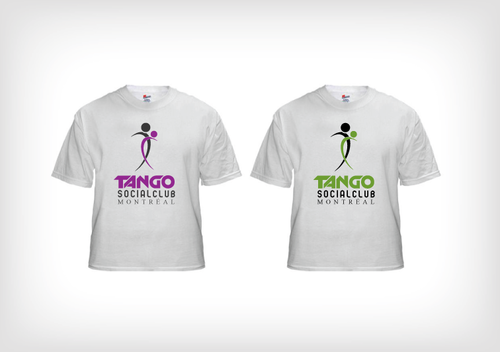
    An update on colors: For purple, we would like to see 660066 (or darker, like 330033). For lime, we would like to see 66FF00 or 66CC00. Thanks creative people!

    Like Icon 0   DislikeIcon 0
  • May 07, 2011 6:10 PM
    kristintania kristintania
      Project Holder
    This is only a suggestion, for fonts, we love FritzQuadrata and would be curious to see how you might incorporate it into your designs.

    Like Icon 0   DislikeIcon 0
  • May 07, 2011 6:07 PM
    kristintania kristintania
      Project Holder
    Kiwidesign... we really like the four designs you uploaded! Could we please see draft #28 with purple instead of the light blue?

    Like Icon 0   DislikeIcon 0
  • May 06, 2011 5:01 PM
    kristintania kristintania
      Project Holder
    Thanks for these new drafts so far today! Much appreciated!!! The comment below about body positions can apply to drafts #11 and #14. I know this is difficult, but any abstraction of the dancers still needs to clearly show "tango". The figures in drafts #6 and #12 do a good job of this, for example. We would love to see how a logo might look with the three words Tango Social Club on the same line or in some configuration such that we could easily add " .ca " to the end because that will be our website address (tangosocialclub.ca). I'm really curious to see how that might be done. :) So far these logos are friendly and colorful and convey the social aspect of our tango studio, but we would like to also see something in the vintage, sultry, more sophisticated range. Like what Buena Vista Social Club might envoke. Thanks creatives!!

    Like Icon 0   DislikeIcon 0
  • May 06, 2011 4:53 PM
    kristintania kristintania
      Project Holder
    Sorry, you have to copy and paste those URLs, too bad you can't just click on them. :P

    Like Icon 0   DislikeIcon 0
  • May 06, 2011 4:52 PM
    kristintania kristintania
      Project Holder
    While we do not want to see silhouettes in our logo, here are some examples that show poses with body, leg and arm positions that we like: http://www.shutterstock.com/pic-15994003/stock-vector-tango.html http://www.canstockphoto.com/it-takes-two-to-tango-3951188.html http://www.shutterstock.com/pic-31266709/stock-vector-vector-silhouette-of-couple-dancing-tango-with-red-sun-on-background.html In this image, only the couples on the right and the one in the centre would be appropriate: http://www.shutterstock.com/pic-21918589/stock-vector-dancing-couples.html

    Like Icon 0   DislikeIcon 0
  • May 06, 2011 3:22 PM
    kristintania kristintania
      Project Holder
    We would like to also see some designs that are more sultry, sophisticated, more appropriate for night time. :)

    Like Icon 0   DislikeIcon 0
  • May 06, 2011 9:43 AM
    kristintania kristintania
      Project Holder
    Thank you for these ideas, please keep them coming. Looking forward to seeing more!!

    Like Icon 0   DislikeIcon 0
  • May 05, 2011 10:20 PM
    kristintania kristintania
      Project Holder
    In general, we would like to make sure "social club" stands out a bit more than it appears in these drafts so far (#1 - #6). Tango can still be a larger font than social club, but social club needs to be much more prominent than it is now. Also, the font used for Montréal needs to have characters with accents for sure so we can show the accent on the e like this é (or in upper case). Thank you!!!

    Like Icon 0   DislikeIcon 0
  • May 05, 2011 10:18 PM
    kristintania kristintania
      Project Holder
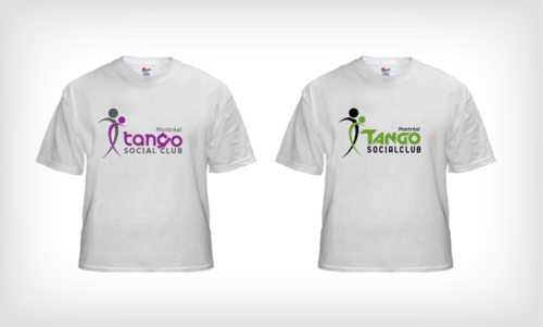
    Re: drafts #5 and #6. We love the abstract dancers, this is definitely on the right track! Excellent! For #6 we'd like to see a different font and a color with more presence than the light gray. For #5, it's great! Could we see a purple/lime combination or other color combination that is more masculine/neutral? Also, could Montréal be upper case? Thank you!!!!

    Like Icon 0   DislikeIcon 0