SALES / SUPPORT : +1-877-525-5646 |
Login
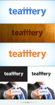
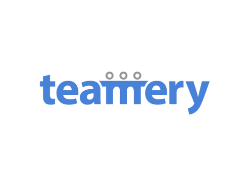
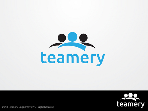
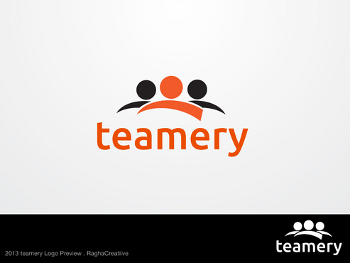
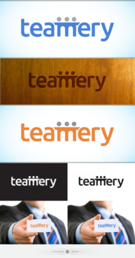
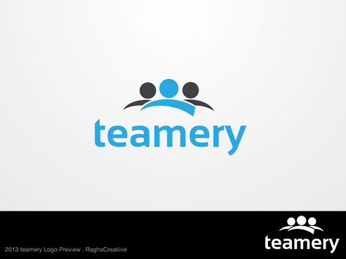
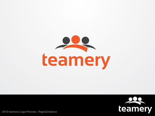
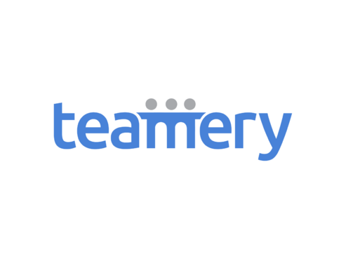
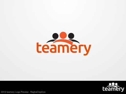
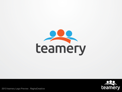
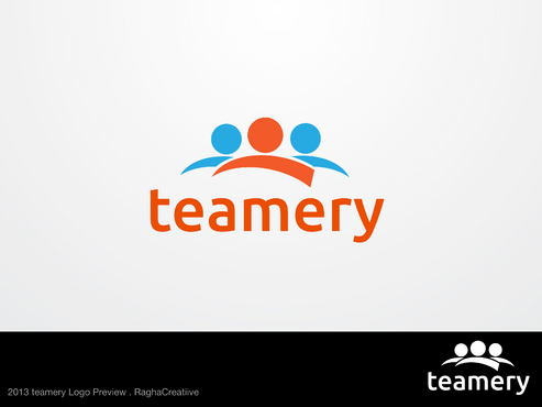
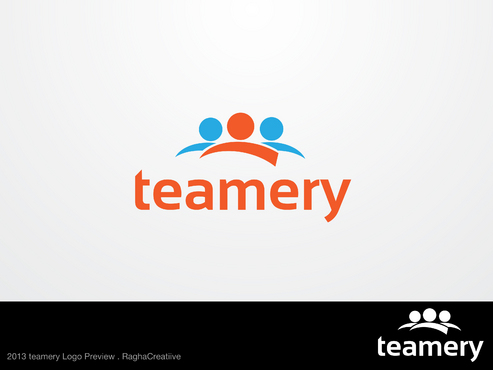
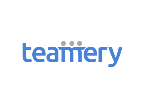
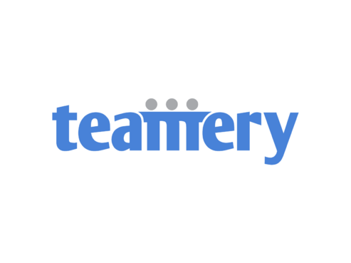
Logo for software dev company
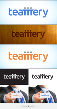
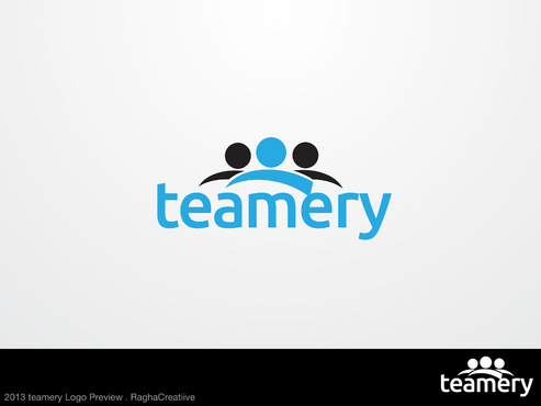
teamery
|
Contest Holder
kevingounden
?
Last Logged in : 3236days23hrs ago |
Concepts Submitted
247 |
Guaranteed Prize
270
|
Winner(s) | A Logo, Monogram, or Icon |
|
Live Project
Deciding
Project Finalized
Project: Logo for software dev company
Industry:
Software Logo
Contest Launched:
Jul 23, 2013
Selected:
1
winning design from 247 concepts
Winning Design by:
Skovran
Close Date:
Jul 31, 2013


Creative Brief
Logo for software dev company
teamery
No
cutting edge software company that is appealing to a corporate audience... so a font that is distinctive, yet has gravitas. Not too playful, not too boring. want the name of the company to be the logo... but happy if some part of the logo, like one of the letters is unique in some way.
Software
Sophisticated
Professional
High Tech
Not sure, we would like some hue of blue but would like to see some variations... definitely not a google multicolor... must be a color that makes it look sophisticated and have stature
not sure
Related Contests


Comments
Project Holder
Project Holder
Project Holder