SALES / SUPPORT : +1-877-525-5646 |
Login
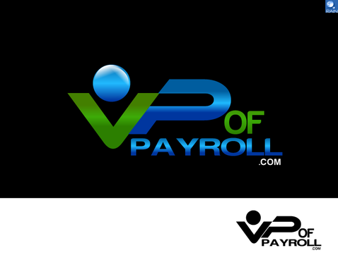
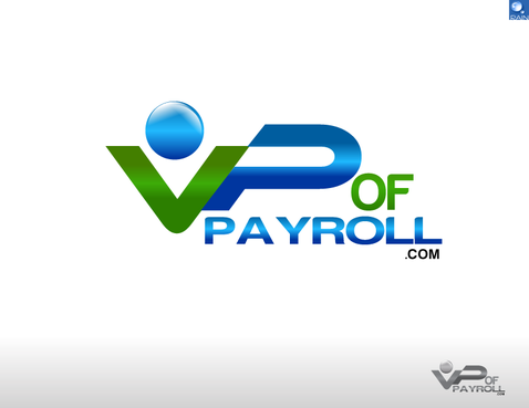
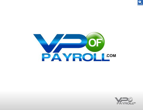
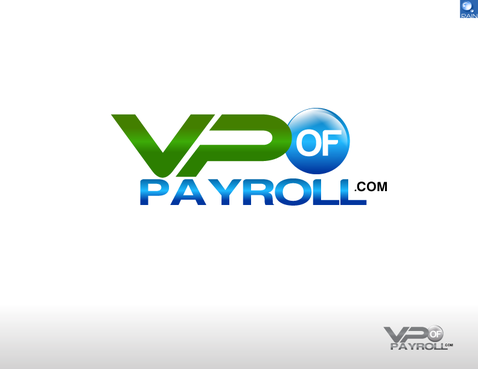
Logo for payroll company
VP of Payroll.com
|
Contest Holder
LowCostPayroll
?
Last Logged in : 4141days5hrs ago |
Concepts Submitted
101 |
Guaranteed Prize
200
|
Winner(s) | A Logo, Monogram, or Icon |
|
Live Project
Deciding
Project Finalized
Project: Logo for payroll company
Industry:
Financial Services Logo
Contest Launched:
Feb 09, 2011
Selected:
1
winning design from 101 concepts
Winning Design by:
validesign
Close Date:
Feb 19, 2011


Creative Brief
Logo for payroll company
VP of Payroll.com
No
Provide full service payroll to small businesses (50 employees or less). We offer the most affordable rates in the industry. Our rates are all inclusive and easy to compute. No nickle and dime charges.
Financial Services
Logo Type
![]()
Abstract Mark
![]()
Web 2.0
![]()
Unique/Creative
Clean/Simple
Industry Oriented
Fun
Green (color of money), purple, blue - whatever combination works best
2
I want the .com to be part of the logo (VP of Payroll.com). Also want something that can also be printed in one color if necessary. Our company sponsors several youth teams and we want something that will easily print and be visible on t-shirts/jerseys.
Related Contests


Comments
Project Holder
Project Holder
Project Holder
Project Holder
Project Holder
Project Holder
Project Holder
Project Holder
Project Holder
Project Holder
Project Holder
Project Holder