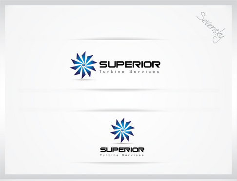
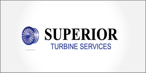
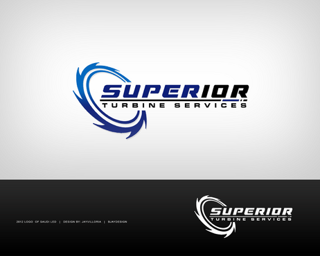
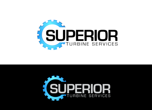
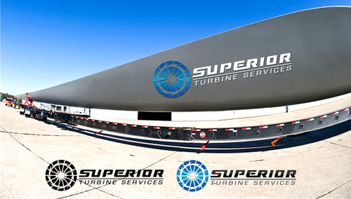
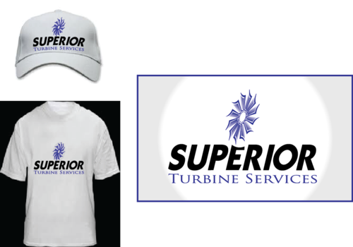
logo for gas turbine services
Superior Turbine Services
|
Contest Holder
jm308002128
?
Last Logged in : 4803days6hrs ago |
Concepts Submitted
134 |
Guaranteed Prize
200 |
Winner(s) | A Logo, Monogram, or Icon |
|
Live Project
Deciding
Project Finalized
Project: logo for gas turbine services
Industry:
Energy Logo
Contest Launched:
Oct 14, 2012
Selected:
1
winning design from 134 concepts
Winning Design by:
herojava
Close Date:
Oct 24, 2012