SALES / SUPPORT : +1-877-525-5646   |   Login


Logo for Financial Services Company

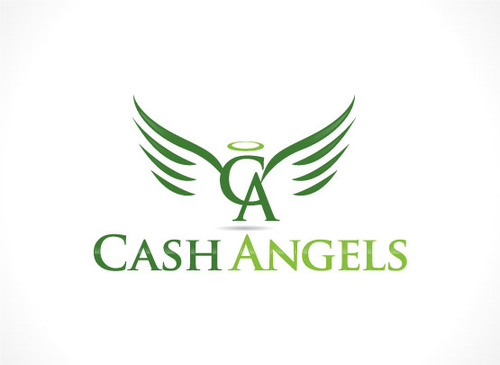
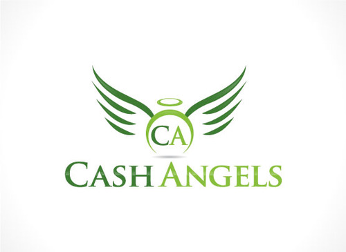
Cash Angels

Contest Holder FashionRealty ?

Last Logged in : 3180days13hrs ago

Concepts Submitted

609

Guaranteed Prize
200
Winner(s)

1

A Logo, Monogram, or Icon veildAll design entries are veiled from other designers till the end of the contest. Featured Featured Contest
tick_gray

Live Project

tick_gray

Deciding

tick_blue

Project Finalized


Project: Logo for Financial Services Compa ...
Contest Launched: Jan 12, 2015
Selected: 1 winning design from 609 concepts
Winning Design by: gnane143
Close Date: Feb 07, 2015


Logo for Financial Services Company - Financial Services


Awarded as a winner
Project Report    

Sort by:


#420

#419

#418

#417

#416

#415

#414

#413

#412

#411

#410

#409

#408

#407

#406

#405

#404

#403

#402

#399

#398

#397

#396

#395

#394

#393

#392


Creative Brief


Logo for Financial Services Company

Cash Angels

No

We are a financial services company offering a individuals and companies the cash that they need for personal and business purposes. We provide cash advances, payday loans, lawsuit cash advances, business loans, mortgages, and a variety of other cash options. We would like to be envisioned as a logo and company where people can come to us whenever they want cash for any reasons -- we are the cash angels that provide the cash needed.

Financial Services

Logo Type
Logo Type

Symbolic
Symbolic

Abstract Mark
Abstract Mark

Initials
Initials

Illustrative
Illustrative

Character
Character

Web 2.0
Web 2.0


Masculine
Feminine
Modern
Retro
Cutting-edge
Traditional
Youthful
Sophisticated
Simple
Elaborate
Professional
Casual
High Tech
Rustic

Not sure, you decide

not sure

Not sure, you decide

Related Contests


Logo design for a financial broker
$240
Prize Money
123
Concepts
Platinum Bill Pay, LLC
$249
Prize Money
64
Concepts
Diversiphi Logo Contest
$200
Prize Money
115
Concepts
health insurance website for business professionals
$200
Prize Money
138
Concepts

Discussion


Comments

  • February 04, 2015 10:11 AM
    FashionRealty FashionRealty
      Project Holder
    I've received a few messages from designers saying that they have been unable to upload designs before the contest has ended. I have extended the contest by 3 more days. Designers now have 3 more days to submit designs. This will be the final extension provided. A winner will be selected after the contest ends on Saturday.

    Like Icon 0   DislikeIcon 0
  • January 31, 2015 11:06 PM
    FashionRealty FashionRealty
      Project Holder
    I have extended the contest by 3 more days. There have been a total of 379 submitted logos. Unfortunately, 370 have been eliminated and just 9 designs remain. I have sent all designers a personal message with advice on improving the logos. I ask that everyone reading this message, whether you have already submitted designs or you are submitting designs to this project for the 1st time, please please read the contest brief and contest updates very carefully before submitting designs. 90% of the eliminated designs are because designers are submitting random designs and are not spending the time with reading the contest notes. Thank you to everyone. I look forward to receiving new designs, and I wish everyone the best of luck.

    Like Icon 1   DislikeIcon 0
  • January 20, 2015 9:20 AM
    FashionRealty FashionRealty
      Project Holder
    Dear Designers, As promised, the contest has been extended by 3 days. Please read the contest notes above. I wish everyone the best of luck.

    Like Icon 0   DislikeIcon 0
  • January 19, 2015 6:39 PM
    FashionRealty FashionRealty
      Project Holder
    Dear Designers, I will be extending this contest for another 7 days. The contest should be extended by the administrators of this site sometime tomorrow. There have been a total of 265 concepts submitted. First and foremost, thank you to all of the designers that have submitted designs. If your designs have been eliminated, please do not get discouraged -- there can only be 1 winner. Also, this is my 5th contest launch and I will be launching more contests soon, so if you do not win this contest, you will certainly have the opportunity of winning future contests. I have gone through the submissions and have eliminated 227 designs. There are presently 38 active pending designs. Unfortunately, I am honestly not "wow'd" by any of the designs and would like to see more designs submitted before I make a final decision. The present logo award is $200. I will also provide a donation to the winning designer. To help designers with improving the quality of their designs and increasing the chances of winning this contest, I suggest that each designer please read the following before submitting additional designs: 1) Please do not submit any designs where the words "Cash" and "Angels" are simply placed next to a generic symbol. I can easily take 2 words and place a symbol next to the words from a thousand different symbols available online. Many of the submitted designs also contain the words “Cash” and “Angels” next to a generic symbol which has absolutely nothing to do with the concept of the business. Designs need to be unique and by that, I mean that the words or at least the initials from the words should be incorporated into the actual logo and not simply placed next to the words. 2) Please be creative with the words of the company name. The word "cash" can be in green, since american currency is in green. The term "angels" are usually described as having wings, or a small circle. When submitting designs, please take this into consideration. 3) I have seen several designs where the letter "C" is connected to the letter "A". Although this certainly looks nice, it will present a problem for trademarking purposes since there are already trademarked initials of "C" and "A". Unless the "C" and the "A" can be incorporated into some sort of a logo, it will be very difficult to trademark just a "C" and "A" in the design. 4) I have seen several designs where just the words were spelled out in different colors. Again, as in #1 above, I can do this on my own. Projects are posted on this site because a professionals help is needed. Your creativity is needed. 5) I have seen some designs with an angels wings or an angels circle with the words “Cash” and “Angels” but it looks very unappealing. The important thing to understand is that although it’s a good idea to incorporate such a design concept, it also needs to look in a good way. It’s important that the blend looks nice, and that it is not simply blended. If anyone has any questions, please send me a private message. I will respond to all private messages within 1 day.

    Like Icon 3   DislikeIcon 0