SALES / SUPPORT : +1-877-525-5646   |  


Logo for Coaching, Consulting and Training/ Development Firm

Fulfil 2 B, LLC

Contest Holder kaydee ?

Last Logged in : 4683days15hrs ago

Concepts Submitted

335

Guaranteed Prize
225
Winner(s)

1

A Logo, Monogram, or Icon veildAll design entries can be viewed by other designers. Featured Featured Contest
tick_gray

Live Project

tick_gray

Deciding

tick_blue

Project Finalized


Project: Logo for Coaching, Consulting and ...
Industry: Logo
Contest Launched: Nov 08, 2011
Selected: 1 winning design from 335 concepts
Winning Design by: Don180
Close Date: Dec 18, 2011


Logo for Coaching, Consulting and Training/ Development Firm -


Awarded as a winner
Project Report    

Sort by:


#259


Creative Brief


Logo for Coaching, Consulting and Training/ Development Firm

Fulfil 2 B, LLC

Maximizing Your Potential

No

This logo is for an independent coaching/consulting firm that provides individual and group training in the private and corporate sector. The company focuses on holistic development of people. Services concentrating on providing tools to obtain work/life balance, stress management, finding one's life purpose, career/professional development, and fitness/wellness concentration. We are goal and action oriented in our approach.

Logo Type
Logo Type

Symbolic
Symbolic

Abstract Mark
Abstract Mark

Initials
Initials

Web 2.0
Web 2.0


Unique/Creative
Clean/Simple
Sophisticated
Corporate
Modern
Traditional

I personally love deep rich colors deep oranges, burnt oranges, browns, chocolates, dark hue blues, deep purples. These are my favorite colors but not sure if it would accomplish the motivation piece of the organization. Telling you the colors just gives you a little information of my/founder's personality.

not sure

I love the concept of the name of the organization. You can design the words in any compilation: for example Fulfil2B, Fulfil 2 B, Fulfil 2-B, etc.

You also do not have to place the LLC behind the name. It’s up to you if you want the tagline or not.

Below is a quote from the founder I am placing on the website.
“Many people feel encumbered not because of the lack of potential to succeed. Instead they have not been equipped with the correct tools in creating the fulfillment of who they desire to become.”

Basically, Fulfill to be who ever you desire to be and by coming to our organization we will help maximize your potential in achieving your goals of fulfillment.
“Many people feel encumbered not because of the lack of potential to succeed. Instead they have not been equipped with the correct tools in creating the fulfillment of who they desire to become.”

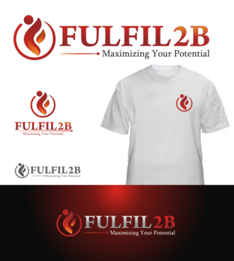
Also, I would like the logo to have the ability to look good on a shirt with one color potentially. If not doable - I understand. I just don't want to busy that is wouldn't look good on a company shirt.

Discussion


Comments

  • January 15, 2012 1:51 AM
    Don180 Don180
     
    dear project holder, pls check your message inbox.

    Like Icon 0   DislikeIcon 0
  • December 04, 2011 1:29 PM
    molteck molteck
     
    Hi PH: but in your last feedback you don't name the exact draft number you are directing your feedback to? Thanks.

    Like Icon 0   DislikeIcon 0
  • December 04, 2011 11:26 AM
    kaydee kaydee
      Project Holder
    I REALLY like the concept of the letter "F" looking like a person. You are accomplishing two things - a person and the first letter of the company name. If there is a way to have the abstract "F" look like a person for the the logo that would be awesome

    Like Icon 0   DislikeIcon 0
  • November 17, 2011 9:38 PM
    kaydee kaydee
      Project Holder
    To all Designers - thank you for participating in my design contest. I have not decided on a winner. Everyone has given me very nice work and this is a very hard decision to make. Thank you for your patience and time.

    Like Icon 0   DislikeIcon 0
  • November 14, 2011 6:24 AM
    kaydee kaydee
      Project Holder
    Just accidently eliminated a desgin, can't remember which one it was - if you were the designer and I had your logo up just recently it was an accident - sorry

    Like Icon 0   DislikeIcon 0
  • November 14, 2011 4:57 AM
    kaydee kaydee
      Project Holder
    I want to thank all the designers for participating in my project. I have made eliminations to help myself and you-the designer narrow down my top designs. All designs have be great I am trying to find the closed and best design to represent my company. The colors from the ones left are right where I want them to be -the colors are great The biggest part that I am trying to get completion on is the company name, the tagline have been great but something about the font , spacing or design for "Fulfil2B" having me search for more I am honored to have you participate in my design contest

    Like Icon 0   DislikeIcon 0
  • November 12, 2011 3:29 AM
    kaydee kaydee
      Project Holder
    Designers, thank you so much for participating in my logo design contest. I have reassigned the star ratings - please review to see the change. I want to continue to give the best feedback I can to help you. Thank you so much for your dedication.

    Like Icon 0   DislikeIcon 0
  • November 11, 2011 7:11 AM
    kaydee kaydee
      Project Holder
    Now that I see the symbolism of a person, My thoughts - may not look as professional as I want but may work out well. If you want the challenge to try my idea that would be great. Thoughts are: -Making the 2 in Fulfil 2B a symbolic person -Making the dot in the "i" of Fulfil 2B a star and person reaching for the star

    Like Icon 0   DislikeIcon 0
  • November 11, 2011 4:44 AM
    kaydee kaydee
      Project Holder
    #63 the icon is a pretty color

    Like Icon 0   DislikeIcon 0
  • November 10, 2011 11:06 AM
    kaydee kaydee
      Project Holder
    #43 Also have the right colors

    Like Icon 0   DislikeIcon 0
  • November 10, 2011 11:06 AM
    kaydee kaydee
      Project Holder
    #49 Icon Colors are exacting what I am looking for

    Like Icon 0   DislikeIcon 0
  • November 10, 2011 10:44 AM
    kaydee kaydee
      Project Holder
    to better describe my gray: Please use Metallic or Silver

    Like Icon 0   DislikeIcon 0
  • November 10, 2011 7:27 AM
    kaydee kaydee
      Project Holder
    #43 Love the Icon Colors, Make tagline smaller, use a gray color for tagline like in your #45, can you try a different font for the company name - thanks much better the icon tons better

    Like Icon 0   DislikeIcon 0
  • November 10, 2011 6:04 AM
    kaydee kaydee
      Project Holder
    another http://www.fruitsencyclopedia.com/blood-orange.html the slice that has the light going through it - those dark rich colors thank you

    Like Icon 0   DislikeIcon 0
  • November 10, 2011 5:59 AM
    kaydee kaydee
      Project Holder
    http://abstract.desktopnexus.com/wallpaper/425172/ not sure if this will help

    Like Icon 0   DislikeIcon 0
  • November 10, 2011 5:12 AM
    kaydee kaydee
      Project Holder
    Did some reach to help explain what I like for the other color. These are word - object - patlettes that I liked Russett Spicy Russett Burgundy Russett Red Anjou Pear (just goregous to me - and the hues vary) Burgundy Metallic Russett Pigment Seckel Pear (this had different speckle hues) Thank you for your time and patience - i am trying to give as much feedback as I can to help . I am so happy of the designs I seen and just want to give the things that are holding be back from a final winner As Always thank you for your time

    Like Icon 0   DislikeIcon 0
  • November 10, 2011 4:46 AM
    kaydee kaydee
      Project Holder
    #18 and #19 that middle color (the two strokes) in the icon I really like also

    Like Icon 0   DislikeIcon 0
  • November 10, 2011 4:44 AM
    kaydee kaydee
      Project Holder
    Color Thoughts: #39, #36, #37, #38 - these logos are the colors I am thinking that I am think about and like - the orange just needs a darker hue - more of a brown or black to make it darker more of the orange-burgundy-dark red family There are some AWESOME designs, its the color that I am having the least amount of success in liking - out of the colors given the gray implemented in the designs are a keeper.

    Like Icon 0   DislikeIcon 0
  • November 10, 2011 4:14 AM
    kaydee kaydee
      Project Holder
    Thank you designers for submitting! I am amazed by your work. The main color that seems to continue for me Love is the gray color that people have been submitting. The other colors have not completely "won me over" like the gray hues have. I saw a new car yesterday and said - that's it - that's my color! The car color was beautiful to me. I looked up the color but the pictures when you goggle doesn't give it justice. Important FYI - In person the car is a darker hue - the lighting that you see when you google is lighter. The color is Mocha Steel Metallic (Chrysler) Again, Thank you

    Like Icon 0   DislikeIcon 0
  • November 09, 2011 2:06 PM
    kaydee kaydee
      Project Holder
    I am liking the oranges but they just are not dark/deep enough for me. More of a burnt orange.

    Like Icon 0   DislikeIcon 0
  • November 09, 2011 10:45 AM
    BigGenius BigGenius
     
    Please, send private messages at the top right. Thanks

    Like Icon 0   DislikeIcon 0
  • November 09, 2011 10:41 AM
    kaydee kaydee
      Project Holder
    I really want to thank all the designers so far who has submitted designs. I am excited, in awe and currently just continuing to change the star ratings to tell you how I "feel" about the designs. I have so many emotions I determine and express more of the "why" to the ratings a little later when I have more time for more explanation. I am changing the ratings as new designs come in to at least for give feedback for right now. Again, thank you.

    Like Icon 0   DislikeIcon 0
  • November 09, 2011 6:02 AM
    kaydee kaydee
      Project Holder
    #9 - like the concept, not a fan of the green - was wondering if could put icon to side and see what happens

    Like Icon 0   DislikeIcon 0
  • November 09, 2011 6:00 AM
    kaydee kaydee
      Project Holder
    #8 - Like the gray but still not liking the blue #6 - like it but seems like something is missing that is why I originally said color because I like the b/w, hmmm - not sure what it is but I am liking the gray for your #8

    Like Icon 0   DislikeIcon 0
  • November 09, 2011 5:59 AM
    kaydee kaydee
      Project Holder
    Maribo - I changed some ratings for your work

    Like Icon 0   DislikeIcon 0