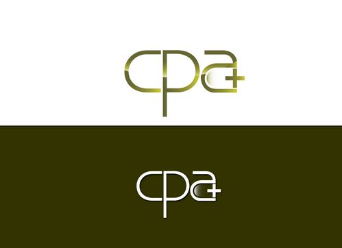
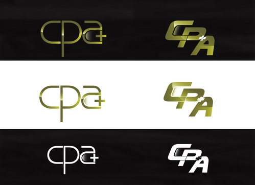
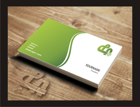
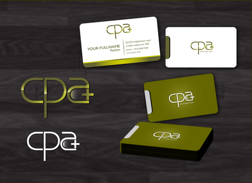
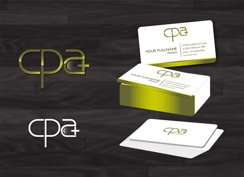
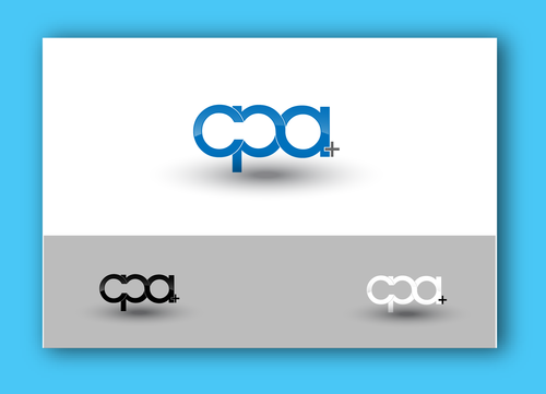
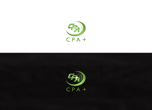
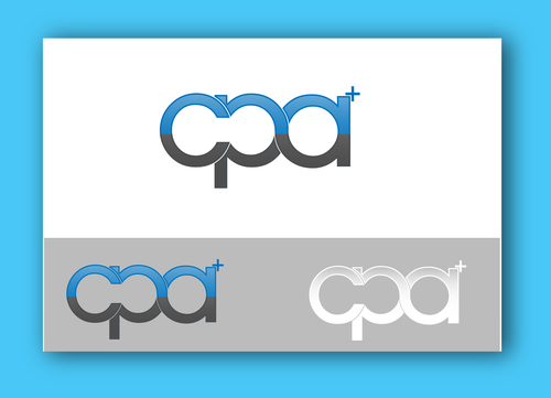
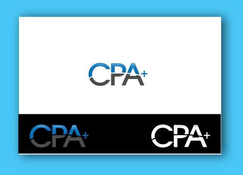
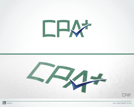
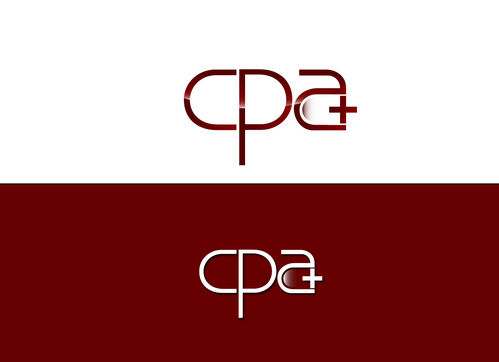
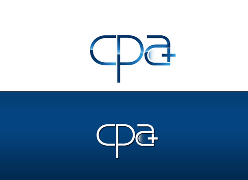
SALES / SUPPORT : +1-877-525-5646   |  


Logo for a CPA firm

CPA+

Contest Holder cpasam ?

Last Logged in : 4095days7hrs ago

Concepts Submitted

236

Guaranteed Prize
300
Winner(s)

1

A Logo, Monogram, or Icon veildAll design entries can be viewed by other designers. Featured Featured Contest
tick_gray

Live Project

tick_gray

Deciding

tick_blue

Project Finalized


Project: Logo for a CPA firm
Contest Launched: Jan 10, 2013
Selected: 1 winning design from 236 concepts
Winning Design by: pixdesign
Close Date: Jan 29, 2013


Logo for a CPA firm - Financial Services


Awarded as a winner
Project Report    

Sort by:


#208

#200

#179

#165

#158

#118

#220

#219

#188

#176

#174

#144

#130

#119

#117

#112

#109

#107

#102

#83

#62

#56

#8

#4

#223

#222

#221

#204


Creative Brief


Logo for a CPA firm

CPA+

No

Professional logo for a full service CPA firm. Want neither to feminine or masculine, but definitely professional.

Financial Services

Abstract Mark
Abstract Mark

Initials
Initials

Web 2.0
Web 2.0


Sophisticated
Professional

We are open to suggestions here. Currently our business card are the color of money with almost looking like a dollar bill.

not sure

We have tried before and came out with a plus that reminded us of the medical field. Definitely don't want anything that looks like medical. See above.

Related Contests


Diversiphi Logo Contest
$200
Prize Money
115
Concepts
Logo design for a stock investing product called Options Trader Elite
$200
Prize Money
84
Concepts
Unsung Heroes
$199
Prize Money
41
Concepts
Logo for a wealth management firm
$350
Prize Money
295
Concepts

Discussion


Comments

  • January 15, 2013 1:18 PM
    cpasam cpasam
      Project Holder
    I am blown away by all of the talented deisigners who have submitted such amazing drafts. Thank you all so much. Picking a winner is going to be difficult!

    Like Icon 0   DislikeIcon 0
  • January 14, 2013 5:52 PM
    cpasam cpasam
      Project Holder
    Hate the combination of red and green as a color choice. Really like some of the designs with these colors, but definitely need different colors.

    Like Icon 0   DislikeIcon 0
  • January 12, 2013 12:01 PM
    cpasam cpasam
      Project Holder
    I like the flourish in draft #19, and the innovation of draft #7 and #8 I also like the combination of the plus in all designs particularly the one in draft #12. The letters should be more script as opposed to block. I would not be ossposed to having some sort of symbol as well. I like the green color closer to that of money and not neon green. I would also consider other colors such as maroon, blue, etc.

    Like Icon 0   DislikeIcon 0
  • January 11, 2013 10:48 AM
    SiteAdmin SiteAdmin
     
    Attention Project Holder: Please be informed that your project is a veiled project and designers are restricted to view only their own drafts which ensure that each design has its own originality however, you being a project holder can see all the designs. Suggestion: Provide consistent feedback and star rating on designs to attract more designers towards your project. Thanks, MB/LDG/LS Team.

    Like Icon 0   DislikeIcon 0
  • January 11, 2013 10:47 AM
    SiteAdmin SiteAdmin
     
    Attention Designers!! MycroBurst permits you to submit unlimited designs with unlimited variations. However, if you are providing 2 or 3 different color versions of the same logo in one draft, please make sure that if the particular draft gets finalized, each color version should be separated before you will send the final files. Thanks, MB/LDG/LS Team

    Like Icon 0   DislikeIcon 0