SALES / SUPPORT : +1-877-525-5646   |   Login


Logo for a company that provides mental health consulting for companies.

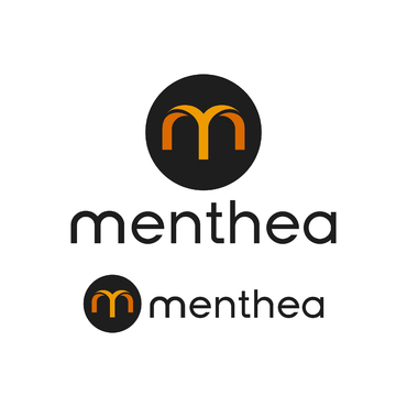
Menthea

Contest Holder Menthea ?

Last Logged in : 480days15hrs ago

Concepts Submitted

3405

Guaranteed Prize
350
Winner(s)

1

A Logo, Monogram, or Icon veildAll design entries are veiled from other designers till the end of the contest.
tick_gray

Live Project

tick_gray

Deciding

tick_blue

Project Finalized


Project: Logo for a company that provides ...
Industry: Consulting Logo
Contest Launched: Jun 07, 2023
Selected: 1 winning design from 3405 concepts
Winning Design by: moxdesign
Close Date: Jul 20, 2023


Logo for a company that provides mental health consulting for companies. - Consulting


Awarded as a winner
Project Report    

Sort by:


#3193

#3192

#3191

#3189

#3188

#3187

#3186

#3183

#3182

#3181

#3180

#3179

#3177

#3176

#3175

#3174

#3173

#3172

#3171

#3168

#3166

#3164

#3161

#3160

#3159

#3158


Creative Brief


Logo for a company that provides mental health consulting for companies.

Menthea

No

This logo will represent a company that has a mission to create a positive change in our work culture and to reduce the stress level. By doing this the employees will experience higher motivation and happiness. We offer customized workshops and tools which will help the companies motivate and support their employees mental health and well-being.

We want to create a calm and simple universe that is easy to relate to.

Consulting

Logo Type
Logo Type

Symbolic
Symbolic

Abstract Mark
Abstract Mark


Simple

not sure
Related Contests


Logo for Business Management and Consulting Group
$199
Prize Money
52
Concepts
Logo-Modern For Business Essentials Consulting
$199
Prize Money
112
Concepts
Logo for an HR Tech consulting company and blog
$250
Prize Money
75
Concepts
Logo for Payroll Company
$200
Prize Money
248
Concepts

Discussion


Comments

  • July 13, 2023 3:13 AM
    Menthea Menthea
      Project Holder
    Design directions 2 NO Gradients Flat design Simple

    Like Icon 0   DislikeIcon 0
  • July 13, 2023 2:35 AM
    Menthea Menthea
      Project Holder
    Dear designers Our logo contest is now extended for threee more days untill 15th of july. Last week, we had actually selected a winner, but the winning logo was not accepted because it was too close to an existing logo. Here is the logo that was already produced and the reason for Zillion Designs not to accept our choise: https://unicorntracker.co/listings/mollie D E S I G N D I R E C T I O N S If you are a new design participant, we would like to give current design directions: Our logo must only consist of: 1) lower case letters menthea 2) No figures, dots, humans, illistrations, only letters 3) The m is to be designed to stand alone as an icon (when not much space to show our full logo) - it is ok for the m to be an illustration 4) The M should also be able to be a part of the logo (easy to read) 4) The font is to be transformed into a unique font - tweak an existing font to be unique (very important) Feel free to use color scheme: https://colorpalettes.net/color-palette-4568 NB: Please don't contact us with a message to check out your work - we are 4 people that constanbtly look at all the incoming work. Rating If we eliminate your design, it means it is a long way from what we want OR it doesn't meet our design directions. If we rate your work with stars, it means you are on the way, but try to work around the idea. In some cases we will also give you feedback. Thank you so much for your hard work :)

    Like Icon 1   DislikeIcon 0
  • June 25, 2023 2:16 AM
    Menthea Menthea
      Project Holder
    Please try to integrate the m as the first part of the company name, also being able to extract it and show it as a stand alone symbol. Thank you.

    Like Icon 2   DislikeIcon 0
  • June 25, 2023 1:45 AM
    brooklee brooklee
     
    What is the font name?

    Like Icon 0   DislikeIcon 0
  • June 24, 2023 1:36 AM
    Menthea Menthea
      Project Holder
    Thank you for a good question MaxxIT The m i also in lower caps (small letter) :)

    Like Icon 1   DislikeIcon 0
  • June 24, 2023 1:21 AM
    MaxxIT MaxxIT
     
    Thanks for your feedback. but is the M icon is small letter " m" or a capital letter " M " ?

    Like Icon 1   DislikeIcon 0
  • June 24, 2023 1:19 AM
    Menthea Menthea
      Project Holder
    Please do NOT integrate the tag-line! Only the whole logo of menthea and also a stand alone icon (the M)

    Like Icon 1   DislikeIcon 0
  • June 24, 2023 1:16 AM
    Menthea Menthea
      Project Holder
    A T T E N T I O N - D E S I G N E R S! We have new design directions. Our logo must only consist of: 1) lower case letters menthea 2) No figures, dots, humans, illistrations, only letters 3) The m is to be designed to stand alone as an icon (when not much space to show our logo) 4) The M should also be able to be a part of the logo (easy to read) 4) The font is to be transformed into a unique font - tweak an existing font to be unique (fonts we like will be uploaded as an image) 5) The M figure is to be Unique - please dont copy from the internet (we run eveything through - google lens to check) Please use color scheme: https://colorpalettes.net/color-palette-4568/ This will be our last 3-day exstension. Thank you so much for your hard work :)

    Like Icon 0   DislikeIcon 0
  • June 19, 2023 9:05 AM
    sanss sanss
     
    Hello sir for design #1019 I think you have opened up my concept for other designers

    Like Icon 1   DislikeIcon 0
  • June 19, 2023 7:56 AM
    Menthea Menthea
      Project Holder
    #1125 - no faces #1019 - we love this but it is a copy of the company mintmesh - please make a new symbol #940 - lower case - more simple #864 - different font - more simple symbol #774 - rework symbol #749 - rework symbol Colors: #EAE7DC #8E8D8A #E98074 #A8DDE6 #00887A Ofc black and white. Please make also with black and white text and colored symbol

    Like Icon 0   DislikeIcon 0
  • June 19, 2023 12:15 AM
    Menthea Menthea
      Project Holder
    Our tagline is People Make The World Go Around

    Like Icon 0   DislikeIcon 0
  • June 14, 2023 8:17 AM
    Menthea Menthea
      Project Holder
    Hi all - we would love to see some simple symbols that has a story to our universe. some comments to some of you specificlly. #449 : combine the text with the symbol #742: Please no background #739: more simple - think about our universe. We like the puzzle pieces #731: develop on the symbol #720: combine with #742 font #675: integrate the leaf without it looking like ears #662: intergrate with text #654: develop on symbol - rounder symbol, more soft #651: one color. Try to make one with the whole name and one with the symbol maybe with m #623: smaller but thicker font #608: softer font - no seperation in name #597: thinner text - try to develop symbol #592:thicker font - not so round m #557:more simple and soft symbol #535: we like the simplicity, but more about what we stand for. #529: try some gradience on the symbol. Also both with the whole name and only symbol #464: lower case - new more simple colors. #445: develop symbol - more simple.

    Like Icon 0   DislikeIcon 1
  • June 12, 2023 7:27 AM
    Menthea Menthea
      Project Holder
    Hi everybody - thank you for your submissions. We would like the symbols made from the designers we have given star rating to be more simple. No humans, brains or crosses. We would like the symbol is seperated from the text or totally intergrated in the text. We have decided not to seperate the name. So no difference in colour or shapes. Please ask questions if you have any about our ideas.

    Like Icon 0   DislikeIcon 0
  • June 08, 2023 5:12 AM
    Menthea Menthea
      Project Holder
    Important info - we want the font all lower case

    Like Icon 0   DislikeIcon 1
  • June 08, 2023 5:05 AM
    Menthea Menthea
      Project Holder
    update: we do not want the words mental and health in the logo - it was just til explain what menthea means

    Like Icon 1   DislikeIcon 2
  • June 08, 2023 4:39 AM
    Menthea Menthea
      Project Holder
    Thank you all so much for your submissions! Very much appriciated! We have some pointers that might make it easier for you to get more in the directions we wish. - No faces - no people - Feminine look - No squares... - Soft look - rounded - Softer font - Simple - lower caps Our name menthea is the combination of mental and health so we like the idea of the logo being divided in two in to highligt the words. We do not wish to have the brain as a symbol It's people development - Consultants We cant wait to see what you come up with!

    Like Icon 1   DislikeIcon 1