SALES / SUPPORT : +1-877-525-5646 |
Login
Law Firm Logo
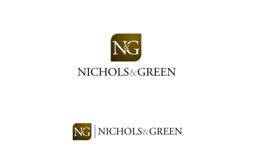
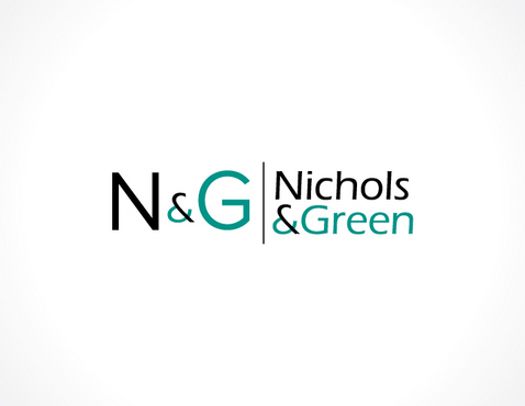
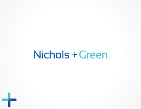
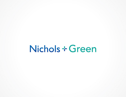
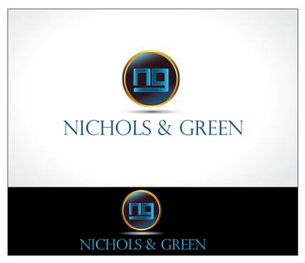
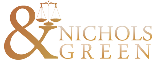
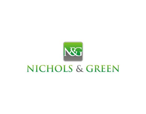
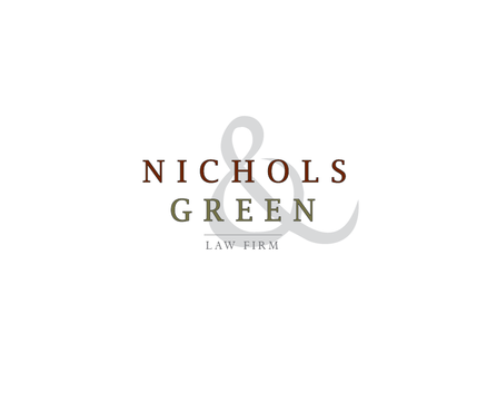
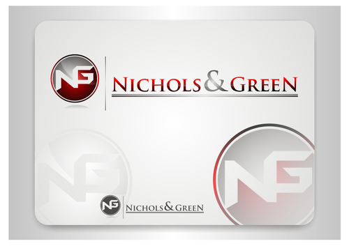
Nichols & Green
|
Contest Holder
lnichols
?
Last Logged in : 3631days12hrs ago |
Concepts Submitted
340 |
Guaranteed Prize
450
|
Winner(s) | A Logo, Monogram, or Icon |
|


Creative Brief
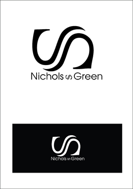
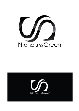
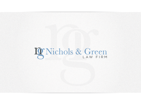
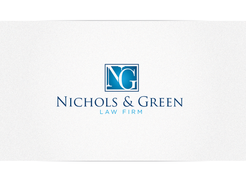
Law Firm Logo
Nichols & Green
Yes
Nichols & Green is a criminal defense law firm in Northern Virginia. We specialize in DUI, reckless driving, and other traffic and misdemeanor offenses. We are on the upper end of the market. This firm is new and formed partly from an old law firm (spectrum-legal.com).
The logo and its derivatives will be used on websites, letterhead. business cards, ect.
Law
Abstract Mark
![]()
Initials
![]()
Web 2.0
![]()
Cutting-Edge
Unique/Creative
Clean/Simple
Corporate
Modern
Serious
Not too particular, but the colors should be able to translate into multiple mediums that may restrict the number of colors (i.e. letter heads, brass busines signs ect)
not sure
We are looking for something more memorable and unique while also being very professional. The logo's memorable and unique features should be appropriate for a high end law firm.
Related Contests

Comments
Project Holder
Project Holder
Project Holder
Project Holder
Project Holder
Project Holder
Project Holder
Project Holder
Project Holder
Project Holder
Project Holder