SALES / SUPPORT : +1-877-525-5646 |
Login
JEFIT
JEFIT
|
Contest Holder
javastate
?
Last Logged in : 1451days13hrs ago |
Concepts Submitted
91 |
Guaranteed Prize
180
|
Winner(s) | A Logo, Monogram, or Icon |
|
Live Project
Deciding
Project Finalized
Project: JEFIT
Industry:
Software Logo
Contest Launched:
Jun 11, 2011
Selected:
1
winning design from 91 concepts
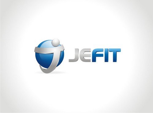
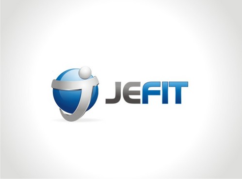
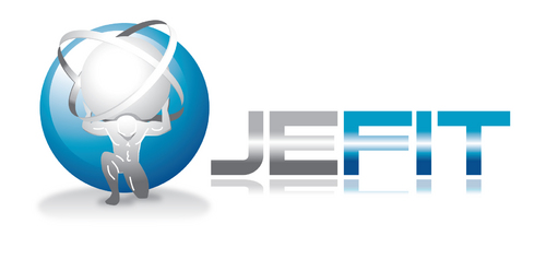
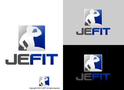
Winning Design by:
QueenZahra
Close Date:
Jun 18, 2011


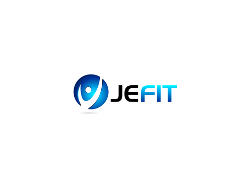
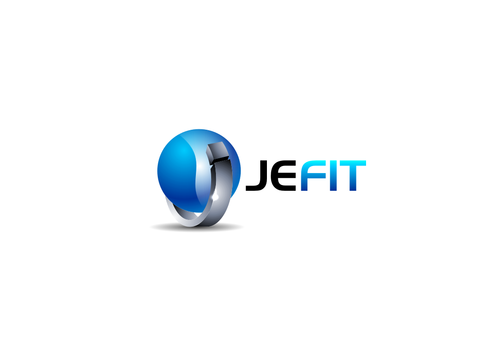
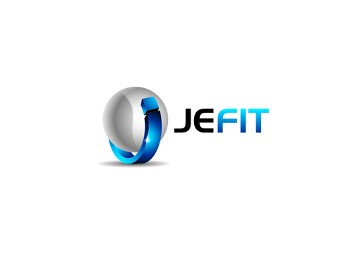
Creative Brief
JEFIT
JEFIT
No
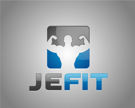
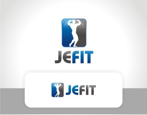
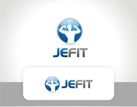
We are a software company focuses on fitness software for mobile platforms. Our products will cover Android, iPhone, iPad and all other major smart phone platforms. Our products are designed for body builders and regular gym users.
Here is a link to our website that explains our software and nature of our business.
http://www.jefit.com/feature/
http://www.jefit.com/company/
Software
Logo Type
![]()
Abstract Mark
![]()
Character
![]()
Web 2.0
![]()
Unique/Creative
Clean/Simple
Corporate
High Tech
Serious
Masculine
Abstract
We currently use a lot blue (or sky blue) color in our software and website. But we are open to any color as long as the logo meet our description above. Here is a link to our site http://www.jefit.com
not sure
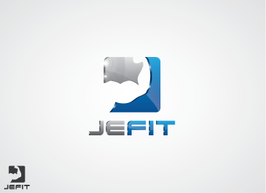
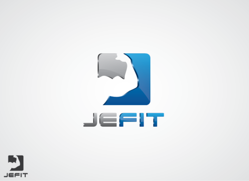
We currently also use a lot of this character in our app.
http://www.jefit.com/wp-content/uploads/2010/12/512icon_png24bit.png
This character was designed by our own team. But our only concern is this character is too similar to Google's Android Robot. It would be great if somehow this character can be integrated into the logo with modified version (make it less look like Android Robot, or even a different character).
But this is totally not required. We accept logo with or without character, as long as we like the design.
Related Contests


Comments
Project Holder
Project Holder
Project Holder
Project Holder
Project Holder
Project Holder
Project Holder