SALES / SUPPORT : +1-877-525-5646 |
Login
House of Dea Logo Contest
House of Dea
|
Contest Holder
HouseofDea
?
Last Logged in : 5211days10hrs ago |
Concepts Submitted
54 |
Prize Money
155
|
Winner(s) | A Logo, Monogram, or Icon |
|
Live Project
Deciding
Project Finalized
Project: House of Dea Logo Contest
Industry:
Logo
Contest Launched:
May 13, 2010
Selected:
1
winning design from 54 concepts
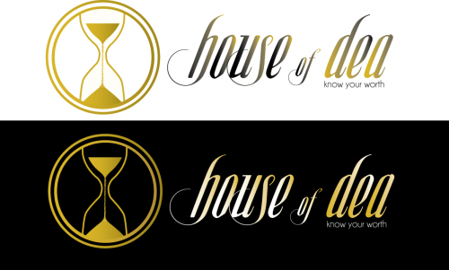
Winning Design by:
ketut
Close Date:
May 23, 2010


Creative Brief
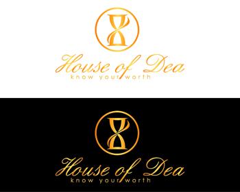
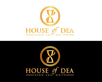
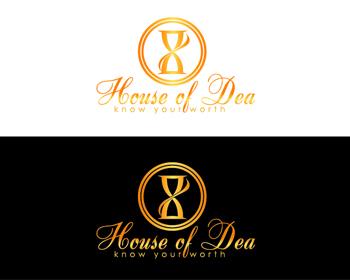
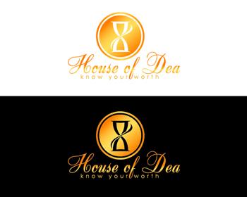
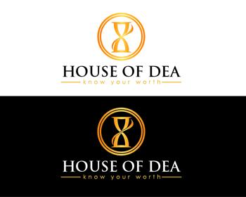
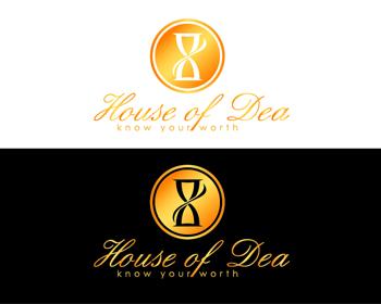
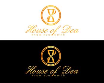
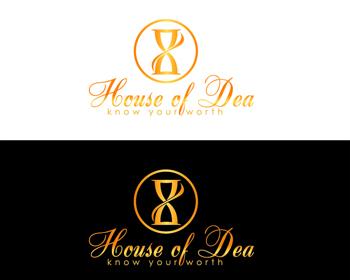
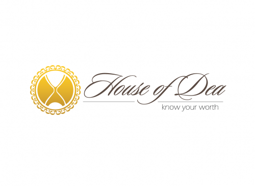
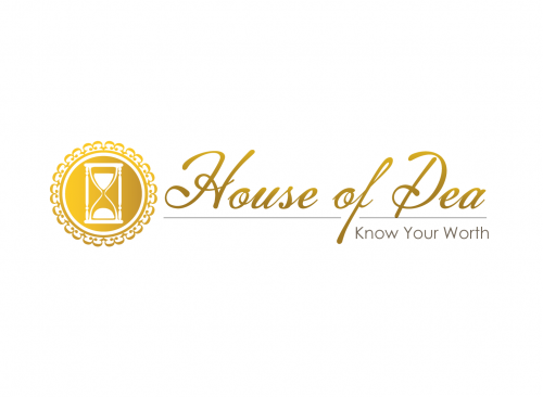
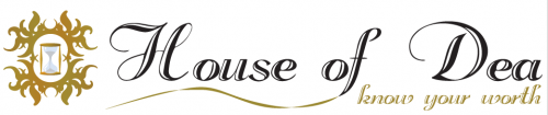
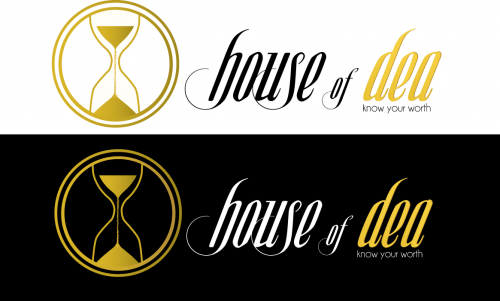
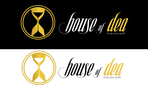
House of Dea Logo Contest
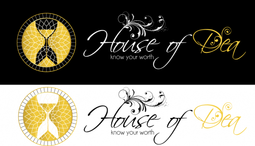
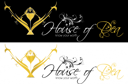
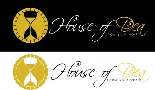
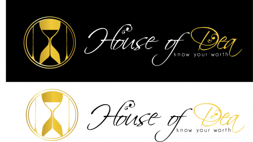
House of Dea
Know Your Worth
Yes
House of Dea is a new, online womenswear label founded in London, specializing in affordable, luxury finished dresses.
both
![]()
Cutting-Edge
Sophisticated
Modern
Industry Oriented
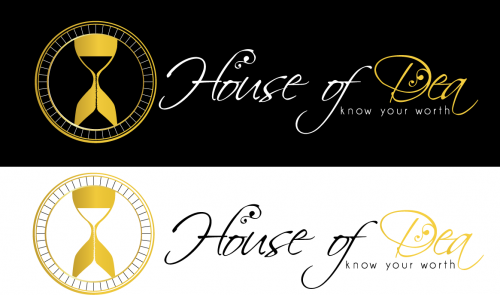
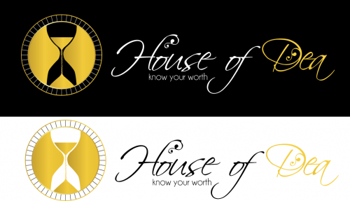
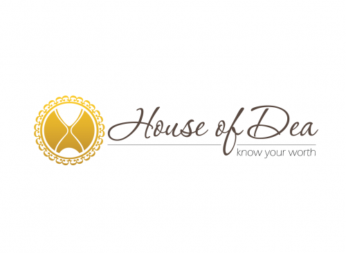
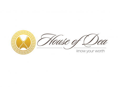
Our company “colours” are black, cream and gold. We are open to different shades of gold/ effects.
not sure
We are keen on a logo that has a script/ handwriting style font, legible but striking, with a symbol that can be used more widely than just fashion as we intend to expand into other areas. The use of a sand-timer symbol is of interest; it is in keeping with our ethos that "life is too short."
Comments
Project Holder
Project Holder
Project Holder
Project Holder
Project Holder
Project Holder
Project Holder
Project Holder
Project Holder