SALES / SUPPORT : +1-877-525-5646   |   Login


Healing Hands Business Cards

Healing Hands Body and Beauty Therapies

Contest Holder Mamakilah ?

Last Logged in : 4331days15hrs ago

Concepts Submitted

299

Guaranteed Prize
200
Winner(s)

1

Business Cards and Stationery veildAll design entries can be viewed by other designers. Featured Featured Contest
tick_gray

Live Project

tick_gray

Deciding

tick_blue

Project Finalized


Project: Healing Hands Business Cards
Industry: Logo
Contest Launched: Jul 09, 2011
Selected: 1 winning design from 299 concepts
Winning Design by: einsanimation
Close Date: Jul 16, 2011


Healing Hands Business Cards -


Awarded as a winner
Project Report    

Sort by:


#240

#239

#224

#207

#192

#179

#177

#176

#111

#299

#270

#269

#267

#264

#259

#256

#253

#250

#249


Creative Brief


Healing Hands Business Cards

Healing Hands Body and Beauty Therapies

I need double sided standard sized Business Card [3.5" x 2"]

Use same font as used in my logo

Modern

Professional

Bright & Fun-filled

Akilah Littles

Owner/Operator IFA, ITEC, CIBTAC, CIDESCO

Bermuda

441-799-2579

magicmobileal@gmail.com

healinghandsmobile.com

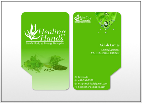
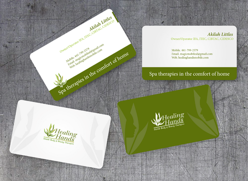
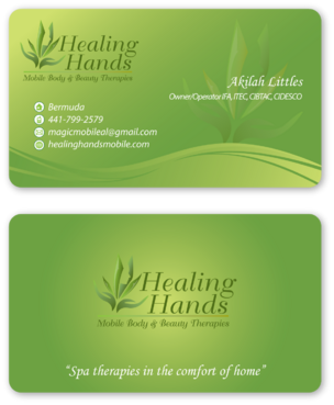
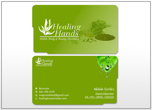
Please design a business card with rounded corners Only the logo goes on the front. Name and additional info goes on the back Coloured background please

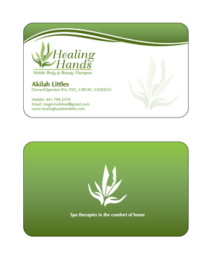
Akilah Littles (in bold print) Owner/Operator IFA, ITEC, CIBTAC, CIDESCO mobile: 441-799-2579 email: magicmobileal@gmail.com web site: healinghandsmobile.com Spa therapies in the comfort of home
Discussion


Comments

  • November 06, 2011 11:10 AM
    RichardB RichardB
     
    Check out www.DesignCage.net its pretty awesome,you can win more contests.

    Like Icon 0   DislikeIcon 0
  • July 12, 2011 6:51 AM
    Mamakilah Mamakilah
      Project Holder
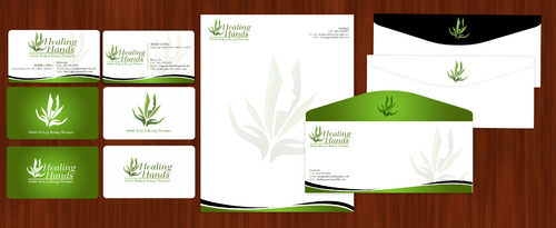
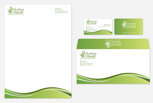
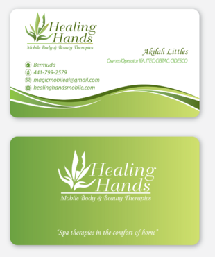
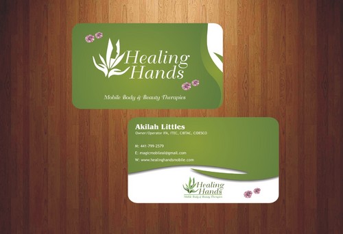
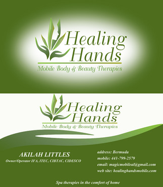
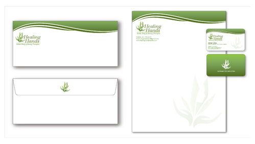
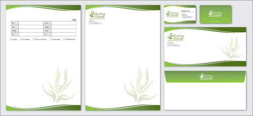
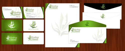
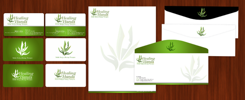
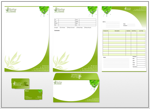
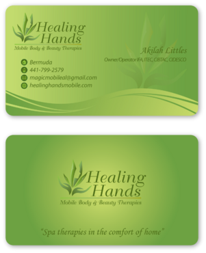
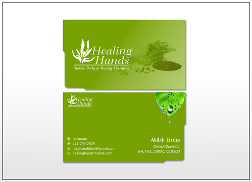
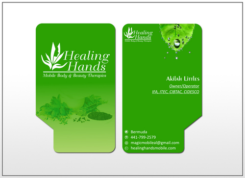
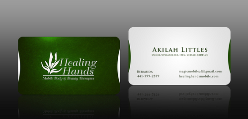
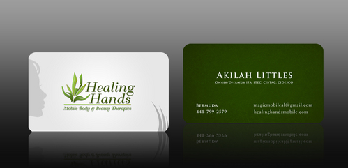
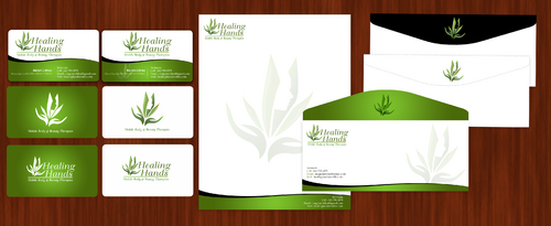
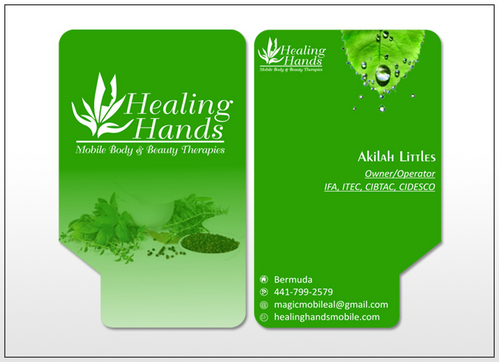
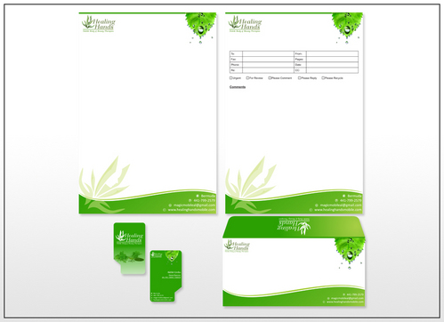
    Draft#179--EXCELLENT use of the hand to divide the logo from the information section! Also, using a colour fade to help the logo stand out against its background is a great idea. The halo effect is a little off-putting though. Is it possible to simply change the colour of the logo to make it stand out? No need to capitalis the entire name. I like that it is written in a larger scale to the other words to help it stand out. Could you blunt the corners or the card please? And did you have the matching stationery to show with it? Draft#178--I actually do like the use of the vertical division line to align the info section. It's quite attractive! I'm not into the combination of greens you have chosen; but I do like the white lettering used. Drafts #177 & 176--The stationery is lovely! I LIKE the wavy detail. I would like to see the complete logo with the correct lettering included please. I would prefer to see the faded logo detail on the writing paper rather than the business card; and have what's on the back of the card reoriented. Dratft# 174--The yellow writing looks good against the green on the front of the card! I don't so much like the bight yellow vertical and horizontal bars or the hunter green though. Would you be able to fit the tag line in there somewhere? Drafts# 170--I think the bubbles, purple flowers and seeds are cute :o) I like the amount of green used in 169 & 170; and the way the logo is partially off the edge. That's hot! Less of the flowers and seeds would be more professional though, I think. The little bit of purple is really pretty. Would you be able to fit the tag line in somewhere? And show your stationery? Draft#167--I like the look. Nice and clean. I would like to see the logo large and on it's own in the front please. Nice greens used. I don't care for the glowing bubbles. What would the matching stationery look like? Thanks, Mamakilah

    Like Icon 0   DislikeIcon 0
  • July 11, 2011 9:29 PM
    Mamakilah Mamakilah
      Project Holder
    Hi folks, I would like to see artistry and flow rather than straight-laced bars across the card. Inspirational colour combinations even. Shades of green flowing into others? There's a look and feel I wish to convey. I'm not sure how to describe the way an elegant spa makes you feel when you walk in. I wish for my cards to represent the most elegant spa you have walked into. Thanks for your entries, Mamakilah

    Like Icon 0   DislikeIcon 0
  • July 11, 2011 6:37 AM
    Mamakilah Mamakilah
      Project Holder
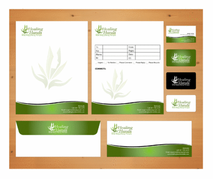
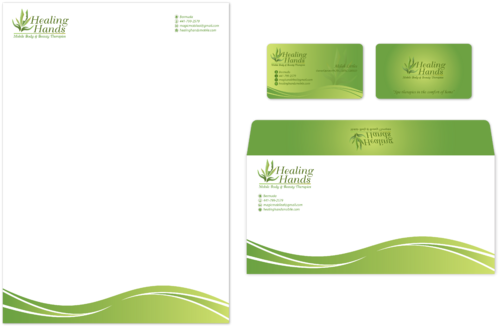
    I would love to see more stationery ideas! Yellow greens--not teals or hunter greens please. If you need to make the logo white to contrast with the background, by all means, feel free to. In the process of working on the cards, what might the matching stationery look like? I like to have colour(and small logo if you want) on the back flap of the envelope with a logo on the front. I like the inclusion of colour in the letterhead and envelope without making heavy, straight bars. The faded logo in large scale is a really nice effect.

    Like Icon 0   DislikeIcon 0
  • July 11, 2011 6:01 AM
    Mamakilah Mamakilah
      Project Holder
    Instead of using heavy bars of colour would it be possible to see what it looks like to flow from one shade to another? I am trying to avoid the heavy horizontal bars. The card should give the impression of freshness and elegance and rejuvenation.

    Like Icon 0   DislikeIcon 0
  • July 11, 2011 5:56 AM
    Mamakilah Mamakilah
      Project Holder
    Please use a coloured background for the logo side of the card. :o)

    Like Icon 0   DislikeIcon 0
  • July 10, 2011 8:12 PM
    Mamakilah Mamakilah
      Project Holder
    Correction! I meant to write # 116--despite the swooshes!

    Like Icon 0   DislikeIcon 0
  • July 10, 2011 8:11 PM
    Mamakilah Mamakilah
      Project Holder
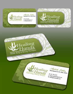
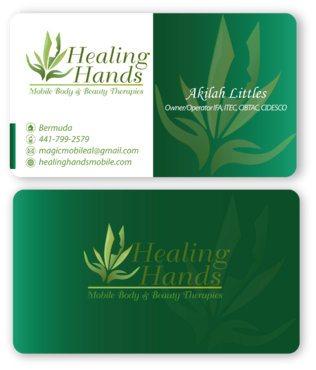
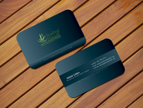
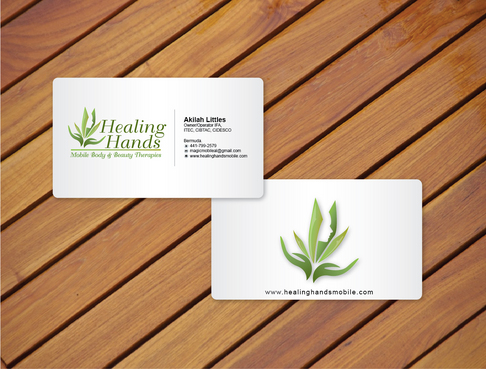
    I am really drawn to the flowing, elegant designs. I'm not much into "swooshes" and swirls in my business cards. Also, I prefer fresh, yellow-based greens to pastels and "chalky" colours. That's the reason why many which include those looks have lower ratings. The faded logo as a large background that I see in some designs is very nice. Reversing the logo colour to white and giving the yellow-based greens the background is a nice switch. The logo can be greens, shades of black/slate, white, or any other combination you think might be attractive. What do you all think would complement the green theme? I quite like seeing the symbols in place of words representing "mobile, email and web site." I especially like the shape, textured elegance, perfectly blunted round corners and yellow-based greens with white contrast in Draft #111. The black is GORGEOUS but it's a bit severe for a spa feel. Can the colour options be played with a bit? What would the matching stationery look like? Heavy, straight bars don't appeal to me as much either. Only a few designs that have them work for me. Some of my favourites are: Drafts: #111 #113 #116 #115--despite the swooshes :o) #100 #96 #89 #77 #75 #13 #9 #7 Please feel free to ask for clarification. I'll check back to see if there are any queries. Thank you! Mamakilah

    Like Icon 0   DislikeIcon 0
  • July 10, 2011 5:49 AM
    Mamakilah Mamakilah
      Project Holder
    Thank you to all who have designed so far! I am on my way to work; but will be back to continue and comment after work. I cannot check these designs while working. I'm excited about the quantity of beautiful designs. I'll be back, Mamakilah

    Like Icon 0   DislikeIcon 0