SALES / SUPPORT : +1-877-525-5646   |   Login


DIM Funds

DIM Funds

Contest Holder corentinscavee ?

Last Logged in : 4676days1hr ago

Concepts Submitted

82

Guaranteed Prize
200
Winner(s)

1

A Logo, Monogram, or Icon veildAll design entries can be viewed by other designers.
tick_gray

Live Project

tick_gray

Deciding

tick_blue

Project Finalized


Project: DIM Funds
Contest Launched: Jan 09, 2012
Selected: 1 winning design from 82 concepts
Winning Design by: lakshmiks
Close Date: Jan 31, 2012


DIM Funds - Financial Services


Awarded as a winner
Project Report    

Sort by:


#78

#41

#34

#43

#42

#40

#36

#35

#33

#32

#31

#10

#27

#17

#57

#56

#53

#45

#44

#28


Creative Brief


DIM Funds

DIM Funds

-

No

The design is for an asset management platform consisting of several independent alternative investment funds. We pool money from private and institutional investors and manage it to increase their capital and wealth. The design will be used on newsletters, business cards, on the website and on presentations.

Financial Services

Logo Type
Logo Type

Initials
Initials


Clean/Simple
Corporate
Modern
Serious
Masculine
Geometric

Nuances of blue. Please refer to the two links mentioned in the "additional suggestions or ideas" section

not sure

Try to use the font Segoe WP of Microsoft as it is our reference font for presentation and newsletters. The logo should easy fit on a dark blue background as well as on a white background.

Refer to the following designs for inspiration. We developed them internally. We would like these nuance of blue to be used in the logo as we use them in our documents (presentations, newsletters, website)

(http://www.dimfunds.com/content/documents/DIM%20Logo%20-%20Initial%20ideas.pdf)

I invite you as well to check the following corporate document for further inspiration : http://www.dimfunds.com/content/documents/11.12.31%20-%20Monthly%20report%20-%20Long%20Short%20Equity.pdf
Related Contests


Diversiphi Logo Contest
$200
Prize Money
115
Concepts
Logo for a wealth management firm
$350
Prize Money
295
Concepts
ATA Financial Services, Inc
$200
Prize Money
77
Concepts
Logo design for a financial broker
$240
Prize Money
123
Concepts

Discussion


Comments

  • January 16, 2012 3:53 AM
    corentinscavee corentinscavee
      Project Holder
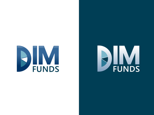
    Draft # 35 : on the right side, could we see a gradiant effect with white as dominant color and blue as gradiant ? We have a lot a documents win which the logo would be integrated to a dark blue background. Otherwise it looks great

    Like Icon 0   DislikeIcon 0
  • January 16, 2012 3:18 AM
    corentinscavee corentinscavee
      Project Holder
    Draft # 33: the gradient effect is interesting, but is the blue of DIM on the left side, the same as the bleu of the background of the right side ? If not, we would like to use the same blue. It would be also intersting to see what the same effect would render on the right side.

    Like Icon 0   DislikeIcon 0
  • January 16, 2012 3:10 AM
    corentinscavee corentinscavee
      Project Holder
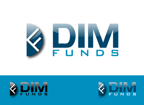
    Draft #19: in the "DF" section, the D should be less strechted and we would like to see how it would look with a thiner "F". In the part "DIM funds", the letters DIm could be a bit bolder and Funds should have the same width as "DIM". The color code is nice and the fact that we can use the logo DF alone as well is very much appreciated.

    Like Icon 0   DislikeIcon 0
  • January 16, 2012 3:05 AM
    corentinscavee corentinscavee
      Project Holder
    Draft # 10 could you add one or two pie slices in the pie chart and have a less glossy effect. Also, we would like to have a less wavy "M" and more squary (now it is a bit to much like the M of Movistar)

    Like Icon 0   DislikeIcon 0
  • January 16, 2012 2:55 AM
    corentinscavee corentinscavee
      Project Holder
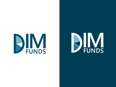
    draft #31 and #32, can we have a less glossy pie chart and a bit narrower

    Like Icon 0   DislikeIcon 0
  • January 16, 2012 2:54 AM
    corentinscavee corentinscavee
      Project Holder
    Draf #17 : could we see the same logo with a thiner/less bold DIM sa that we have a larger piechart within the "D" of DIM

    Like Icon 0   DislikeIcon 0
  • January 13, 2012 10:12 AM
    corentinscavee corentinscavee
      Project Holder
    Draft #4 : we would be glad to see more fragmentation in the pie chart (3-5)

    Like Icon 0   DislikeIcon 0
  • January 13, 2012 7:29 AM
    corentinscavee corentinscavee
      Project Holder
    Draft #4 : Could you produce a similar logo with a 3D piechart that is thinner, a bit of a 3D effect but not as much as it is currently.

    Like Icon 0   DislikeIcon 0
  • January 13, 2012 7:28 AM
    corentinscavee corentinscavee
      Project Holder
    Draft #1 : We would be glade to see what the design would become if we use the "Segeo WP" font for the logo.

    Like Icon 0   DislikeIcon 0