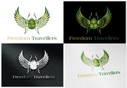
Design a logo for online travel agency specializing in cruises.
Those Two Guys Design Travel (OR...) ttg design travel
|
Contest Holder
ttgdesigntravel
?
Last Logged in : 3398days15hrs ago |
Concepts Submitted
316 |
Prize Money
250
|
Winner(s) | A Logo, Monogram, or Icon |
|
Live Project
Deciding
Project Finalized

Creative Brief
Design a logo for online travel agency specializing in cruises.
Those Two Guys Design Travel (OR...) ttg design travel
"Travel is the only thing you buy that makes you richer" - only if it adds to the logo, Anonymous
No
We are two guys that have organized several cruise groups in the past, often referred to as 'those two guys.' This will be an online full service travel agency but we obviously specialize in cruises, and feel like we have found the secrets on how to make a cruise more fulfilling with personalized activities and services over and beyond what is offered by the cruise lines, whether it organizing private shore excursions, special private get togethers, and activities on and off the ship. The best way to get a sense of that is to visit our last website that we did for a cruise to the South Pacific, located at https://2015southpacificadventure.shutterfly.com and the password is 'paradise.' Our new website will be www.ttgdesigntravel.com. We will accompany some of the cruises to personalize it as much as possible, but again also function as a full service travel agency. Our other domain is www.thosetwoguyscruiseandtravel.com. We want the logo to stand out, be bold, be colorful, be unique and most of all MEMORABLE. Our toll free telephone number is 1-844-I-LUV-TTG. We are trying to make our travel agency DIFFERENT AND UNIQUE. We have also requested a contest to do the business card and stationery after the logo is decided upon and carry on with the same concepts. We could provide photos if you felt that was helpful for the business cards, We have a clientele going into this business which are very experienced traveled people, and want them to bring friends and family to join us in our adventures. The tagline may be more appropriate for the business card or the website than the logo, i would guess, and it was written by an anonymous person. We don't want the LOGO to be cluttered or too busy, but dramatic and memorable.
Travel
Abstract Mark
![]()
Initials
![]()
Illustrative
![]()
Web 2.0
![]()
Masculine
Cutting-edge
Professional
Casual
High Tech
we said bold colors, and would guess 3 or more would be fine to accomplish our logo being more memorable! But we could be influenced here and are not obligated to the 3 or more colors. In reviewing your portfolio, we liked the bold backgrounds like black or dark colors, with primary colors, with a professional look to it.
3
don't want a clip art design, or something child-like appearing. We are dealing with a generally mature group of people. We don't want it too cluttered.
I see no where to put the information for the business cards and stationery, and don't know if that will come in the future or after the logo is completed.


