SALES / SUPPORT : +1-877-525-5646 |
Login
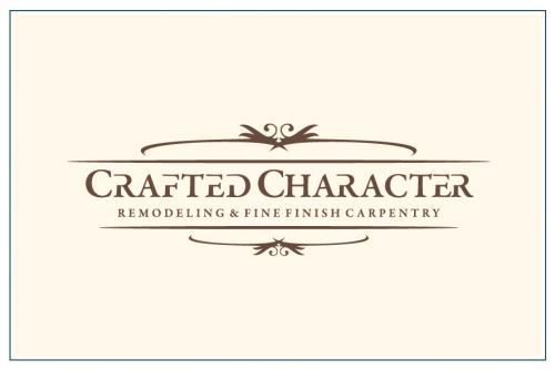
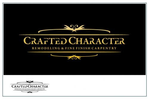
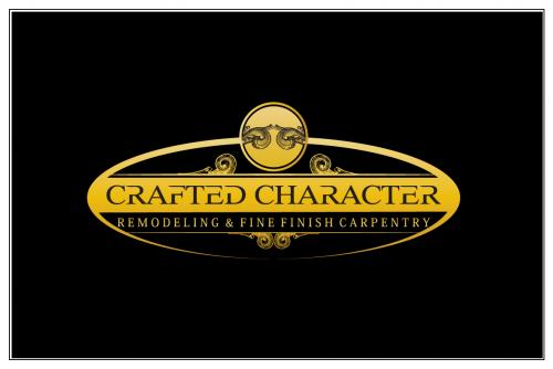
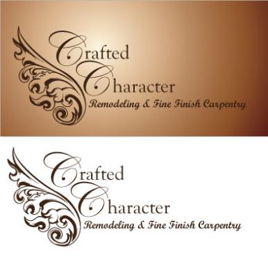
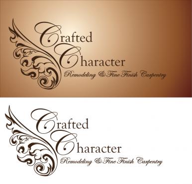
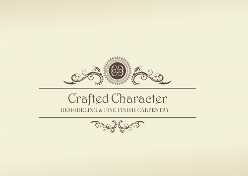
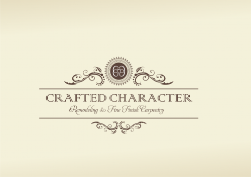
Crafted Character - Remodeling & Fine Finish Carpentry Logo
Crafted Character
|
Contest Holder
CraftedCharacter
?
Last Logged in : 1946days5hrs ago |
Concepts Submitted
112 |
Guaranteed Prize
150
|
Winner(s) | A Logo, Monogram, or Icon |
|
Live Project
Deciding
Project Finalized
Project: Crafted Character - Remodeling & ...
Industry:
Logo
Contest Launched:
May 03, 2010
Selected:
1
winning design from 112 concepts
Winning Design by:
designden
Close Date:
Jun 07, 2010


Creative Brief
Crafted Character - Remodeling & Fine Finish Carpentry Logo
Crafted Character
Remodeling & Fine Finish Carpentry
Yes
Our name comes from the fact that we do things to your home that give it character and really make you love to live there. We perform luxury remodels to residential homes. Examples are home theaters, custom bars, custom kitchens and baths. We build all of the woodworking and cabinetry in-house. We install architectural details like coffered ceiling, wainscoting, one of a kind built-ins, mantels and custom moldings. We build custom homes but our emphasis is on what was described above due to the shift in the market place and downturn in the economy.
We currently have a lame web site but you can see photos of our work which may help.
I may seek help with that next if the logo works out.
www.craftedcharacter.com
both
![]()
Unique/Creative
Clean/Simple
Sophisticated
Corporate
Industry Oriented
Traditional
Retro
Masculine
We started off with brown and periwinkle blue but am truly open to something else, as well as concerned that it will look dated soon if it doesn't already. We used this color scheme on t-shirts and polos.
3
Our current "logo" is a stock photograph with a chair in front of wainscoting. The font we used is Copperplate Gothic light for "Crafted Character" and French Script for our tag line "Remodeling & Fine Finish Carpentry"
I mention those fonts only to give you a feel for what felt right to us at the time. We are open to whatever, but want to convey quality, luxury, and craftsmanship.
We want the final logo to be suitable for Business cards, embroidered polo shirts, silk screened t-shirts, hats, and the side of a huge Dodge Sprinter Van.
Comments
Project Holder
Project Holder
Project Holder
Project Holder
Project Holder
Project Holder
Project Holder
Project Holder
Project Holder
Project Holder
Project Holder