SALES / SUPPORT : +1-877-525-5646   |   Login


Crafted Character - Remodeling & Fine Finish Carpentry Logo

Crafted Character

Contest Holder CraftedCharacter ?

Last Logged in : 1945days16hrs ago

Concepts Submitted

112

Guaranteed Prize
150
Winner(s)

1

A Logo, Monogram, or Icon veildAll design entries can be viewed by other designers. Featured Featured Contest Expedite Expedite Contest
tick_gray

Live Project

tick_gray

Deciding

tick_blue

Project Finalized


Project: Crafted Character - Remodeling & ...
Industry: Logo
Contest Launched: May 03, 2010
Selected: 1 winning design from 112 concepts
Winning Design by: designden
Close Date: Jun 07, 2010


Crafted Character - Remodeling & Fine Finish Carpentry Logo -


Awarded as a winner
Project Report    

Sort by:


#47

#45

#112

#111

#110

#109

#108

#107

#106

#105

#104

#103

#102

#101

#100

#99

#98

#97

#96

#95

#94

#93


Creative Brief


Crafted Character - Remodeling & Fine Finish Carpentry Logo

Crafted Character

Remodeling & Fine Finish Carpentry

Yes

Our name comes from the fact that we do things to your home that give it character and really make you love to live there. We perform luxury remodels to residential homes. Examples are home theaters, custom bars, custom kitchens and baths. We build all of the woodworking and cabinetry in-house. We install architectural details like coffered ceiling, wainscoting, one of a kind built-ins, mantels and custom moldings. We build custom homes but our emphasis is on what was described above due to the shift in the market place and downturn in the economy.

We currently have a lame web site but you can see photos of our work which may help.

I may seek help with that next if the logo works out.

www.craftedcharacter.com

both
both


Unique/Creative
Clean/Simple
Sophisticated
Corporate
Industry Oriented
Traditional
Retro
Masculine

We started off with brown and periwinkle blue but am truly open to something else, as well as concerned that it will look dated soon if it doesn't already. We used this color scheme on t-shirts and polos.

3

Our current "logo" is a stock photograph with a chair in front of wainscoting. The font we used is Copperplate Gothic light for "Crafted Character" and French Script for our tag line "Remodeling & Fine Finish Carpentry"

I mention those fonts only to give you a feel for what felt right to us at the time. We are open to whatever, but want to convey quality, luxury, and craftsmanship.

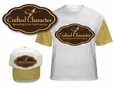
We want the final logo to be suitable for Business cards, embroidered polo shirts, silk screened t-shirts, hats, and the side of a huge Dodge Sprinter Van.
Discussion


Comments

  • June 07, 2010 5:08 PM
    CraftedCharacter CraftedCharacter
      Project Holder
    To everyone who contributed; THANK YOU for taking the time to work on this project! There were many logos that were artisticly excellent but didn't quite capture the feel we were looking for. However, we have narrowed it down to 3 designers and will be making our final decision in the next few days. Thanks again for all the great submissions!!! This process has well exceeded our expections and we really appreciate every Designer's effort!!! Eric Crafted Character

    Like Icon 0   DislikeIcon 0
  • June 02, 2010 10:06 PM
    CraftedCharacter CraftedCharacter
      Project Holder
    Nice job DesignDen. Could you please try the following? 1. Try double horizontal lines, either tapered or straight, above and below the text 2. A little more space between Crafted & Character 3. Tighten up the kerning on the tag line to make the words more distinct and readable. 4. A couple of points more space between the 2 text lines. 5. Please try a version with a scripted font for the tag line. Thanks!

    Like Icon 0   DislikeIcon 0
  • June 02, 2010 9:14 PM
    CraftedCharacter CraftedCharacter
      Project Holder
    Akane, Thank you for your designs. It takes a lot of creativity to submit 5 completely unique designs! Thanks so much for the options.

    Like Icon 0   DislikeIcon 0
  • June 01, 2010 11:13 AM
    CraftedCharacter CraftedCharacter
      Project Holder
    Finaldesign, I like the Capital letters much better. I like #9 the best. I don't know a lot of proper terminology so I am not sure how to communicate my feedback. What appears to be the center element of rotated "C's" does not feel quite right. All of our work is linear and while I am drawn to the beauty of your symbol, I am having trouble linking it to who we are. When you added the filigree to the outside it felt a little better, but the center feels like a camera iris. Is there someway to experiment with the filigree in a linear fashion? Your design has the most hi-end feel so far. I am sorry I can't verbalize more direct recommendations on how to advance the design. Thanks for all you effort!

    Like Icon 0   DislikeIcon 0
  • June 01, 2010 11:01 AM
    CraftedCharacter CraftedCharacter
      Project Holder
    Lakshmiks, Can you please try a serifed font and another scripted font? What I don't like about the existing font is the "d" in Crafted is not clear and kind of looks like a capital "J". Thanks!

    Like Icon 0   DislikeIcon 0
  • June 01, 2010 10:57 AM
    CraftedCharacter CraftedCharacter
      Project Holder
    Raindesign, Can you please remove the gradient elements from #16 and the embossing(engraving?) around the text? Since embroidered and silkscreened clothing are part of our goal, I would like to see how this design would look flattened out. Thanks!

    Like Icon 0   DislikeIcon 0
  • June 01, 2010 10:51 AM
    CraftedCharacter CraftedCharacter
      Project Holder
    RainDesign and Lakshmiks, One of the things that we do is build furniture pieces. Once we have a logo designed, I will be having a custom made branding iron made to burn our Mark into a finished piece of work. Both of your submissions are compatible with that goal. Thank you.

    Like Icon 0   DislikeIcon 0
  • June 01, 2010 10:41 AM
    CraftedCharacter CraftedCharacter
      Project Holder
    Anujdate, Thanks for your designs! I like #14 best of the 2. Maybe a more pronounced chimney shape without smoke may help. While #13 is very creative, it is not heading toward the feeling of a Hi-end company that we are looking for. Thanks again!

    Like Icon 0   DislikeIcon 0
  • June 01, 2010 10:35 AM
    CraftedCharacter CraftedCharacter
      Project Holder
    InciseLogo, My wording on the last sentence sounded ambiguous to me after I sent it. I should have type, "I appreciate the way you showed each with a contrasting background as it helped me visualize better"

    Like Icon 0   DislikeIcon 0
  • June 01, 2010 10:31 AM
    CraftedCharacter CraftedCharacter
      Project Holder
    InciseLogo, Thank you for your submission! I like the logo on #10 and the serif-ed font of #12 the best but would like something even stronger. I appreciate showing each on contrasting backgrounds.

    Like Icon 0   DislikeIcon 0
  • May 29, 2010 9:43 PM
    CraftedCharacter CraftedCharacter
      Project Holder
    Thanks Finaldesign! I would like to see what capitalized first letters look like, about the height of the letter 'd' at the end of crafted. I am not opposed to the font but would like to try others.

    Like Icon 0   DislikeIcon 0